Daily Tohoku Newspaper Plc
Daily Tohoku
Re-born, Bloom again.
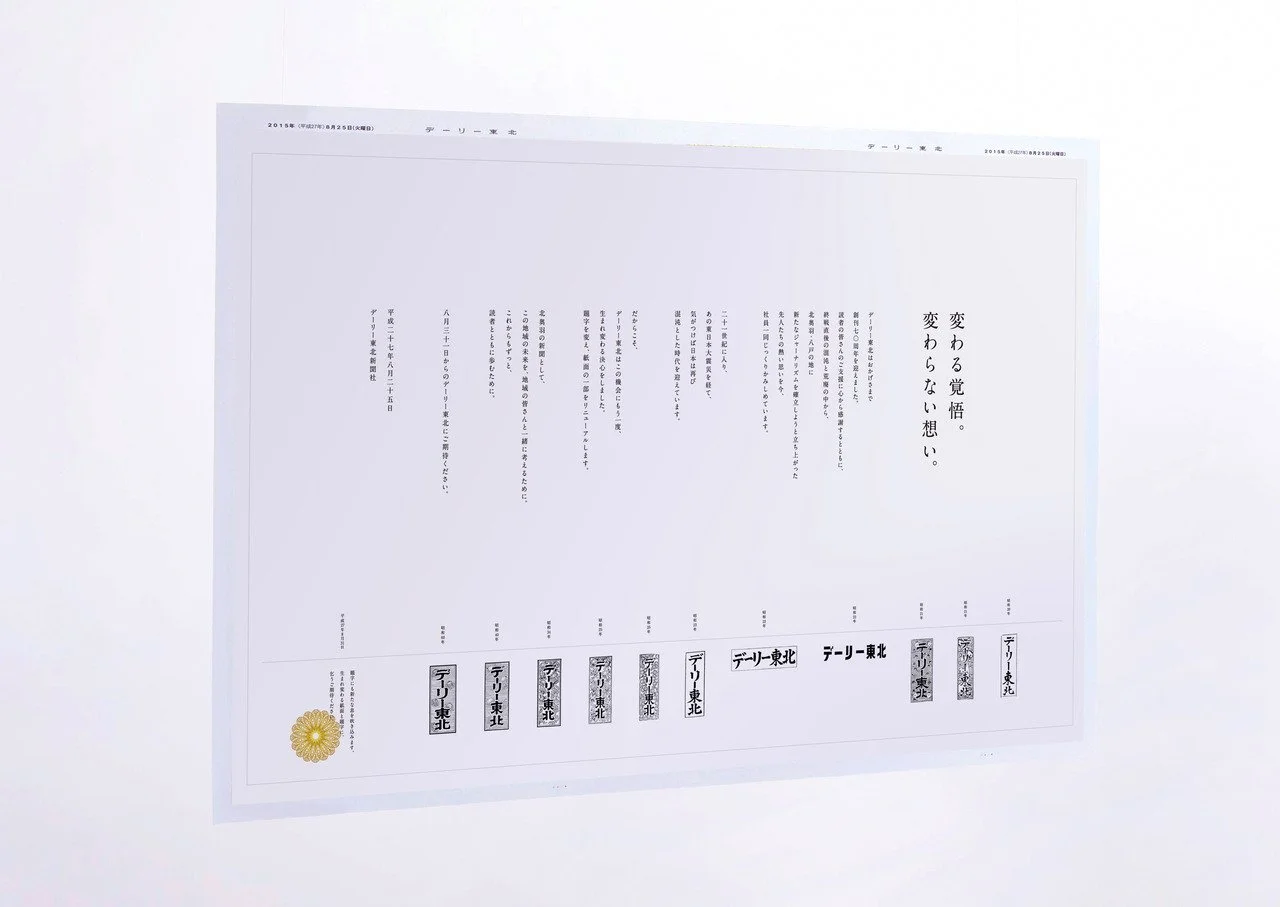
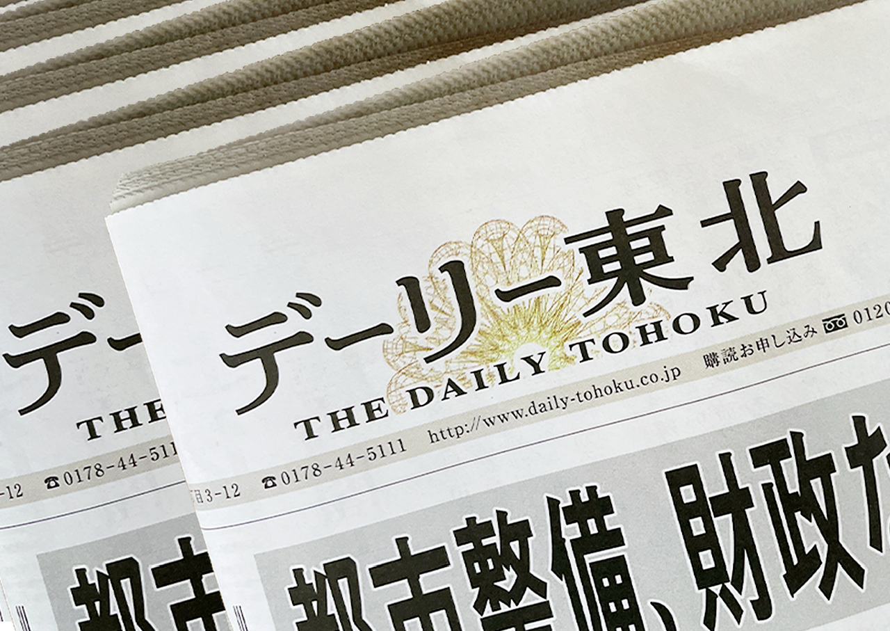
The Daily Tohoku Newspaper asked us to design their corporate identity. It was their 70th anniversary and also 70 years since World War II had ended so changing the corporate identity was very important at that time. As it was announced to their customers to promise their commitment to trusted journalism, and to be re-born as the best local newspaper, once again.
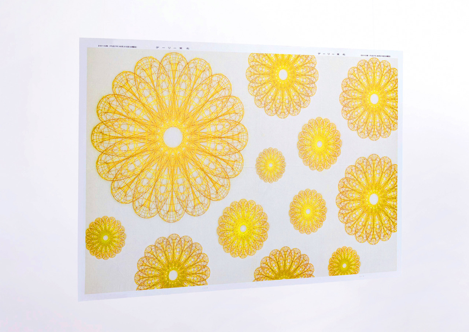
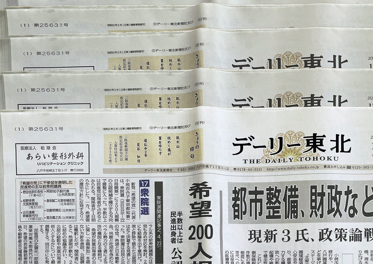
The unique logotype combined English and Japanese typography symbolising both the global and local perspectives. Chrysanthemum logo was based on a globe design and the 3D appearance was to communicate their journalism from all angles. And it showing their determination to bloom again as the best local newspaper.
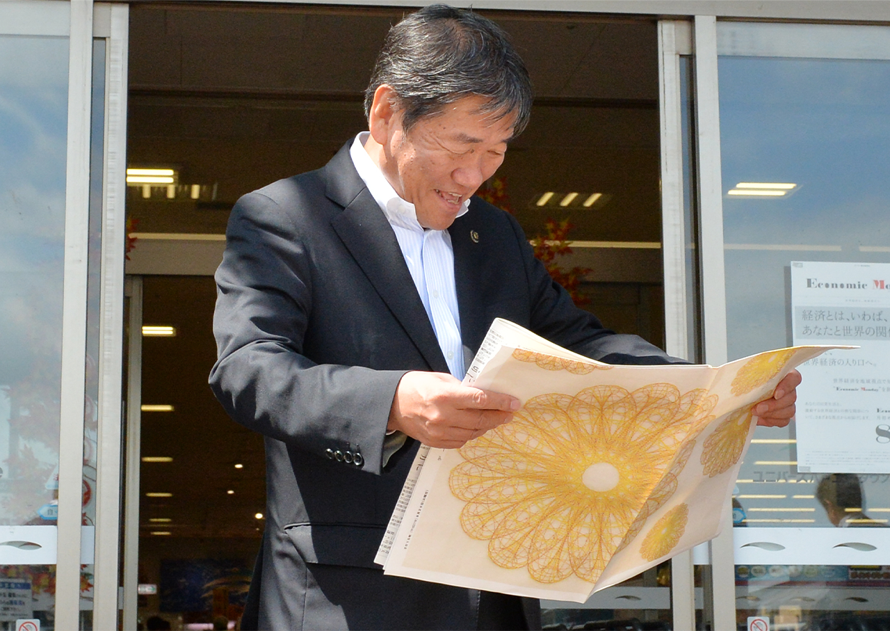
A wrapping newspaper advertisement that inside is a written their history and passionate spirit for the 70th anniversary as a teaser.
-
Category: Brand Identity, Editorial Design, Advertising Campaign
Client: Daily Tohoku Newspaper Inc.
Creative Director: Sekihashi Eisaku, Katuo Mizuguchi
Editor: Daily Tohoku Newspaper Inc.
Producer: Mayumi SuzkiRole: Art Director & Lead Designer
Produced in 2015 - 2017, at Hochikiss