Daily Tohoku Newspaper Plc
Economic Monday
Reclaim the economy
Daily Tohoku Newspaper has a unique name as it is combined with the English word "Daily" and the Japanese word "Tohoku". It tells both of their perspectives on local and global. Also Hachinohe where the company is located is an important area for Japanese economy. But newspaper mainly talking about other regions and the details are on financial press. Our goal is reclaiming the economy from somewhere else or someone else and bring it back home to the individuals.
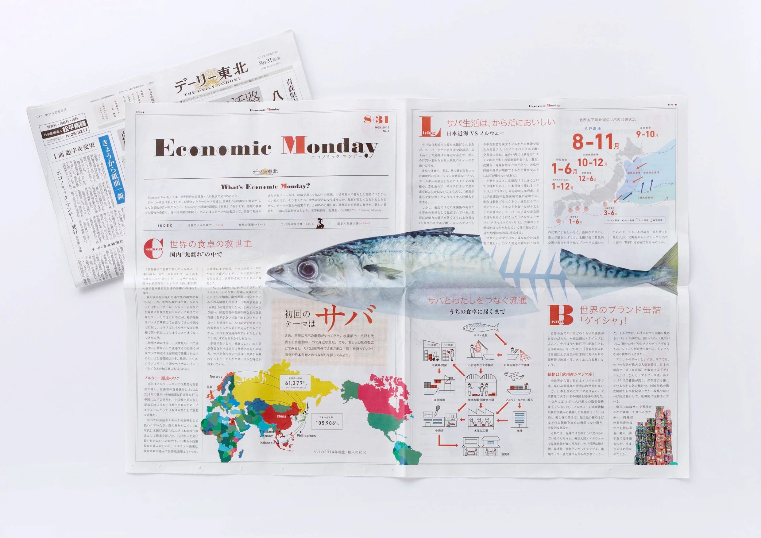
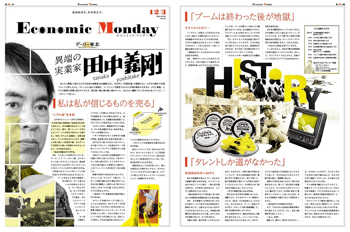
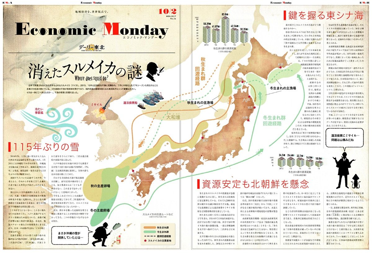
"Economic Monday" is the symbol of their perspectives and their placement. The eyes in logo showcasing their point of views. A graphical design & an infographic-heavy page showing news attractively and supporting the comprehension of economy.
Building own grid system and colouring system could keep the sense of unity with any theme. Advertising campaign in local supermarket wrappings by a new style newspaper on the floors, walls, windows & anywhere else where space was available helped to show the relations between our daily life and the world economy.
It was awarded THE GOOD DESIGN AWARD.
-
Category: Brand Identity, Editorial Design, Advertising Campaign
Client: Daily Tohoku Newspaper Inc.
Creative Director: Sekihashi Eisaku, Katuo Mizuguchi
Editor: Daily Tohoku Newspaper Inc.
Producer: Mayumi SuzkiRole: Art Director & Lead Designer
Produced in 2015 - 2017, at Hochikiss