Konichiwa.
Yuriko is shaped by two cities, two tongues, two time zones, two cups of tea, Green & PG tips.
Ideas don’t just knock on her front door. She greets them from an unexpected angle.
From: Born in Tokyo, raised in Kanagawa, Japan
Love : Seeing and doing Art, vintage & antique finds, and spotting bench plaques
Love and Hate: Playing chess (so stressful)
Hate: Marmite
Some people called me “the little book girl” at W+K Tokyo.
because of the risky application I sent.

Step1: Sent a big box measuring 100cm×100cm to apply for the job.

Step 2: The box had many cushioned pads stuffed inside. It contained my portfolio, which was a very “little book”. Along side it a magnifying glass.

Step 3: On the front cover of this “little book” a message was written ‘You have a good eye that you find my tiny work’.

Step 4: A receptionist received a box, and sent an email to the whole building, after nobody claimed it. ‘Hi, everyone. Mysterious package arrived, addressed with Wieden with only plastic bubble cushion things inside. Does this belong to anyone? Thank you.’

Step 5: Someone thought it was odd and when the box was checked amongst the plastic pads, there was a very “little book”. Approx 3cm×3cm in size. An email was sent out again within the building. ‘Hi guys, This was a Kennedy’s entry! Check it out :) Sooo neat!’

Then, W+K contacted me via a phone call and their opening line to me was, “Hello, is this the little book girl”.
I hoped that by challenging my fear, the little book might be found, and begin a story no one else could write.
Turns out, it did.
Working at W+K Tokyo with international talents opened something up in me, I just realised how big the world actually is.
That’s when I knew I needed to step outside of my comfort zone. So I came to London.
(Nobody warned me I’d be offered tea 6 times a day.)But I stayed. And I grew.
My works
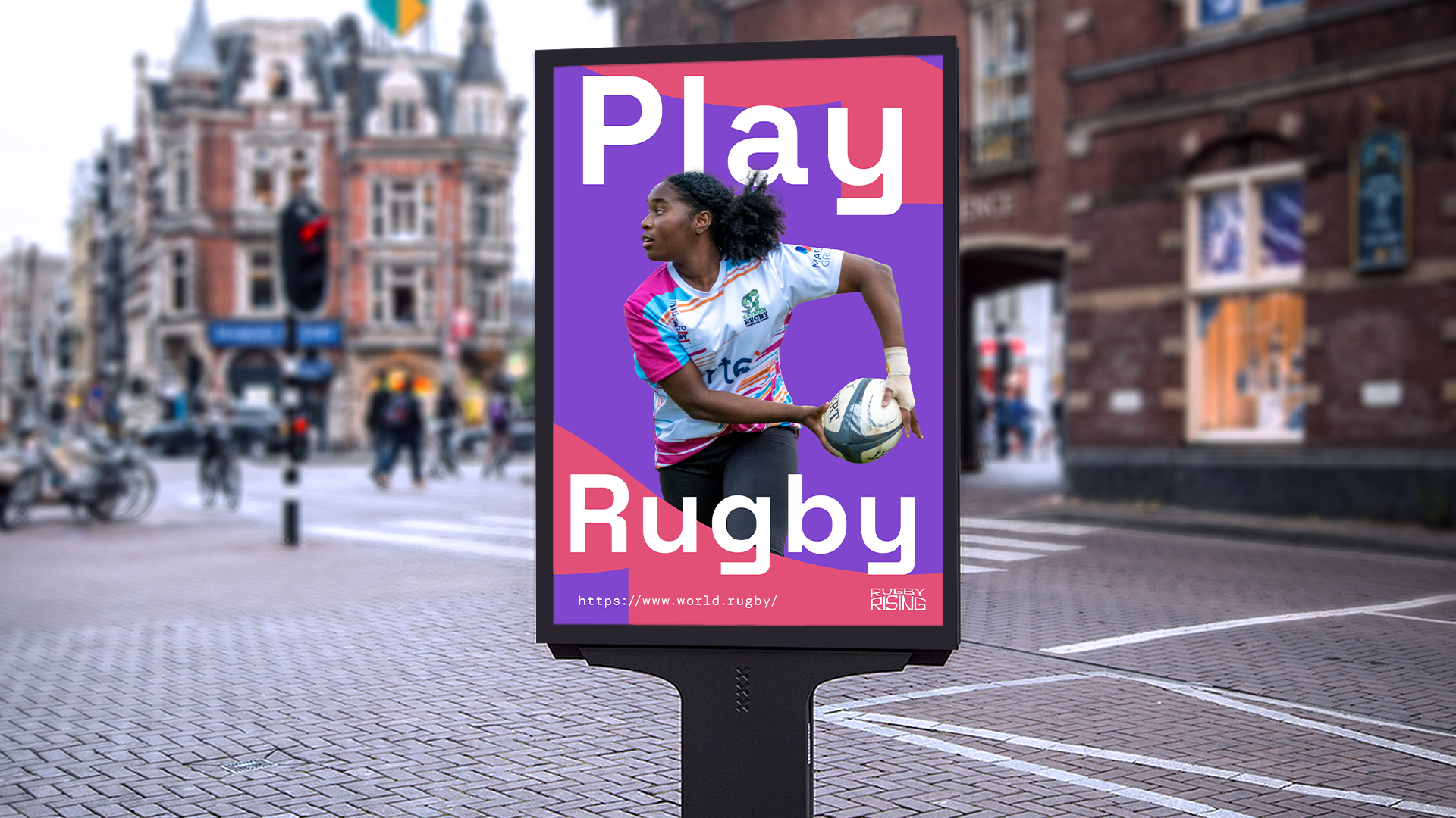
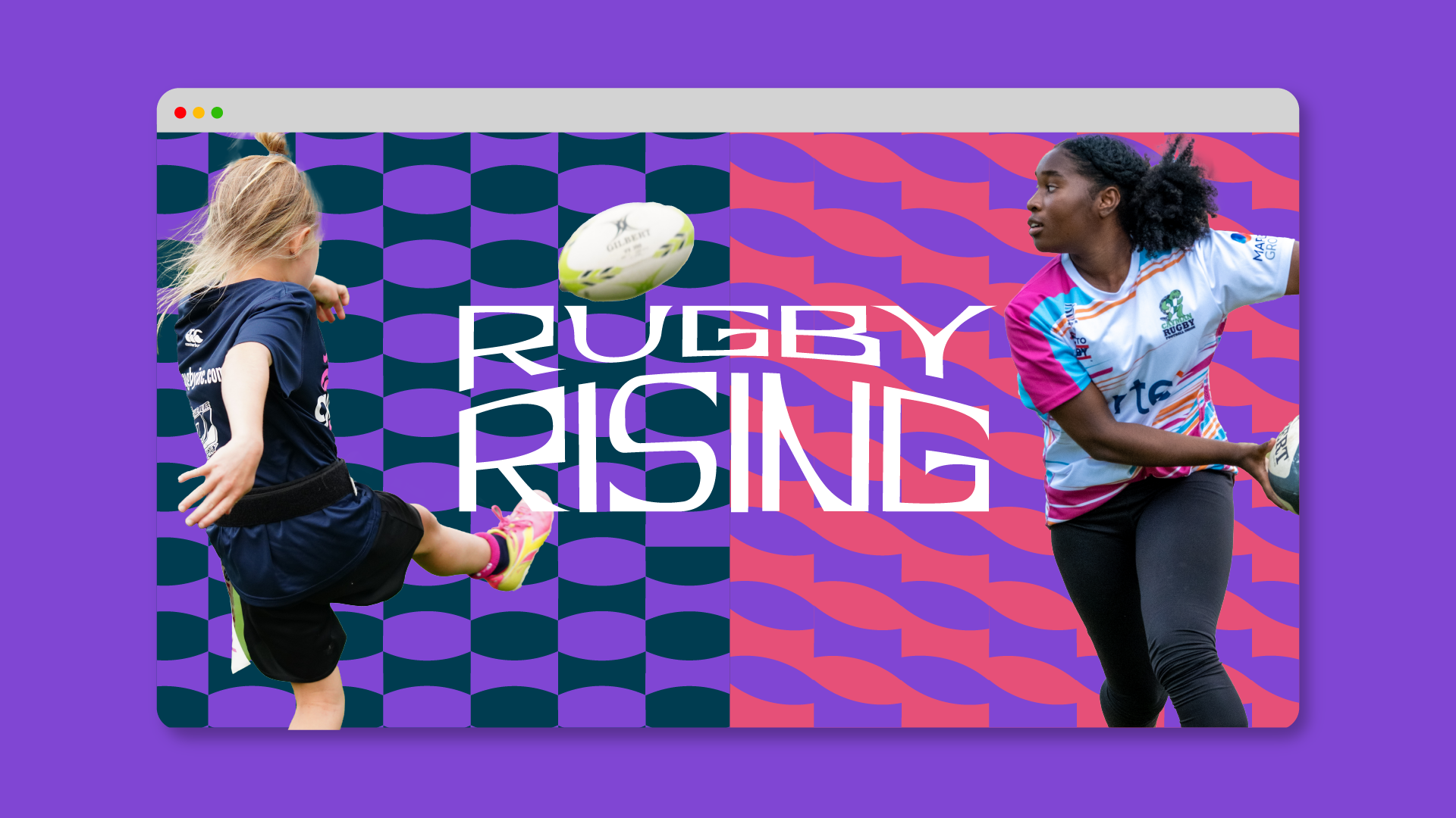
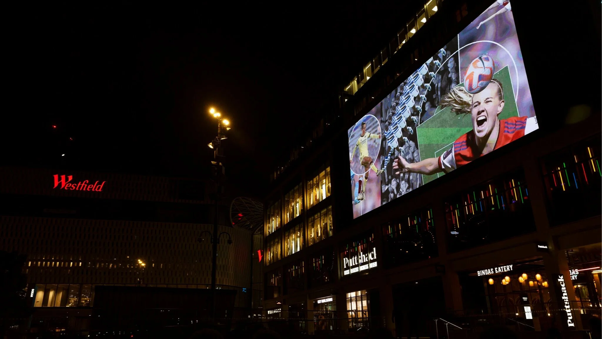
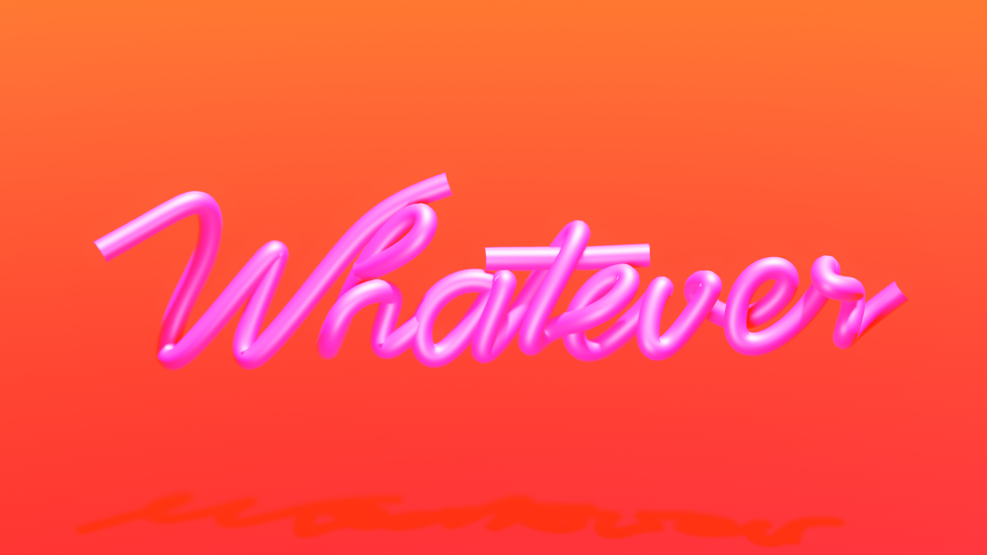
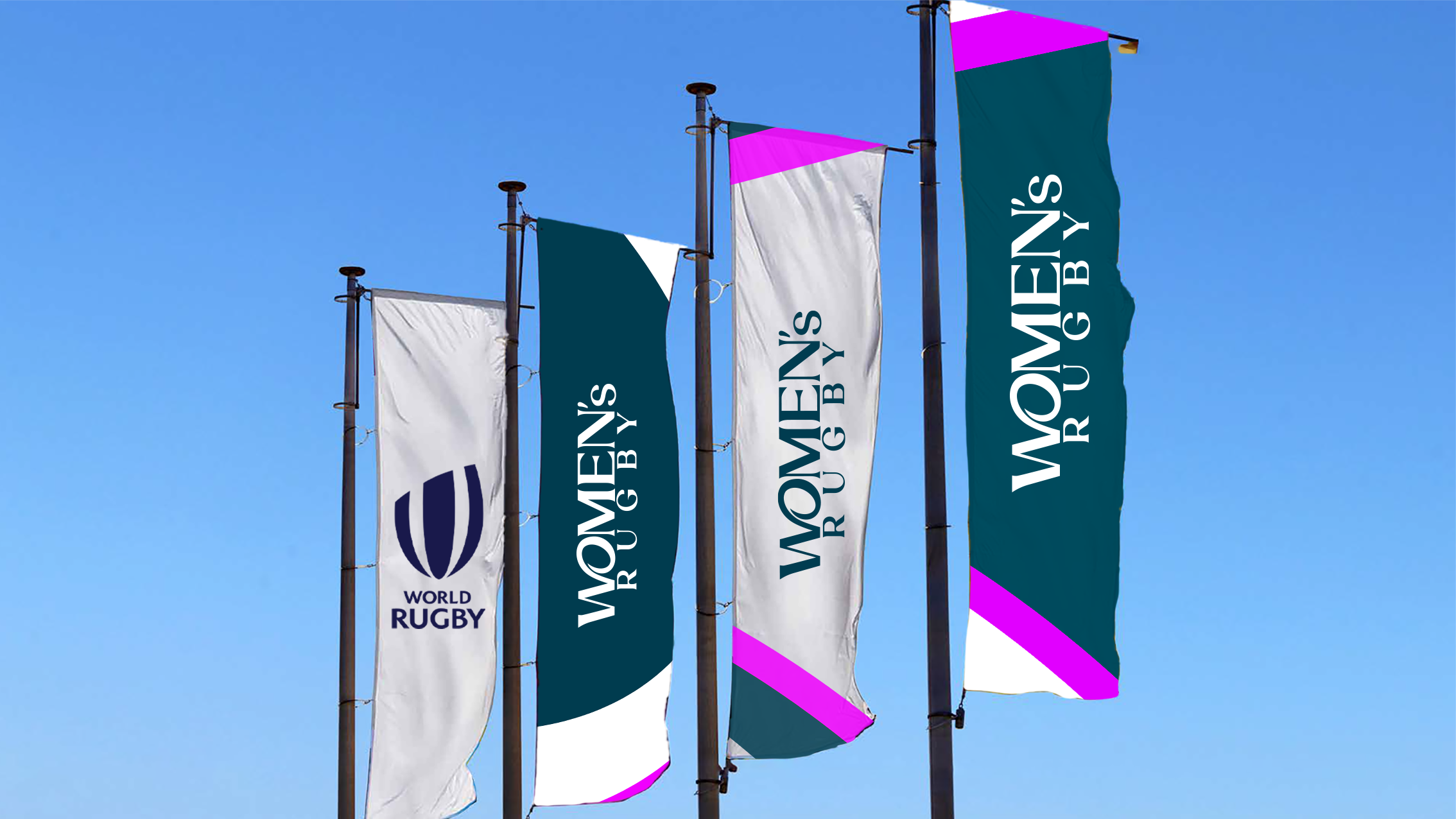
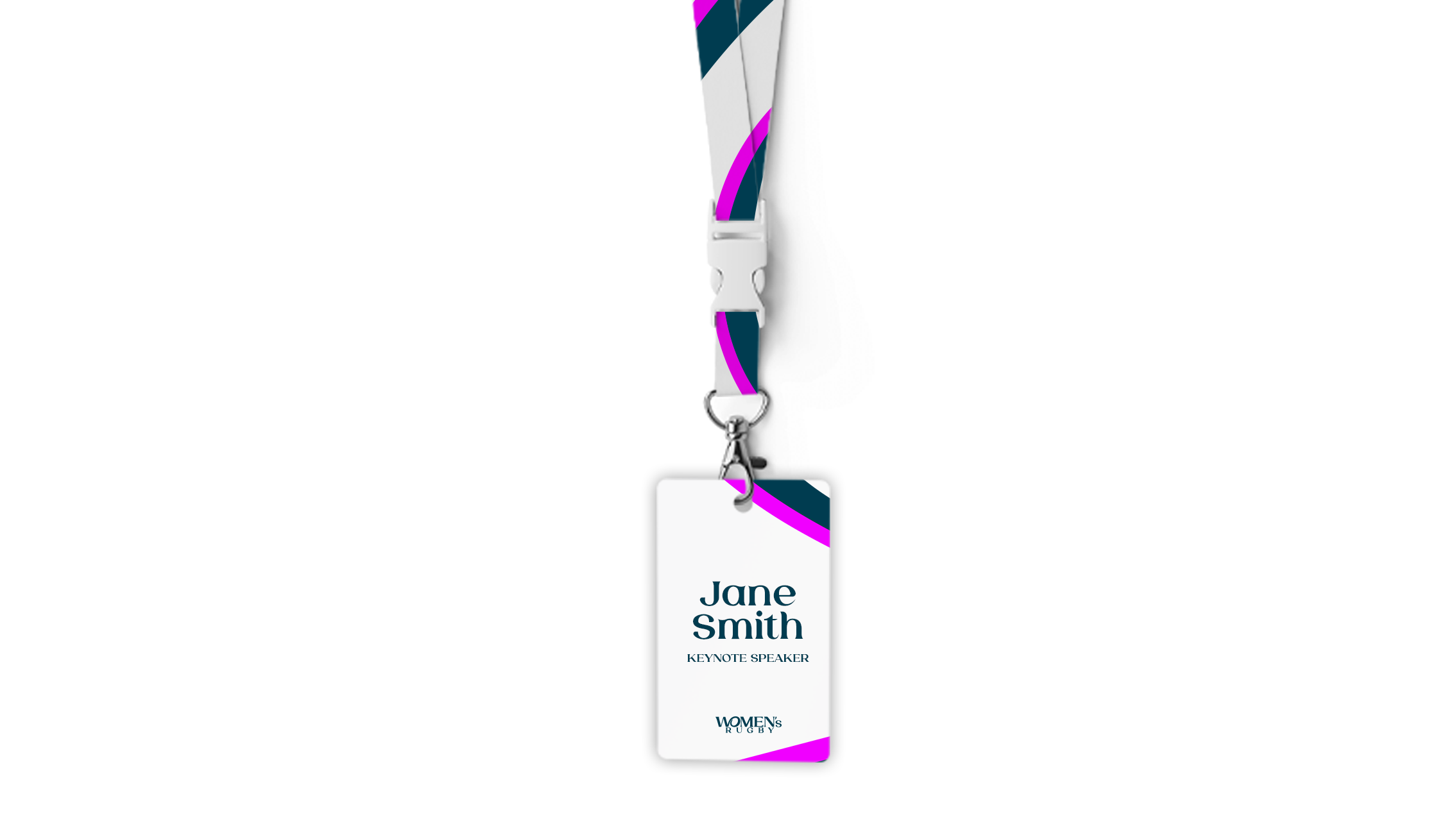
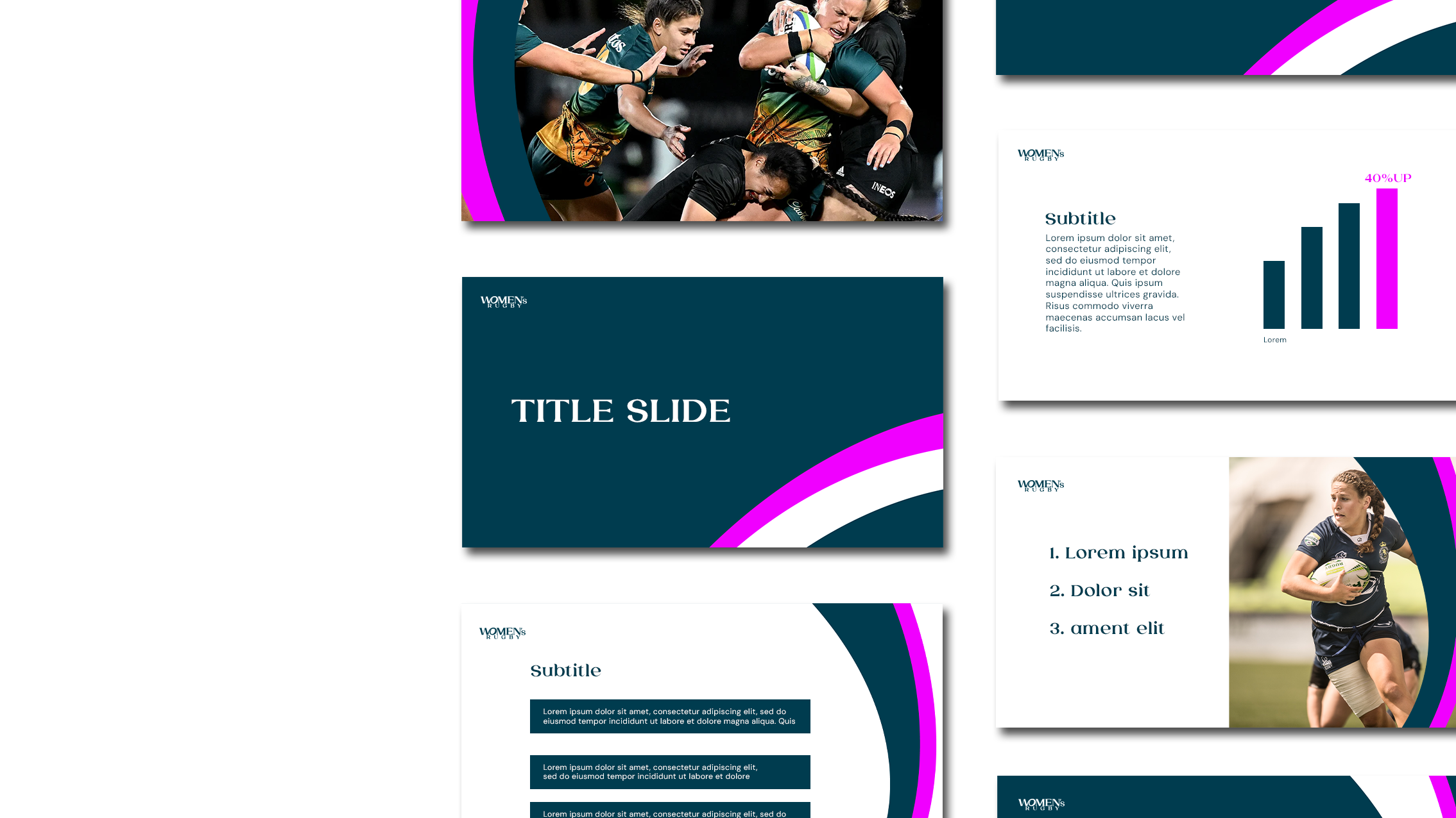
Women’s Rugby

WORLD RUGBYNot a version,
A new standard.
It’s rugby.
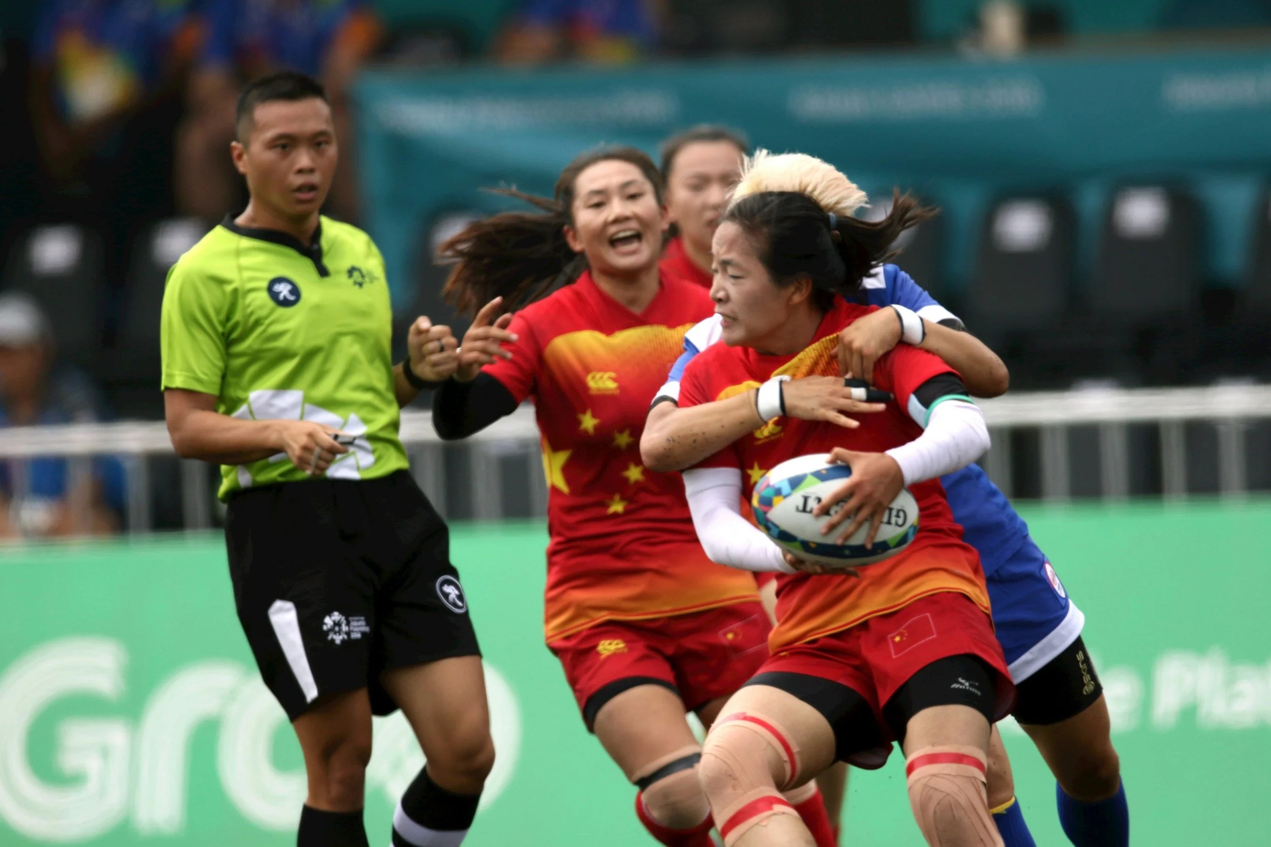
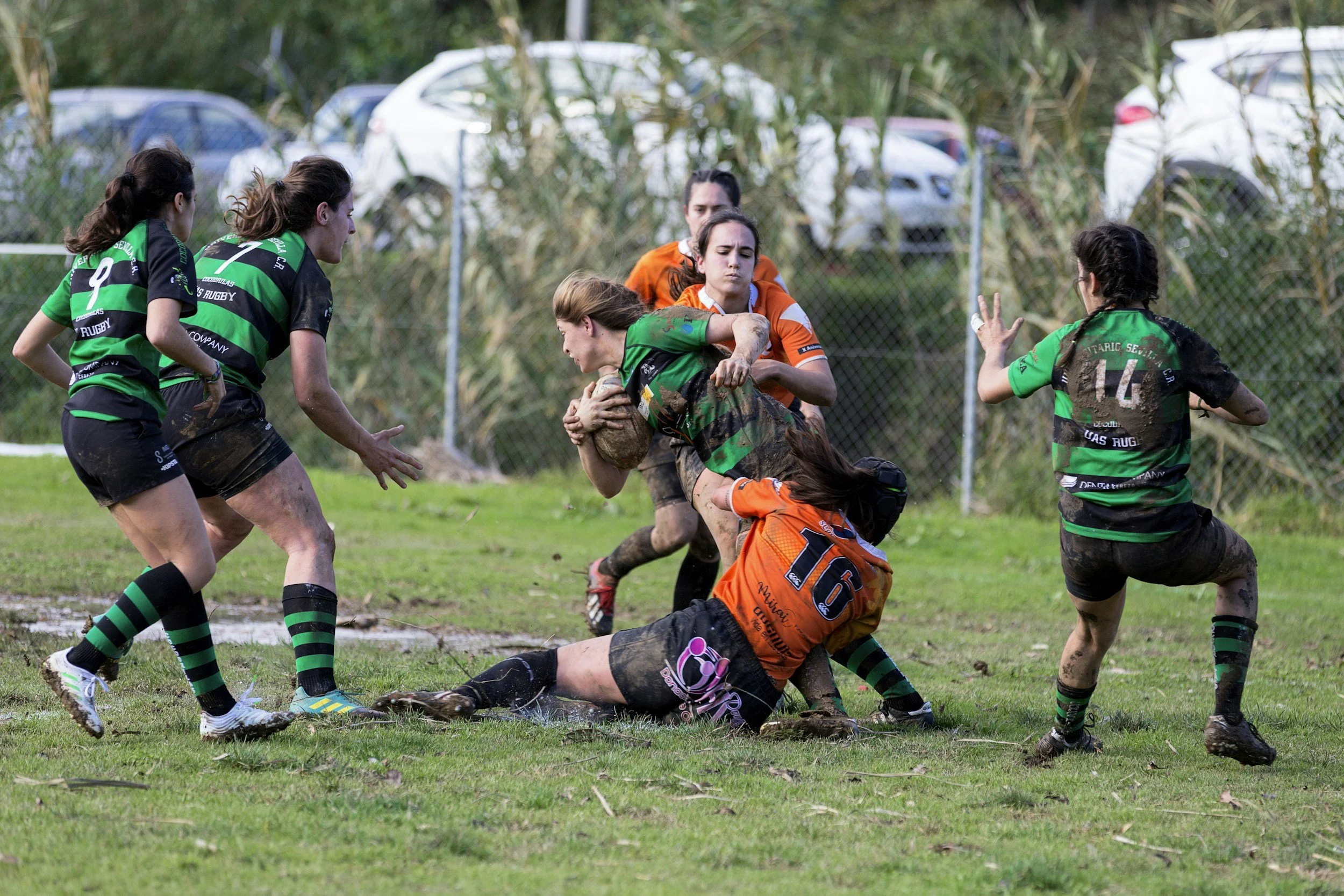
What does it mean to design a world where women’s sport isn’t the exception, but simply sport?How do we build a path grounded in continuity and confidence? And what does it mean to shape a future where this space grows wide open, and stays open?
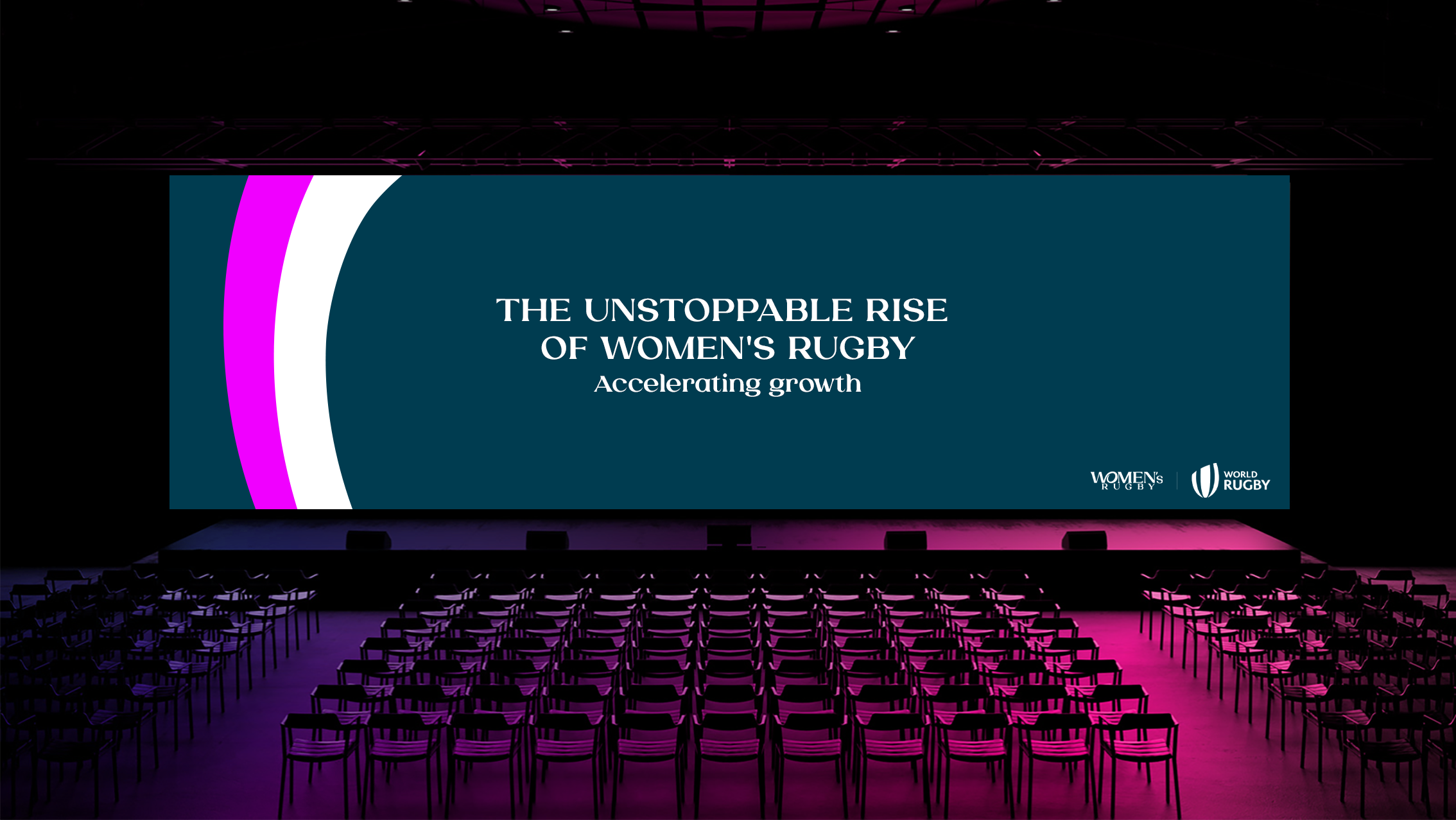
When World Rugby asked us to create a refreshed brand ahead of the biggest ever Women’s Rugby World Cup in 2025, I didn’t see it as just a rebrand. It felt like a cultural shift. We worked with World Rugby to reshape how women’s rugby shows up in the world, not as a version of something else, but as a powerful force in its own right.
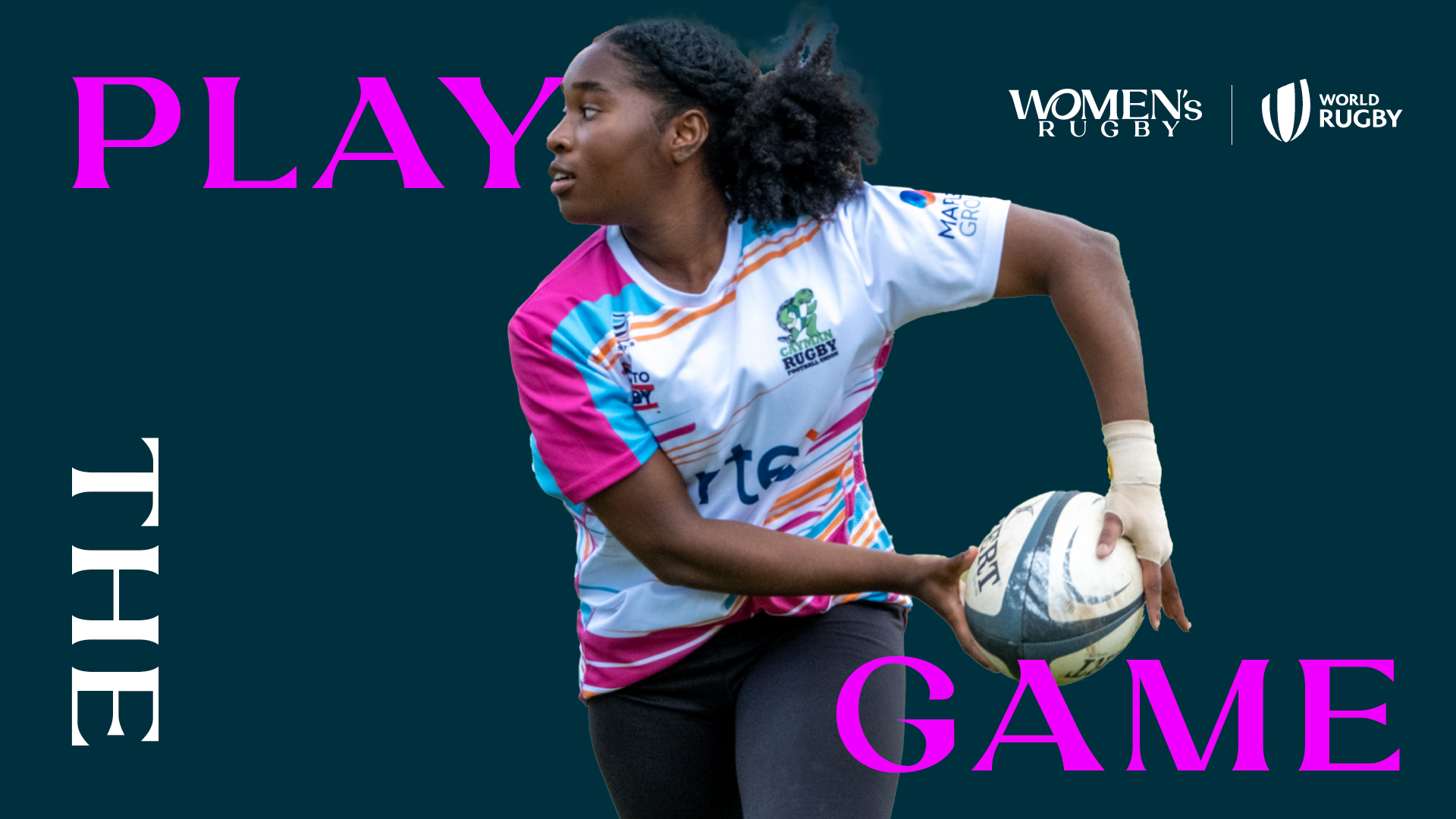
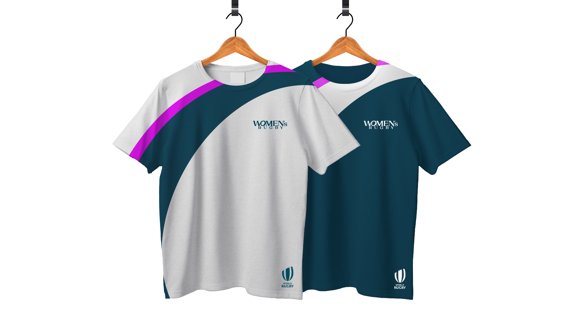
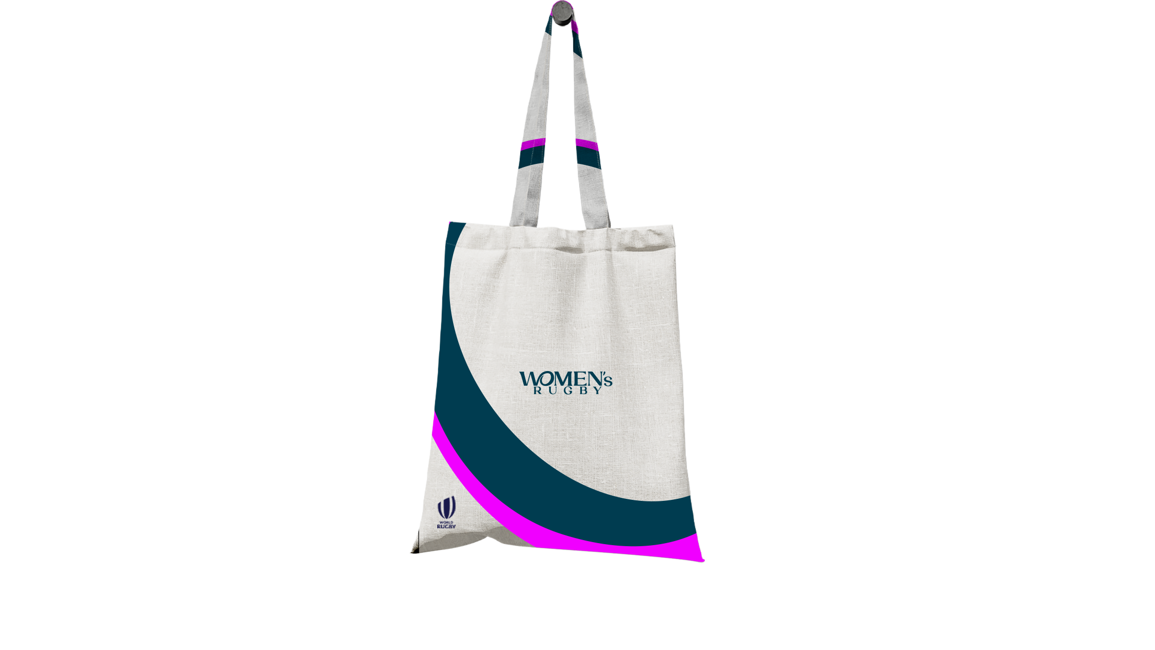
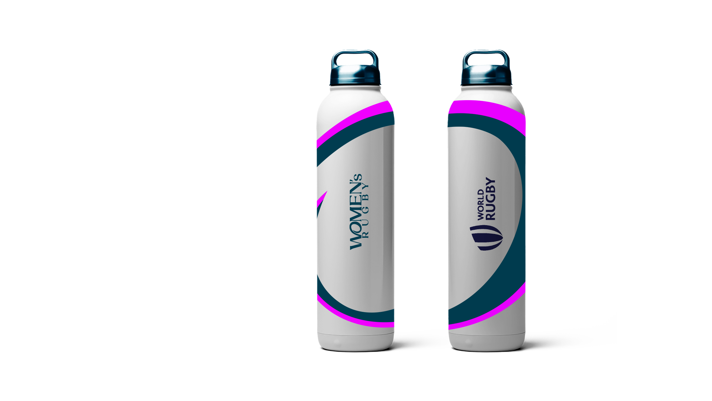
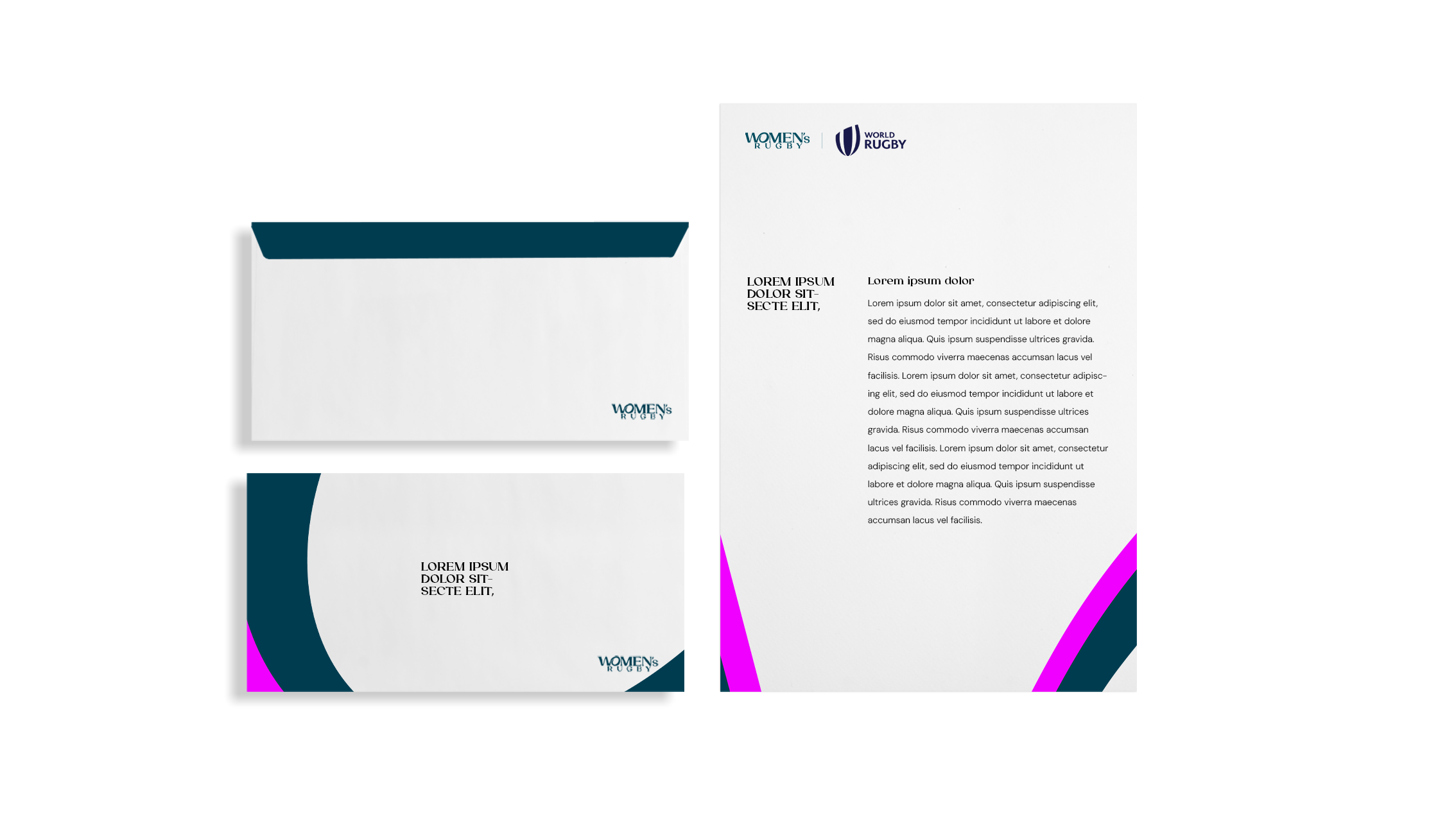
The new brand had to feel unapologetically confident, stylish, and bold, like the women who play the game. Not a copy. Not a comparison. Just the new standard.
The journey.
It wasn't a smooth journey. The brand name changed. The key sponsor changed twice. Reworked colour palettes, type, applications. Then we reworked them again. Momentum came and went. Directions shifted. So did the brief.
At one point, I said: “I need Mr. Motivator to sit next to me while I update this.” (It ended up being nominated for ‘quote of the year’ at the company!) But still, we stayed with the idea. We held the line on what mattered.
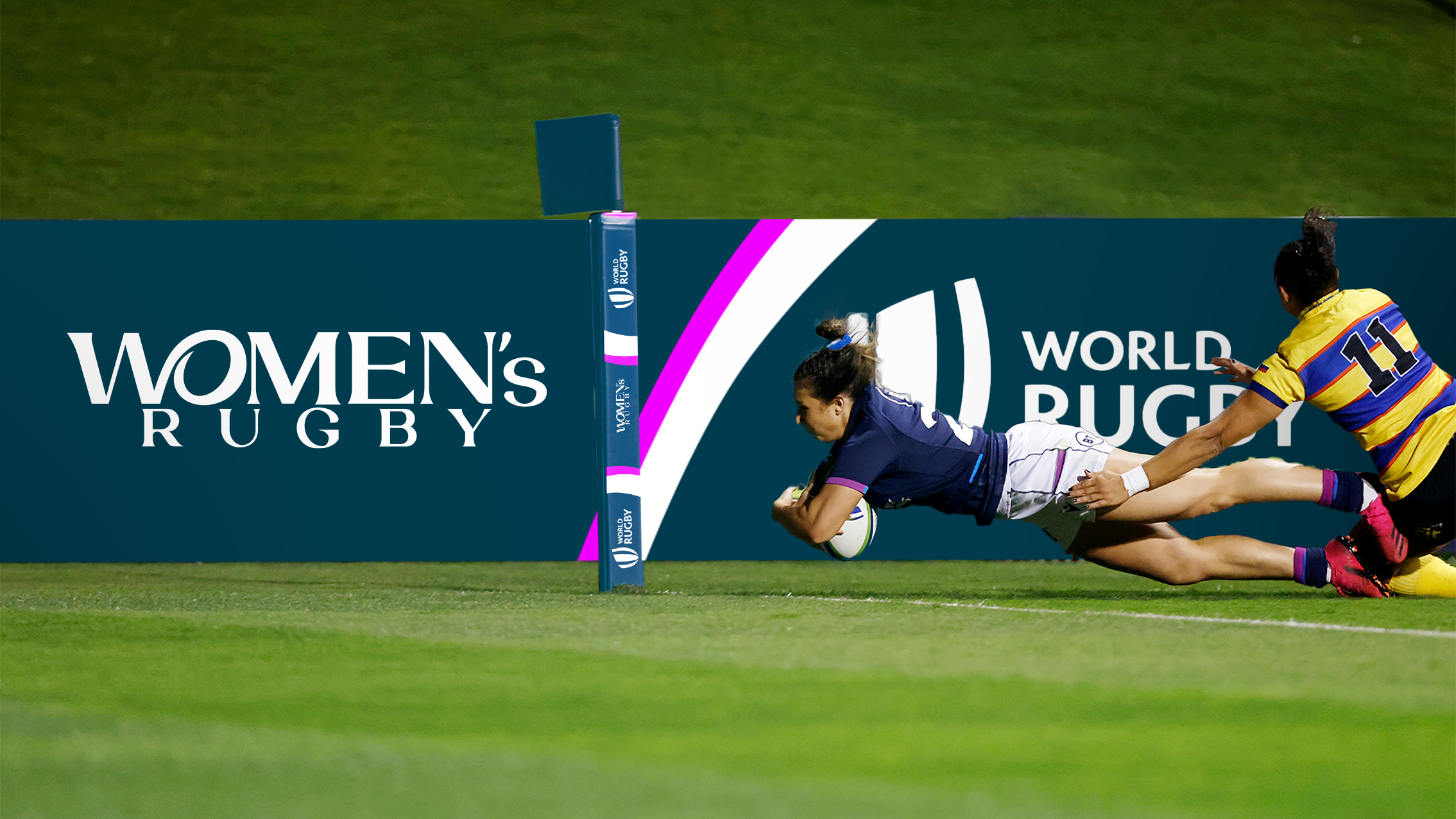
And in the end, it paid off. Here is the final output.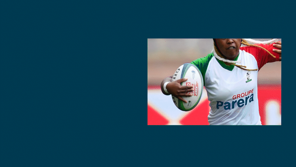
She holds the ball, and carries the game into the future.
The new identity connects the ‘W’ and ‘O’ to form a symbol of a woman holding a rugby ball, powerfully showing that women don’t just belong in this game, at every level, they carry it forward with energy, and elegance.

This gesture became the core of the brand: a visual representation of leadership, motion, and pride. It reflects the belief that women aren’t stepping into a version of rugby, but defining the game on their own terms.

Font, colour, graphic device.
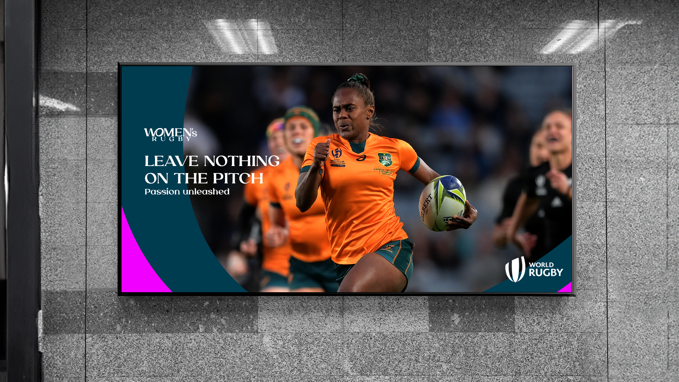
I leaned into a rich teal palette paired with energetic pink accents, a combination that feels both bold and elegant. For typography, I used Laviossa, a typeface that balances softness and strength. Its graceful curves and refined structure reflect the unapologetic elegance of the women’s game.By extracting and enlarging parts of the logo, we created dynamic graphic patterns that capture the energy and movement of the women’s game, almost like the rhythm of a match frozen mid-motion.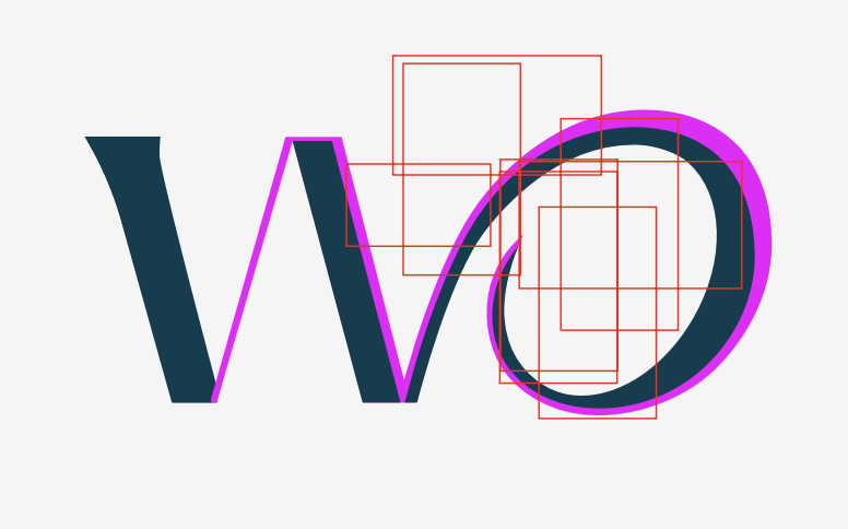


The answer, in motion.
Together, these elements became more than a brand, they became a quiet answer to a loud question: What if women’s sport wasn’t the exception, but simply sport?The identity carries that answer with grace and power. It moves with the rhythm of change, grounded in confidence and built to last, so that this space not only opens, but stays wide open.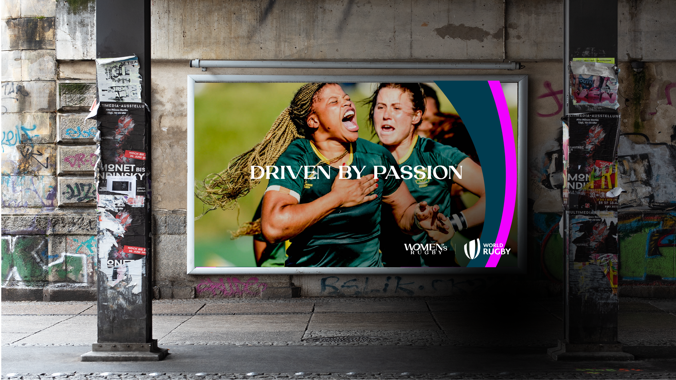
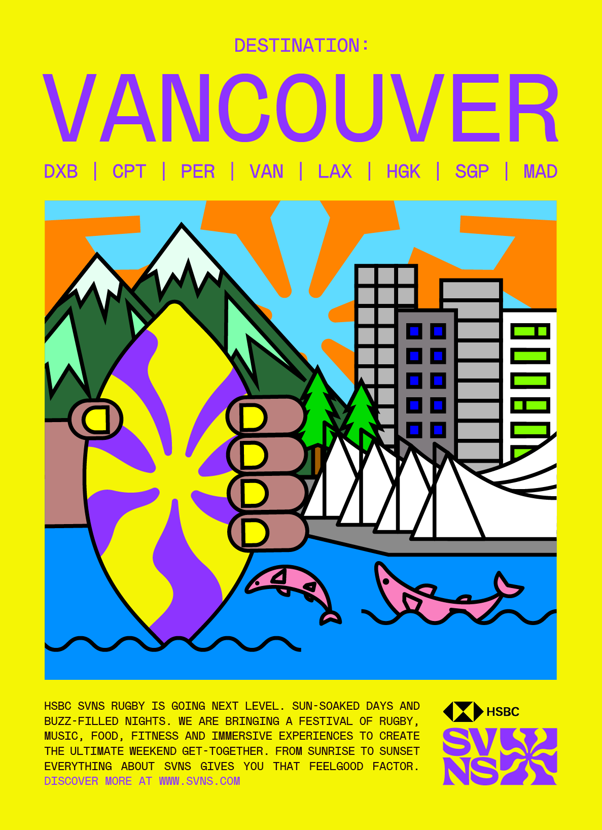
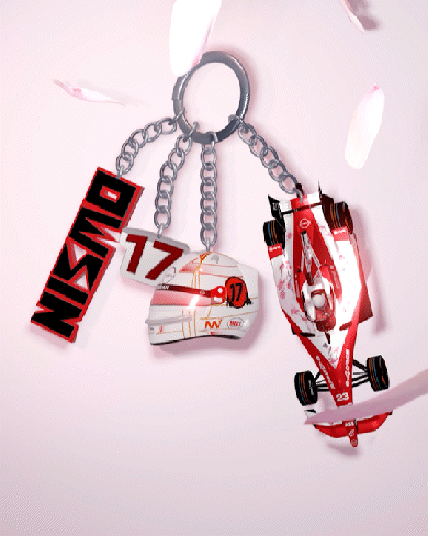
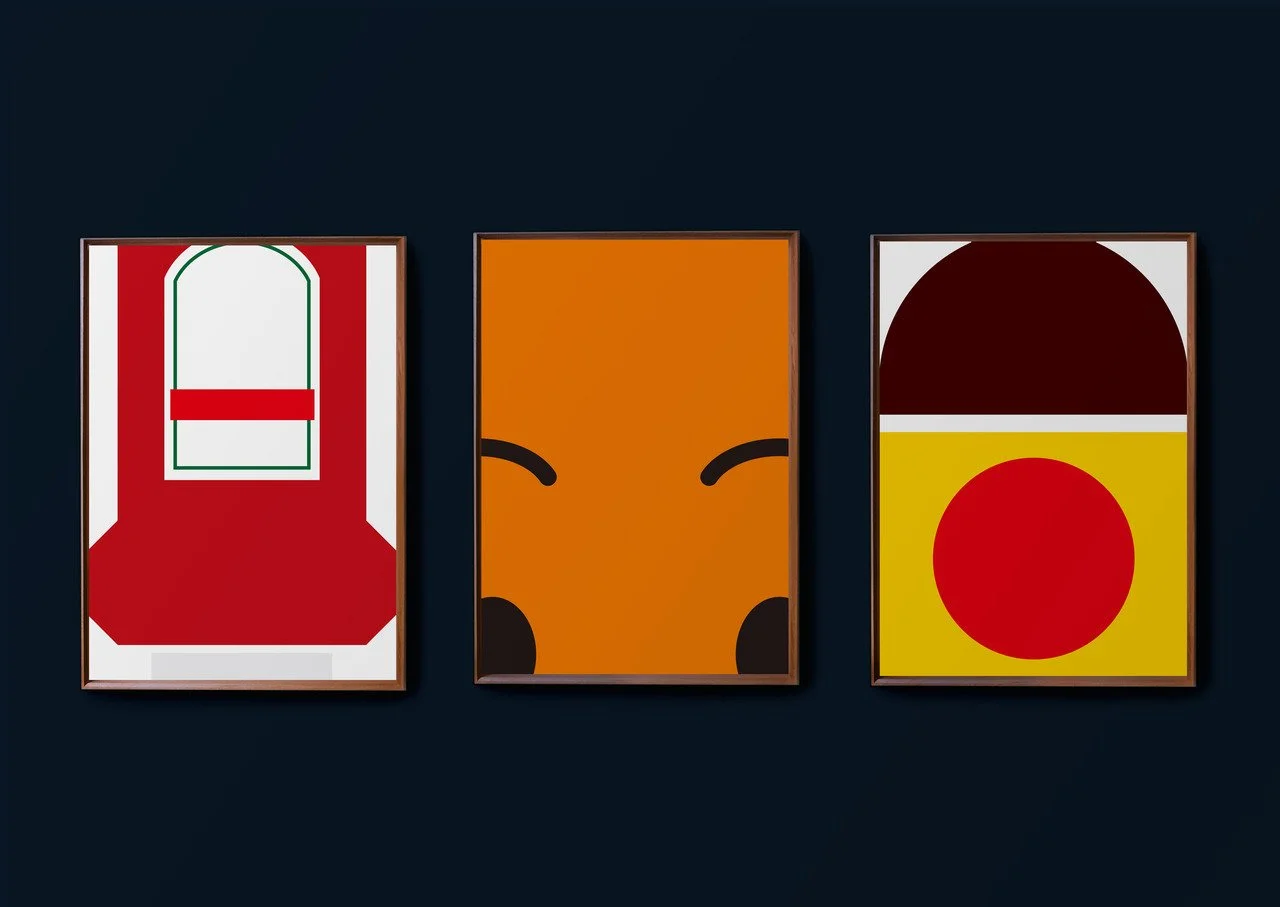
NISSAN FE TEAM

A shift from aesthetic to essence.
I worked across a range of creative outputs for Nissan Formula E, from livery design to advertising, social content, and beyond. But throughout all of it, I kept coming back to the same question: How can I shift from aesthetic to essence? From designing how Japan looks, to designing how Japan feels. This idea became my compass as I explored how to bring Japanese identity into global motorsport, not through surface-level symbols, but through emotional texture, movement, and tone.
LIVERY DESIGNS
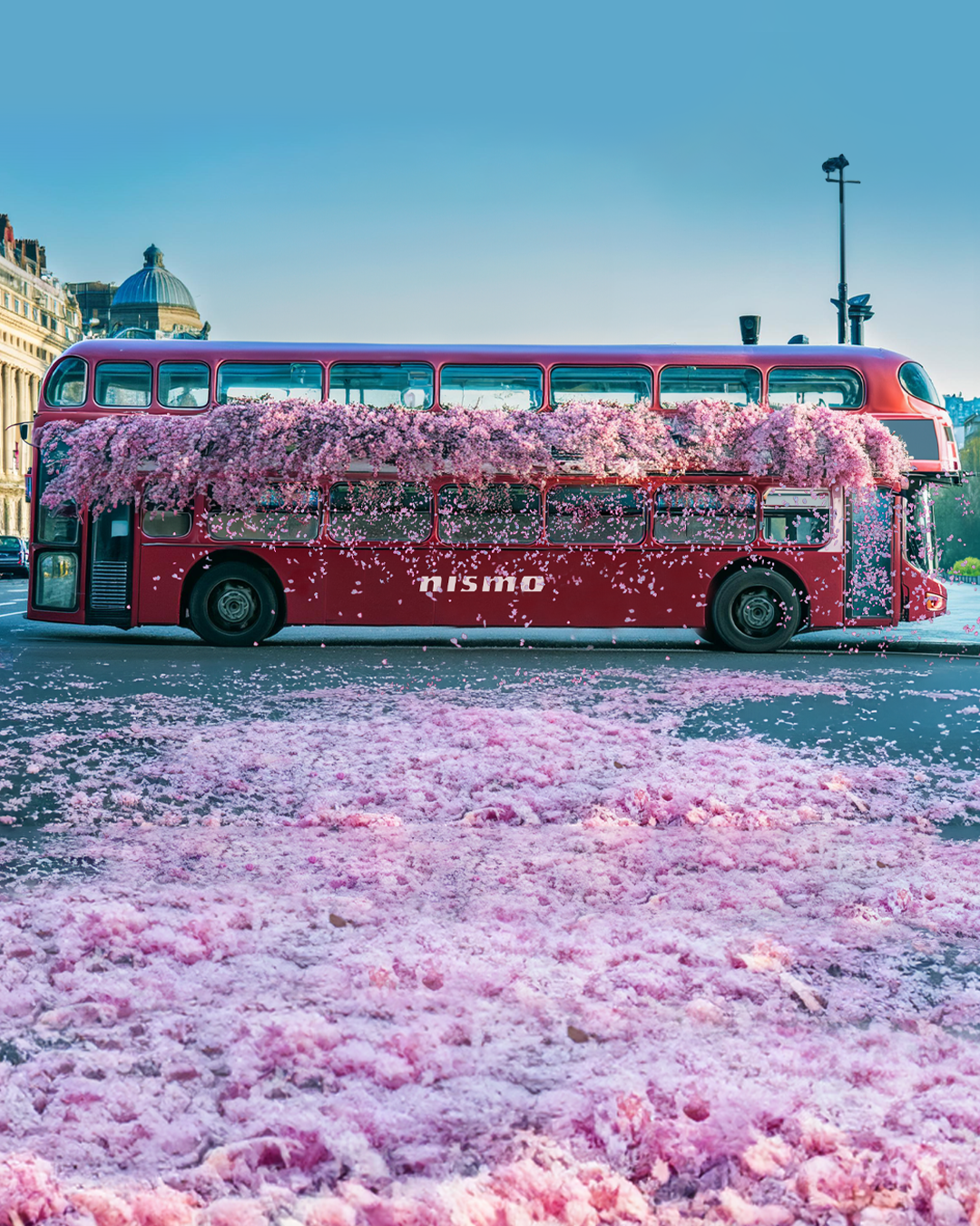
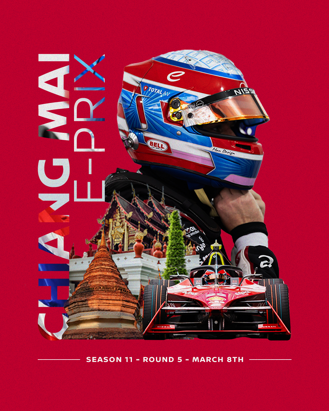
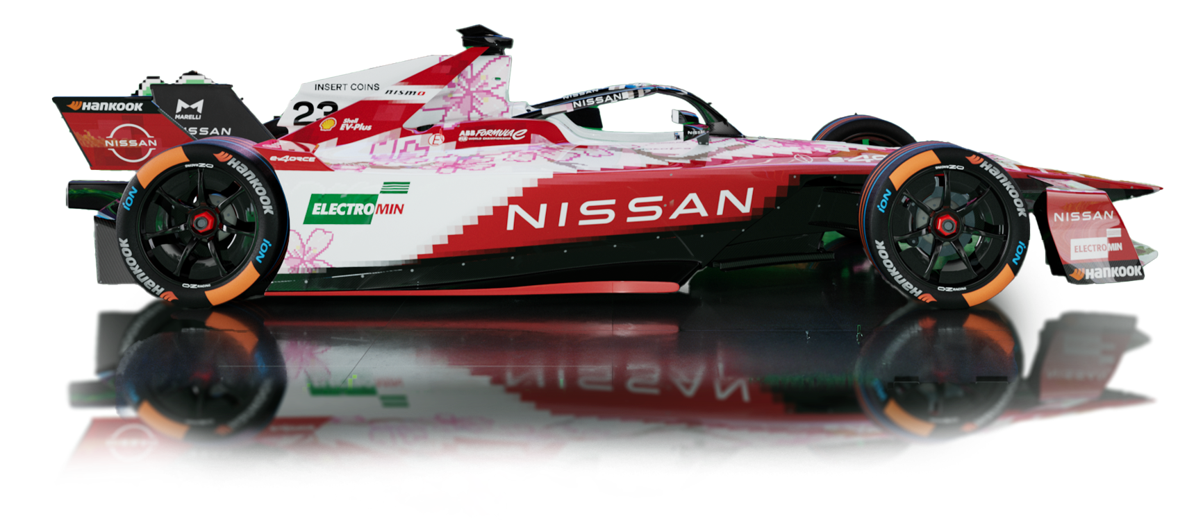
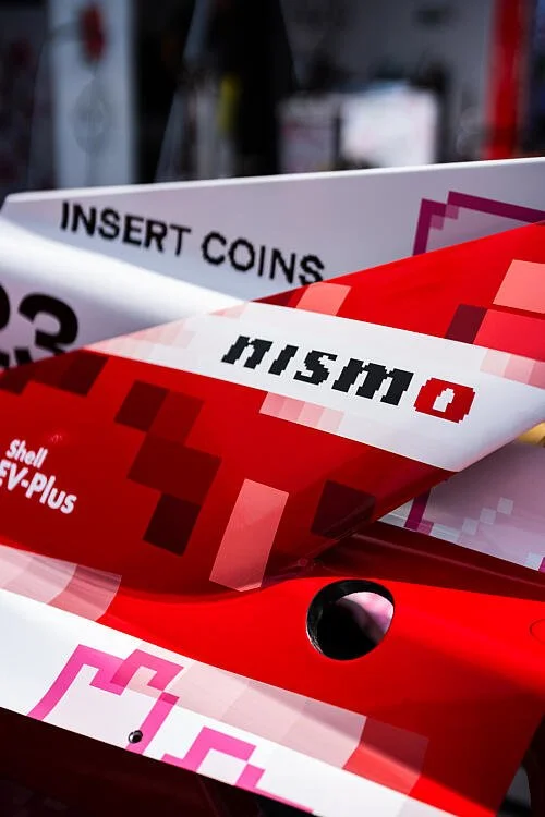
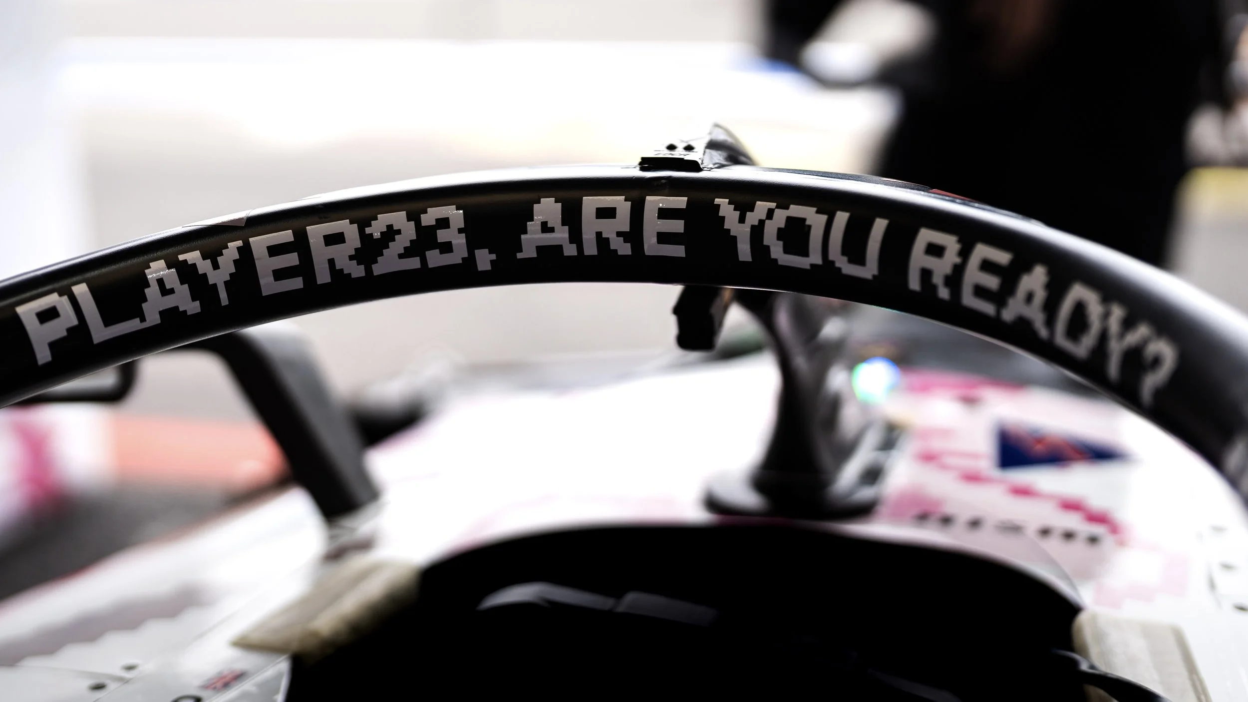
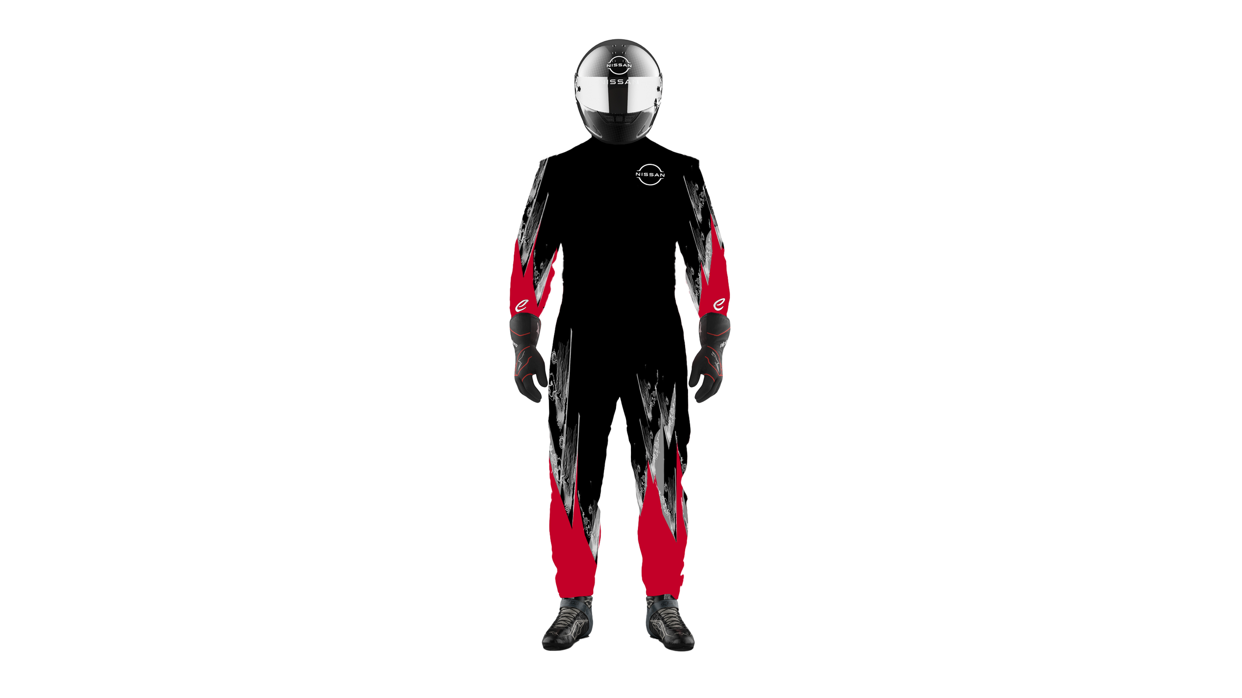
Designing the limited-edition livery for this year’s Tokyo race was truly exciting.
As part of Nismo: Electric Racer, an 8-bit game created to celebrate Nissan’s home Formula E race, worked with Japanese illustrator Kentaro Yoshida to bring a pixelated dream to life on a real track.

From the pixel-perfect bodywork and cherry blossom layout to the custom 8-bit type shouting “Player23, are you ready?” and “Insert coins,” every detail was crafted to blur the line between nostalgia and reality, and to inject a playful spark into the world of motorsport.
To achieve that, I developed a modular pixel grid system to guide the livery layout, balancing movement and legibility at high speeds. The colour palette was between Nissan red and an arcade-inspired brightness, and the typography was fully custom-built to echo a retro game aesthetics while staying bold and playful.
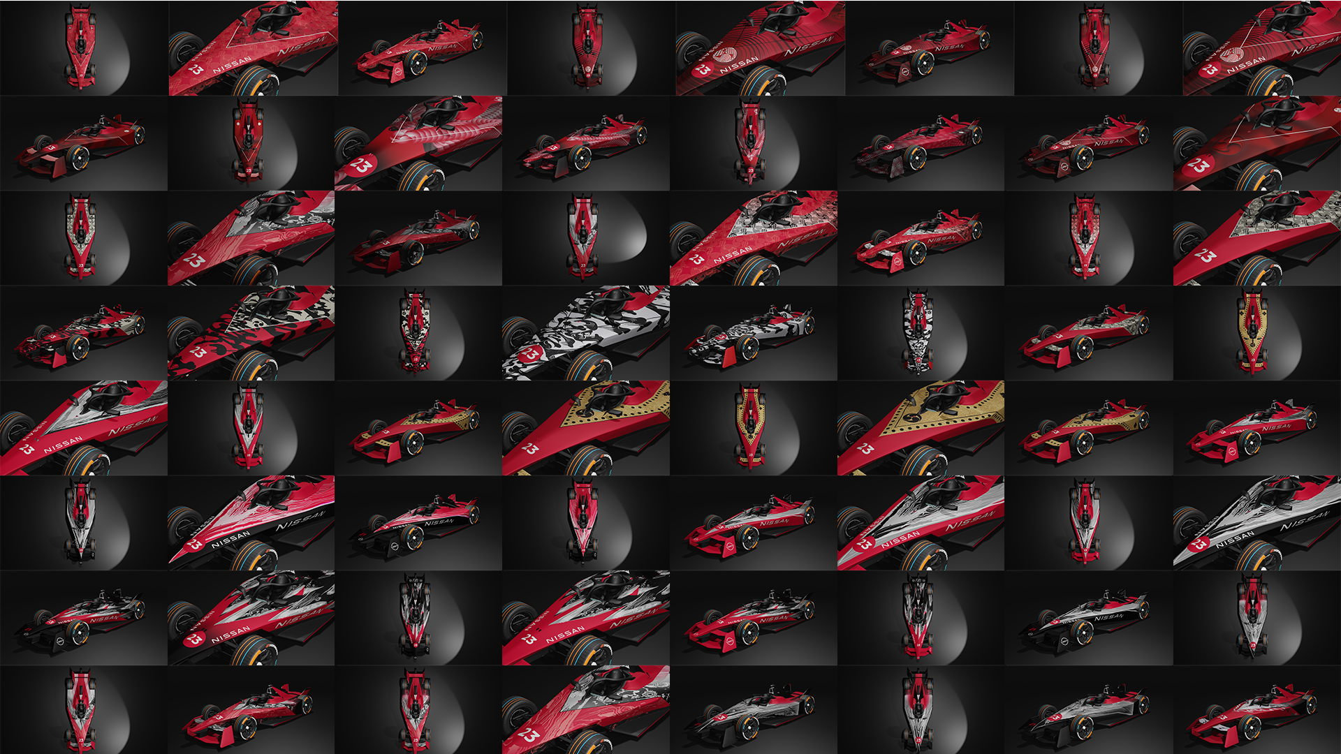
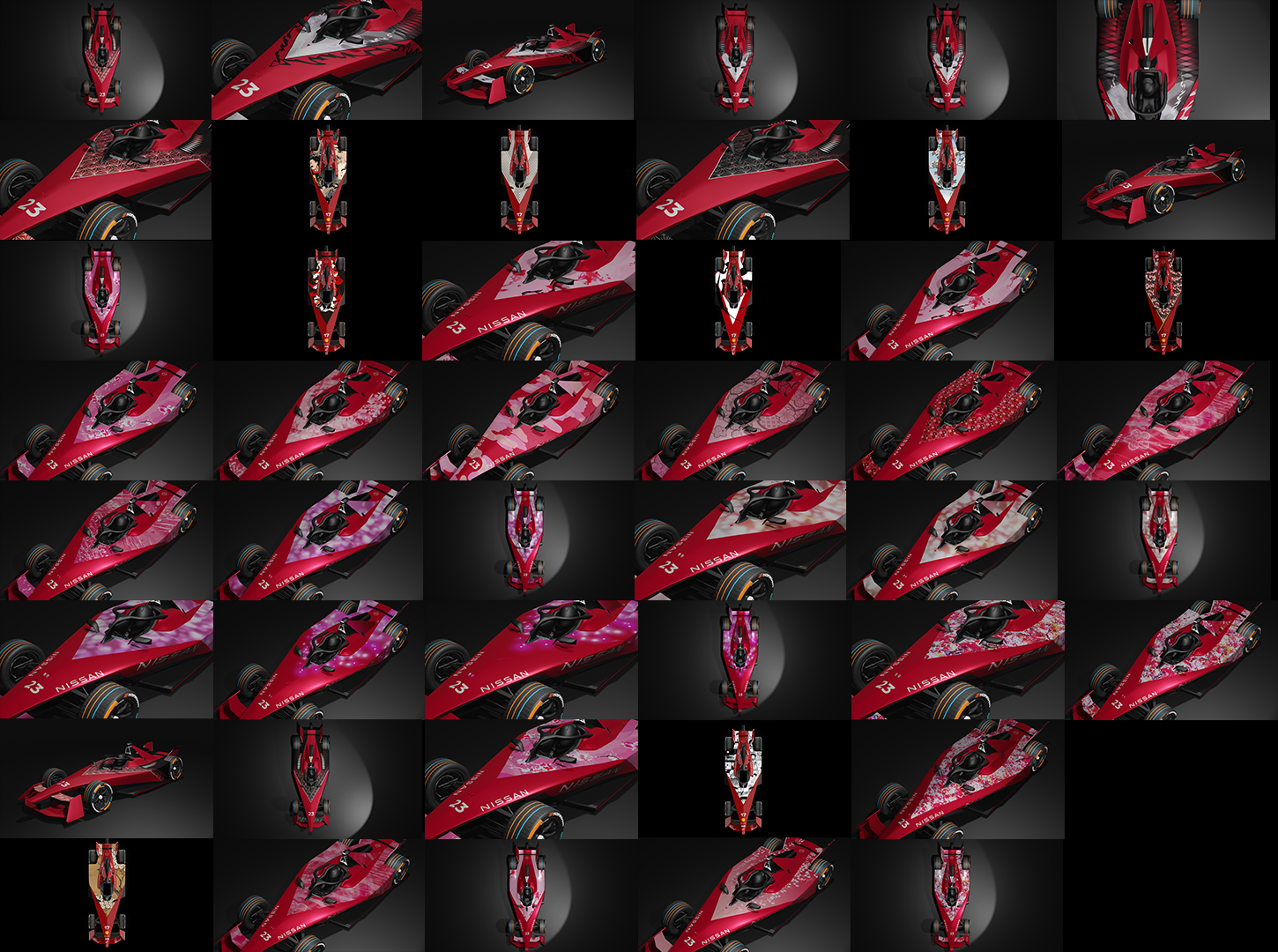
We explored multiple versions of the cherry blossom layout, experimenting with petal size, rhythm, and density to find a visual balance between elegance and energy. Even the placement of red pixels was tested and refined: they needed to convey dynamism without disrupting the overall flow.
Each concept was simulated in 3D to make sure it worked from any angle. A playful livery, grounded in detail.


The chance to design a special livery for the Tokyo race felt like a win,
even before it made it to the track.
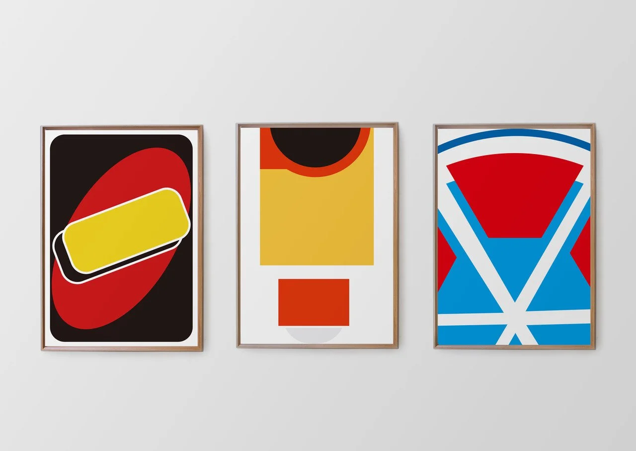
We developed and presented multiple concepts over time. Each one brought something bold and fresh to the table.
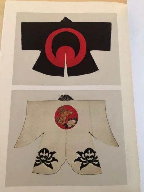
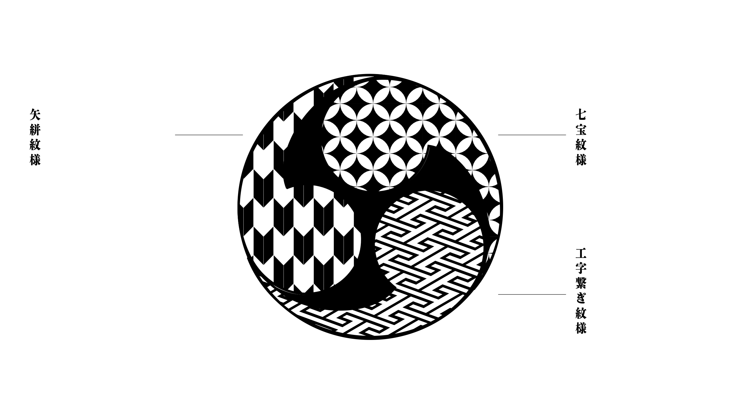
In exploring these ideas, I delved into Japanese visual heritage, researching traditional Japanese patterns and cultural symbols to build a visual language rooted in meaning, not just surface aesthetics. For me, design gains power when backed by story and cultural context. That belief shaped each proposal.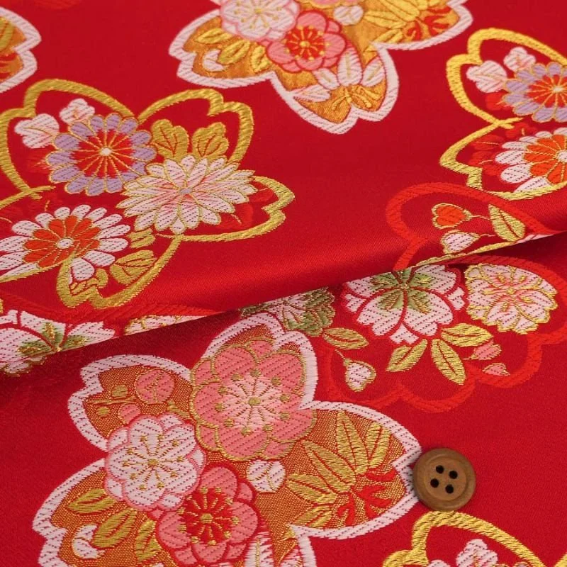

The client loved the directions, but in the end, they stuck with the existing look, as the stats said it was still resonating with the audience.

But none of those ideas were wasted. In fact, they became the foundation for the Tokyo livery that finally came to life. These earlier designs never made it out into the world, but they remain some of my hidden favourites. Here are a few of them:
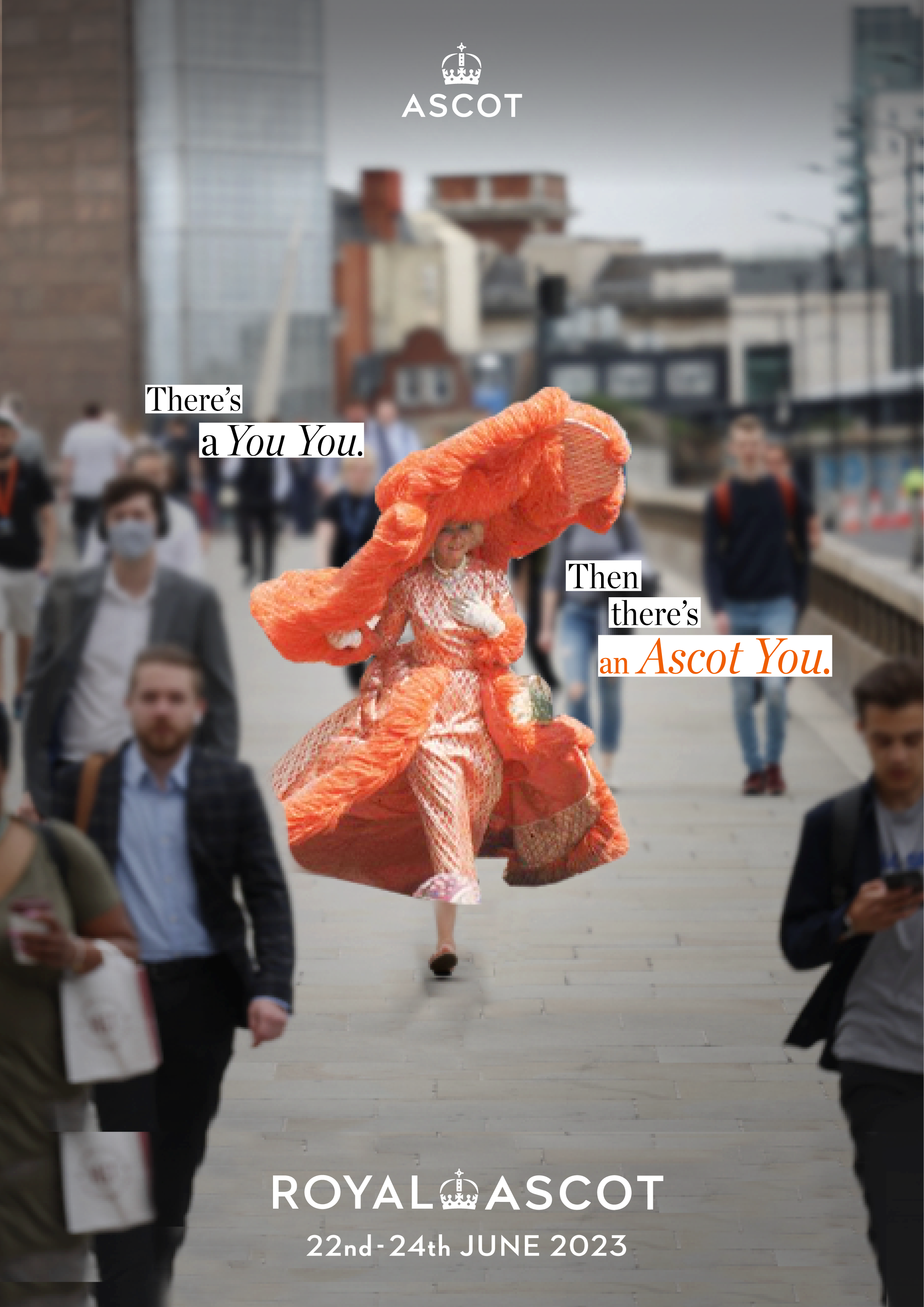
ROYAL ASCOT
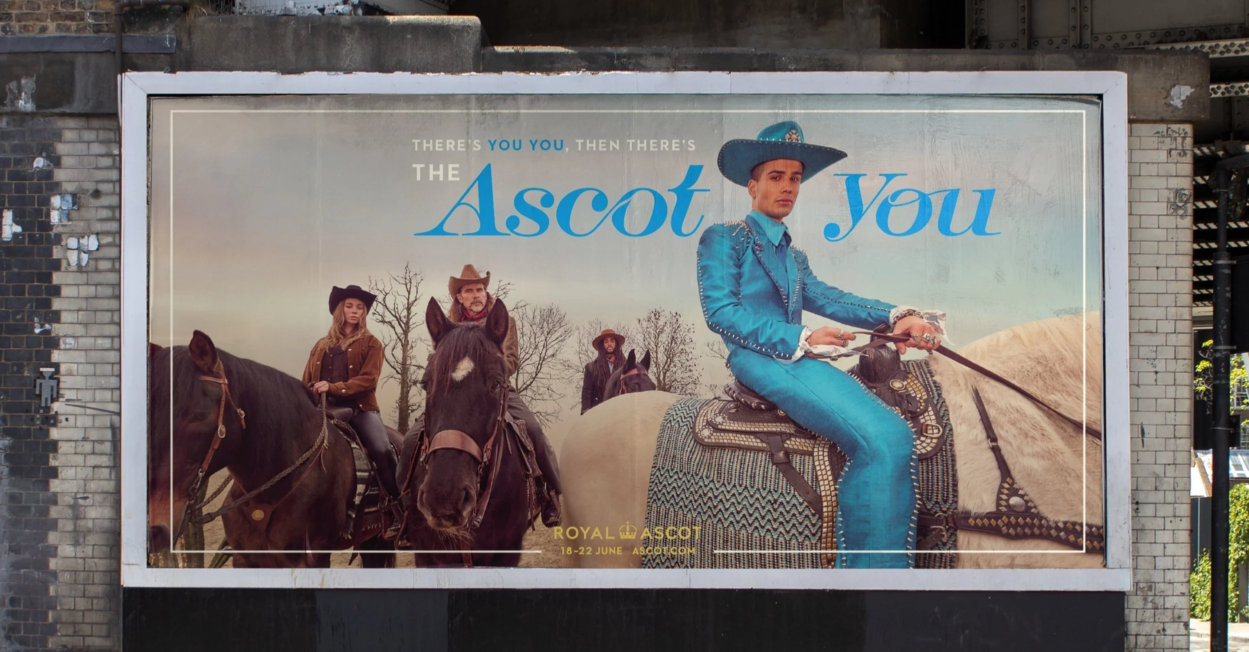
ROYAL ASCOTContributing from idea to execution.
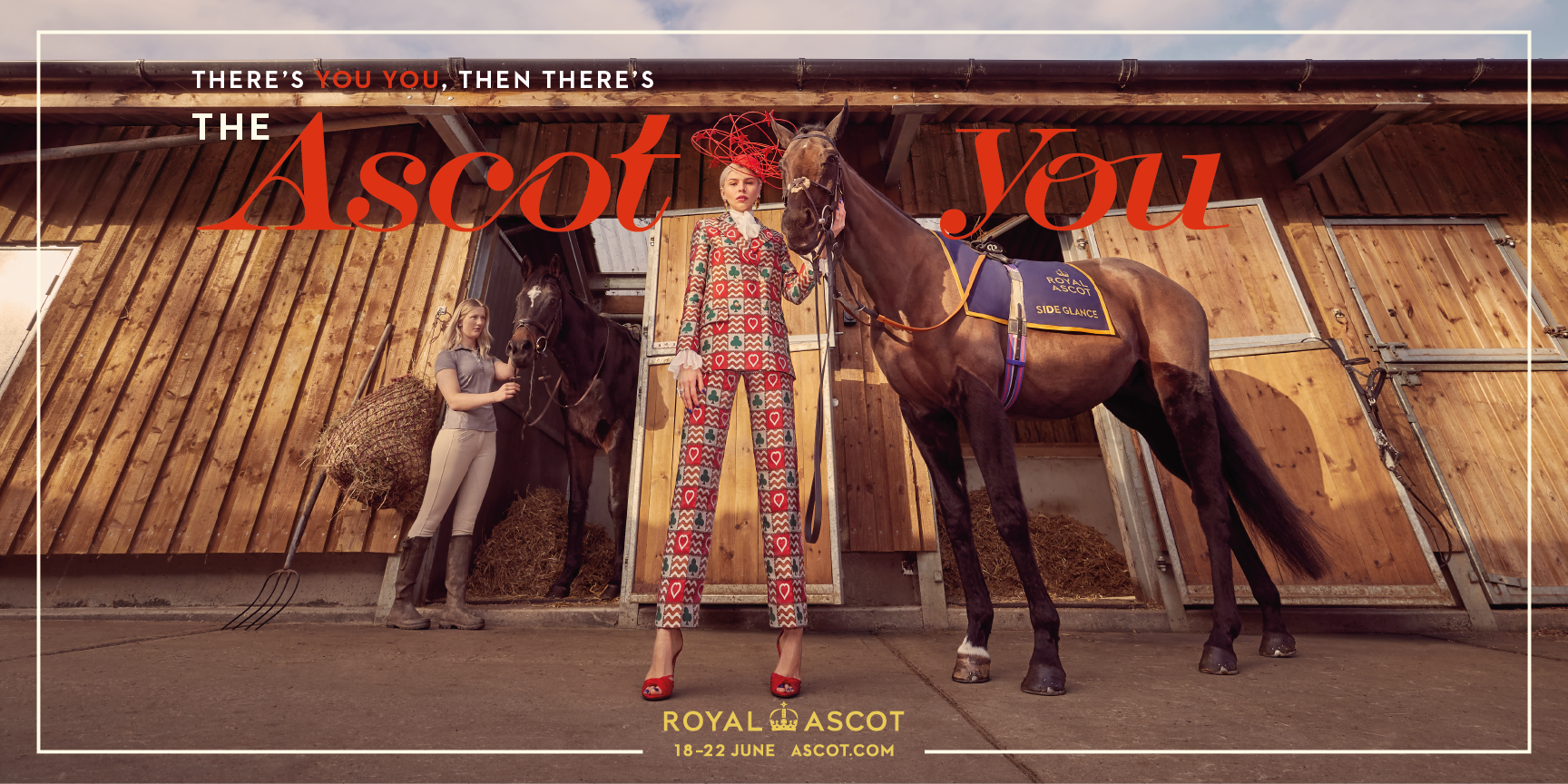
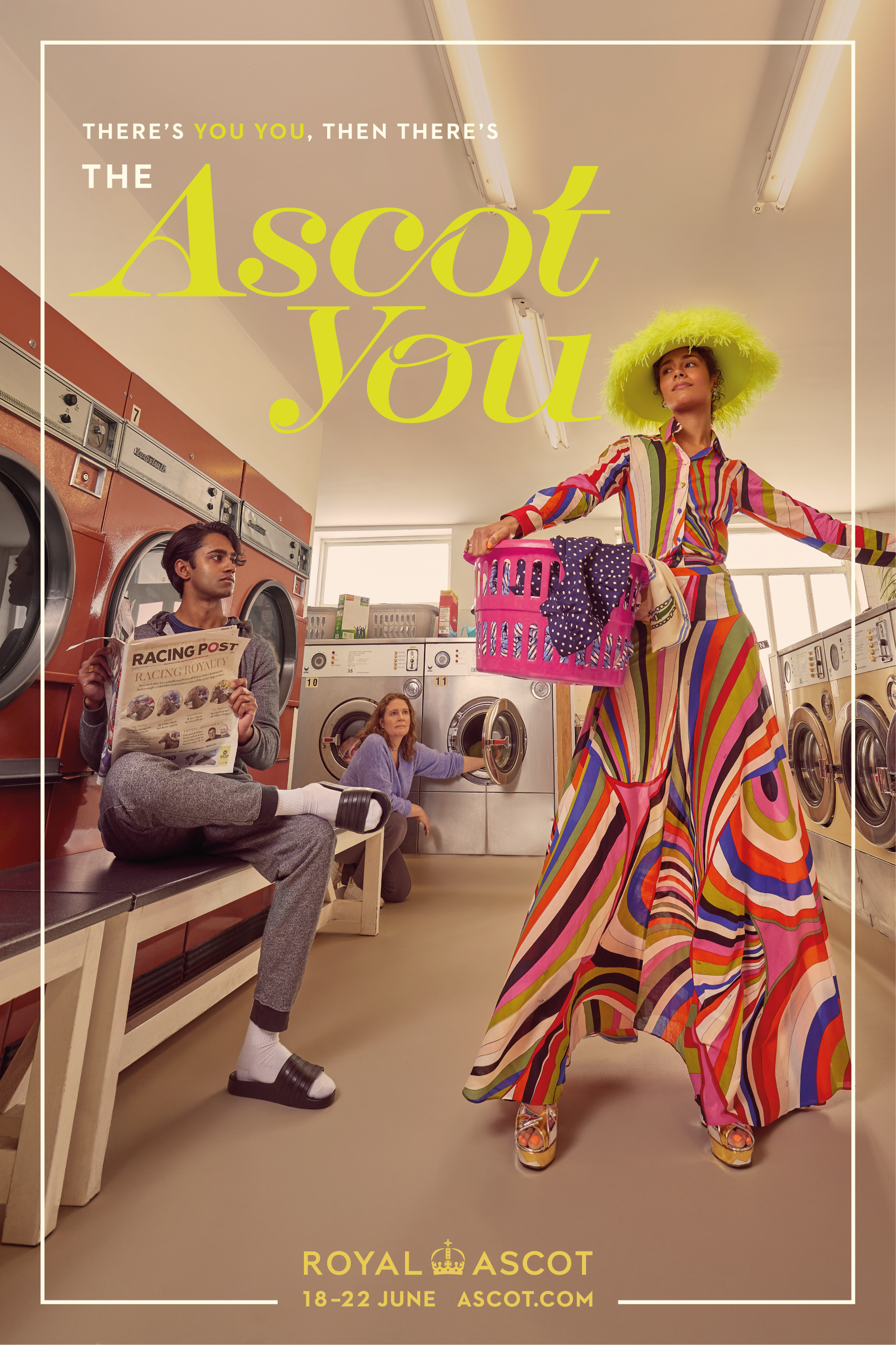
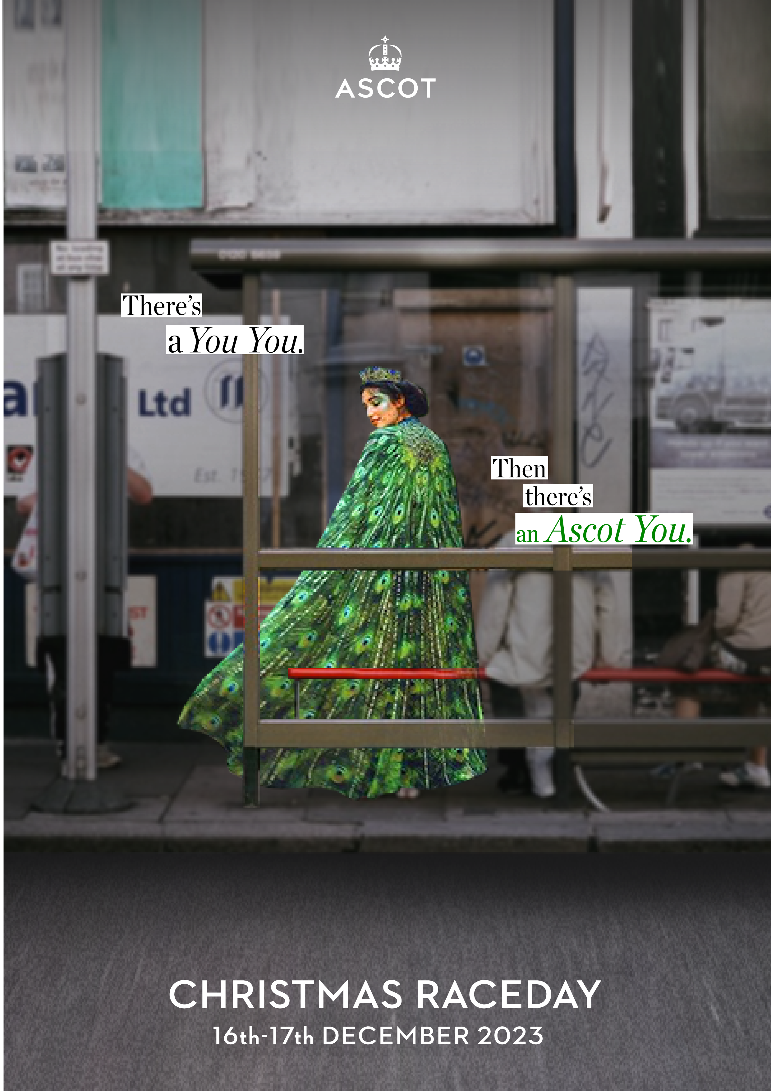
For two consecutive years, “The Ascot You” campaign has reminded audiences that everyone has an inner elegance, one that comes alive at the world-renowned Ascot Racecourse.

I joined the project from the pitch stage, helping to shape the core creative idea that ultimately won us the client. From there, I transitioned into the designer role, where I could fully focus on translating the concept into a compelling visual world.

It was a rare opportunity to stay with the work from idea to execution to think with the team, and then make with my hands.
THERE’S YOU YOU,
THEN THERE’S THE ASCOT YOU. This project began long before a single line was drawn.
Our first visual approach stayed within the traditional brand guidelines. Still, we pushed the edges, injecting modern energy and fashion-forward confidence into a world known for restraint.

It was a careful process between tradition and transformation. The layouts, typography, and palette were crafted to feel timeless, yet unexpected.
Pitch
2023
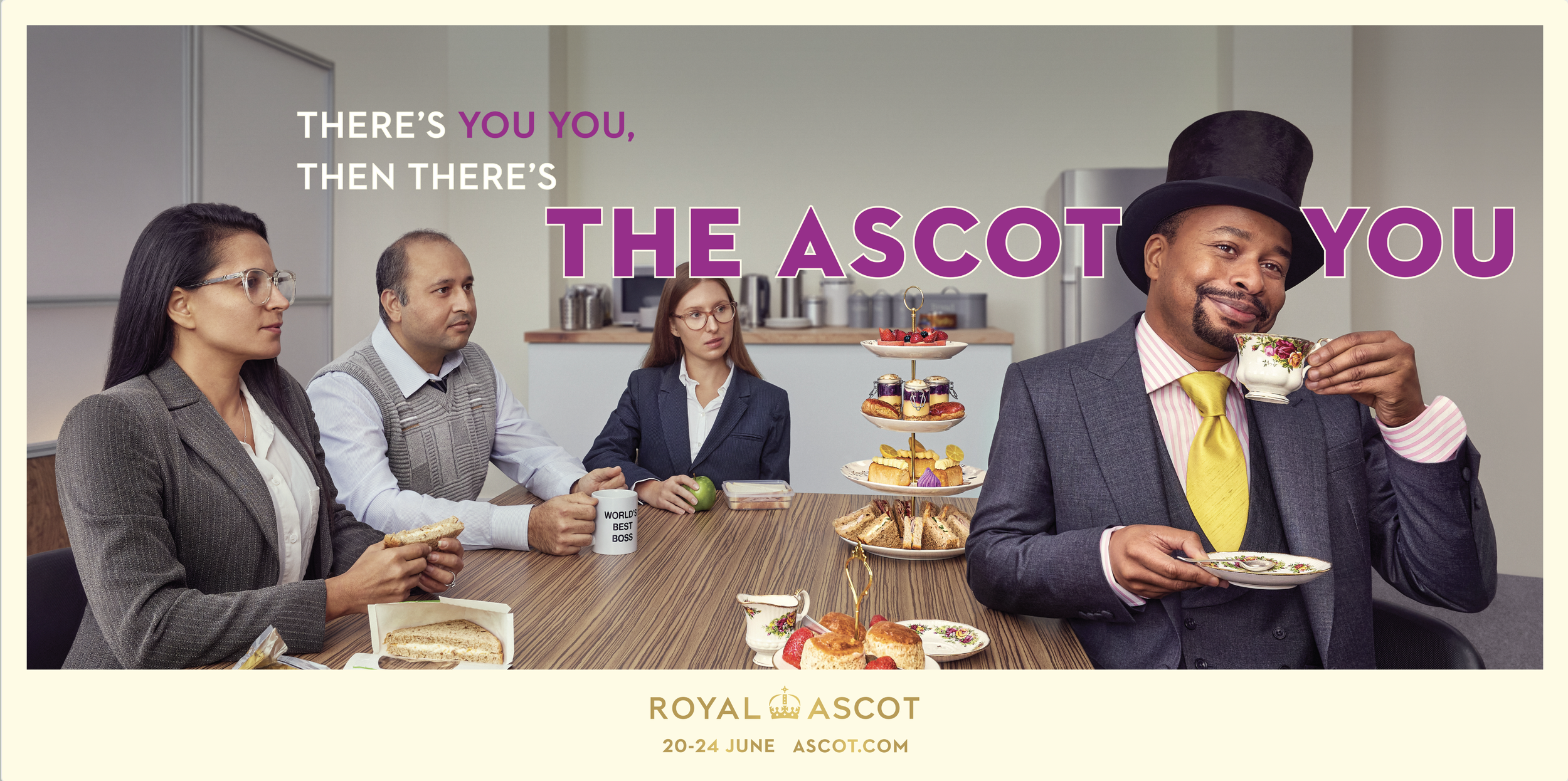

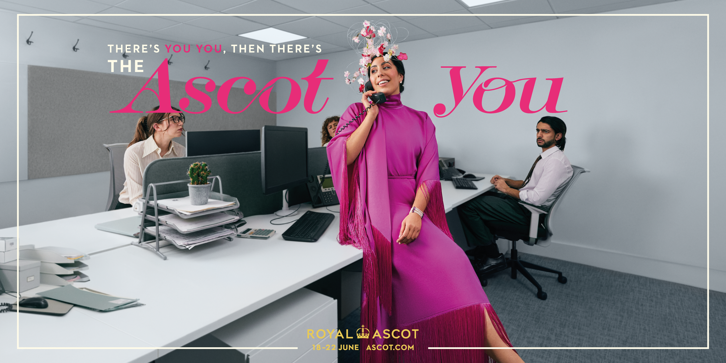
The second yearWhen an idea wears its finest form.
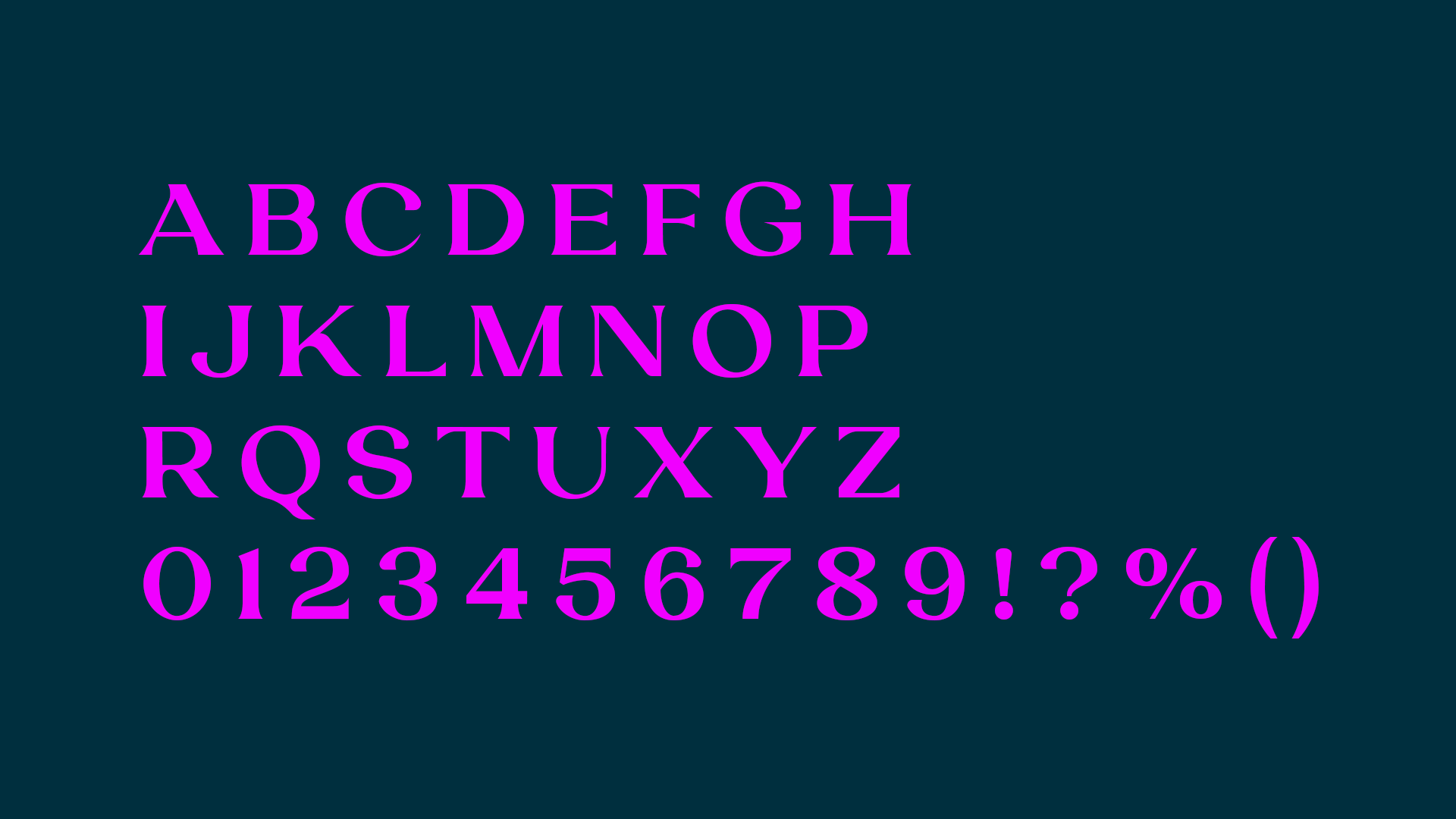
For the 2024 edition, I focused on pushing the visual language to its most refined extreme, especially through a custom typeface I designed specifically for the campaign.

The colour took cues from luxurious fabrics, and the layouts echoed the confidence of fashion editorials. The typeface captured the campaign’s sense of glamour and transformation: exaggerated, confident, and elegant. Every element, from the curves of the letters to the surrounding negative space was crafted to feel entirely at home in a world where elegance isn’t optional, it’s expected.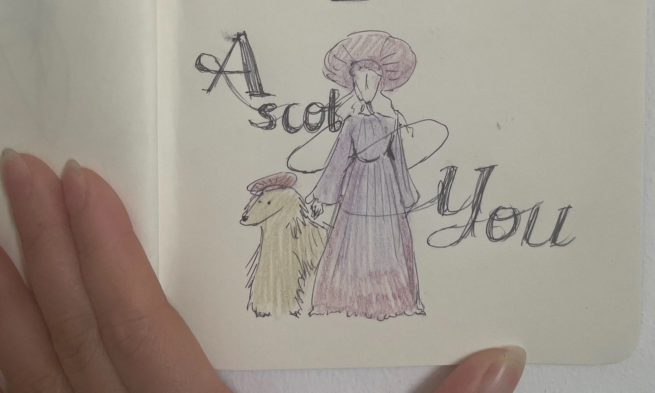

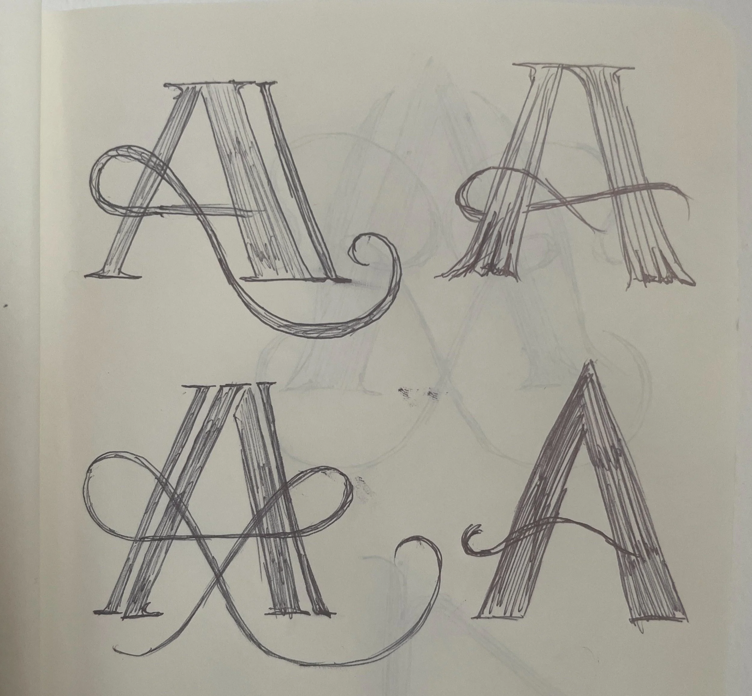
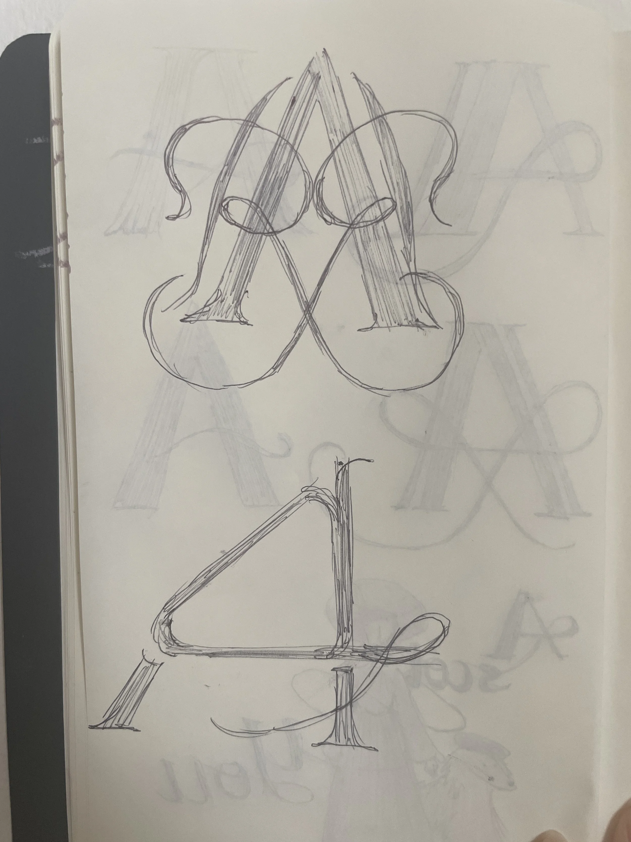
This marked the first time we went beyond Royal Ascot’s formal brand guidelines. It was a shift that came not from rebellion, but from trust, earned through months of client discussions and careful iteration.

We did it, and it worth it.


A few more from the journey so far, small steps, bold questions.