Konichiwa.
Yuriko is shaped by two cities, two tongues, two time zones, two cups of tea, Green & PG tips.
Ideas don’t just knock on her front door. She greets them from an unexpected angle.
From: Born in Tokyo, Japan
Love : Art, vintage & antique finds, and spotting bench plaques
Love and Hate: Playing chess (so stressful)
Hate: Marmite
Some people called me “the little book girl” at W+K Tokyo.
Because of the application I have sent to them.
I hoped that by challenging my fear,
the little book might be found,
and begin a story no one else could write.
Turns out, it did.
Working with international talents opened something up in me, I just realised how big the world actually is.
That’s when I knew I needed to step outside of my comfort zone.
So I came to London.
(Nobody warned me I’d be offered tea 6 times a day.)But I stayed. And I grew.
My works:
From the thrill of speed to the stillness of elegance, all driven by concept
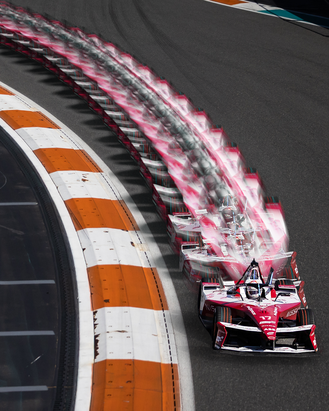
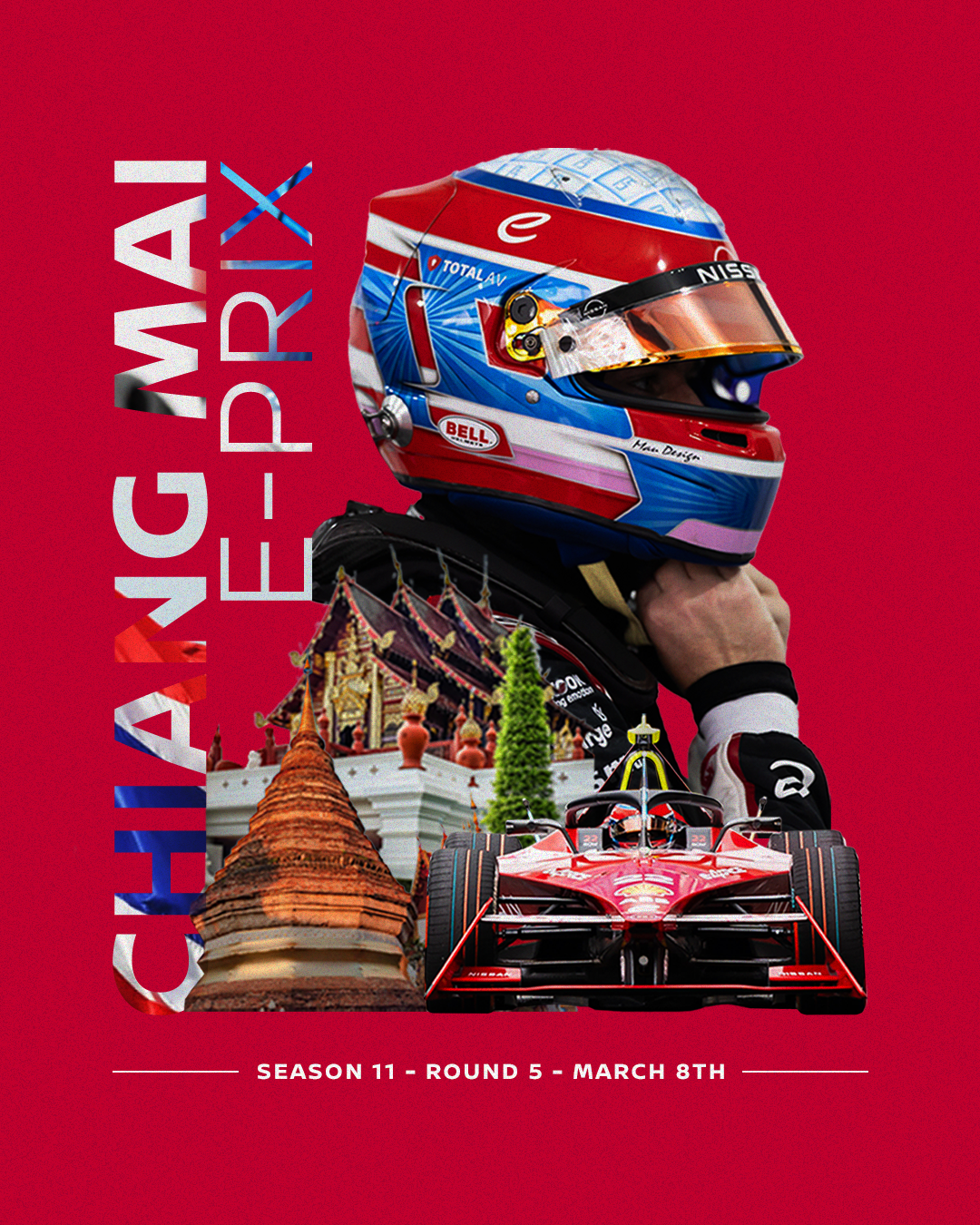
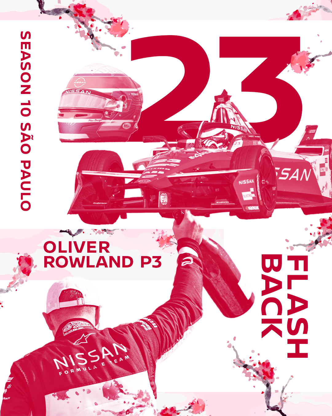
NISSAN FE TEAM
A shift from aesthetic
to essence.
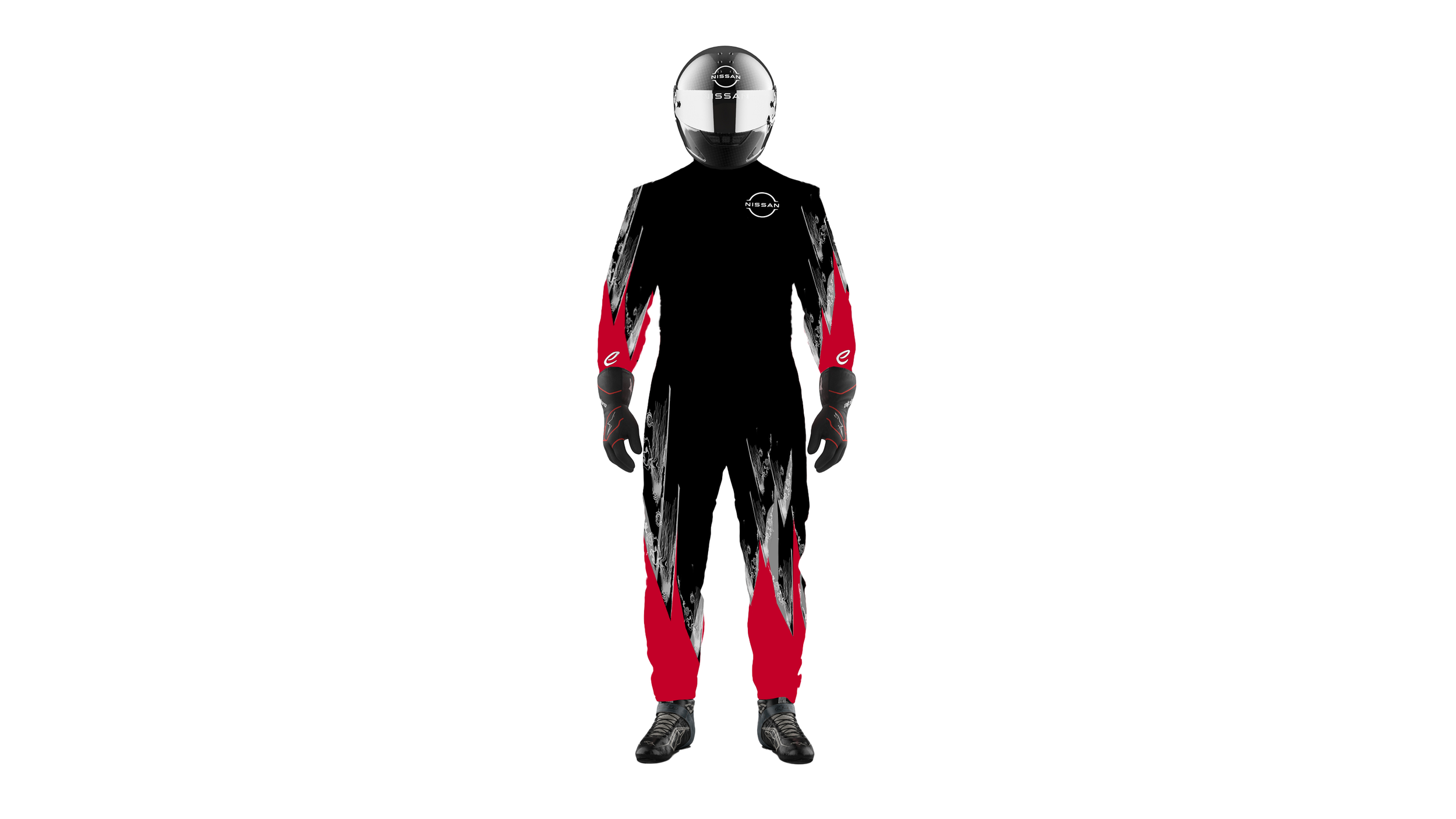
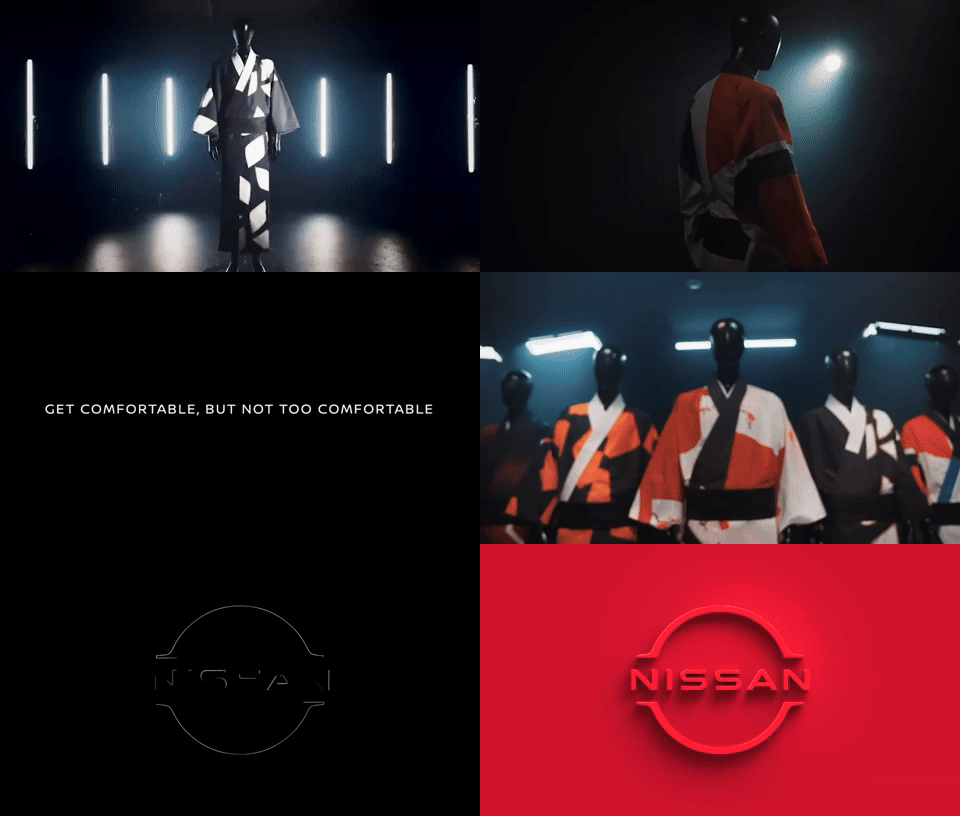
I worked across a range of creative outputs for Nissan Formula E, from livery design to advertising, social content, and beyond. But throughout all of it, I kept coming back to the same question: How can I shift from aesthetic to essence? From designing how Japan looks, to designing how Japan feels. This idea became my compass as I explored how to bring Japanese identity into global motorsport, not through surface-level symbols, but through emotional texture, movement, and tone.LIVERY DESIGNS
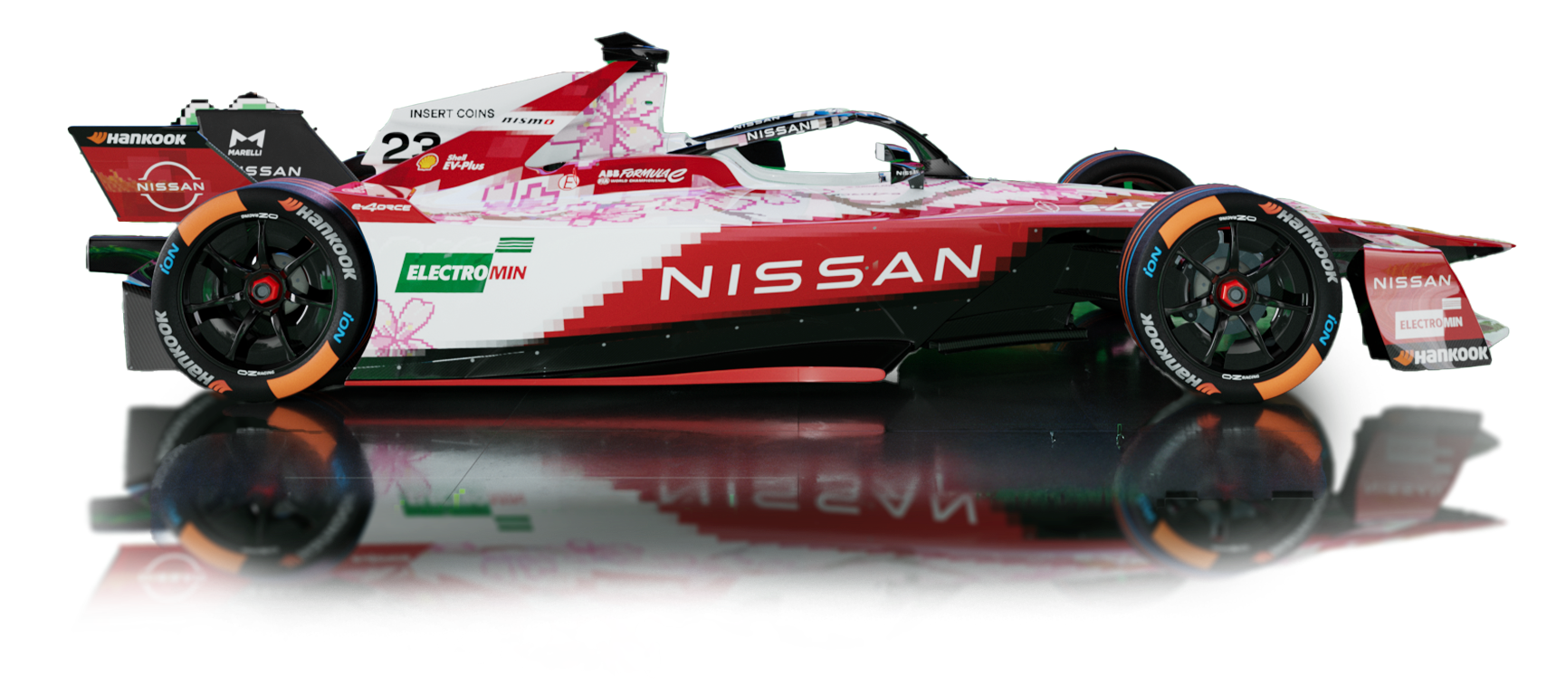
Designing the limited-edition livery for this year’s Tokyo race was truly exciting.
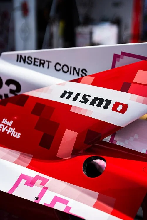
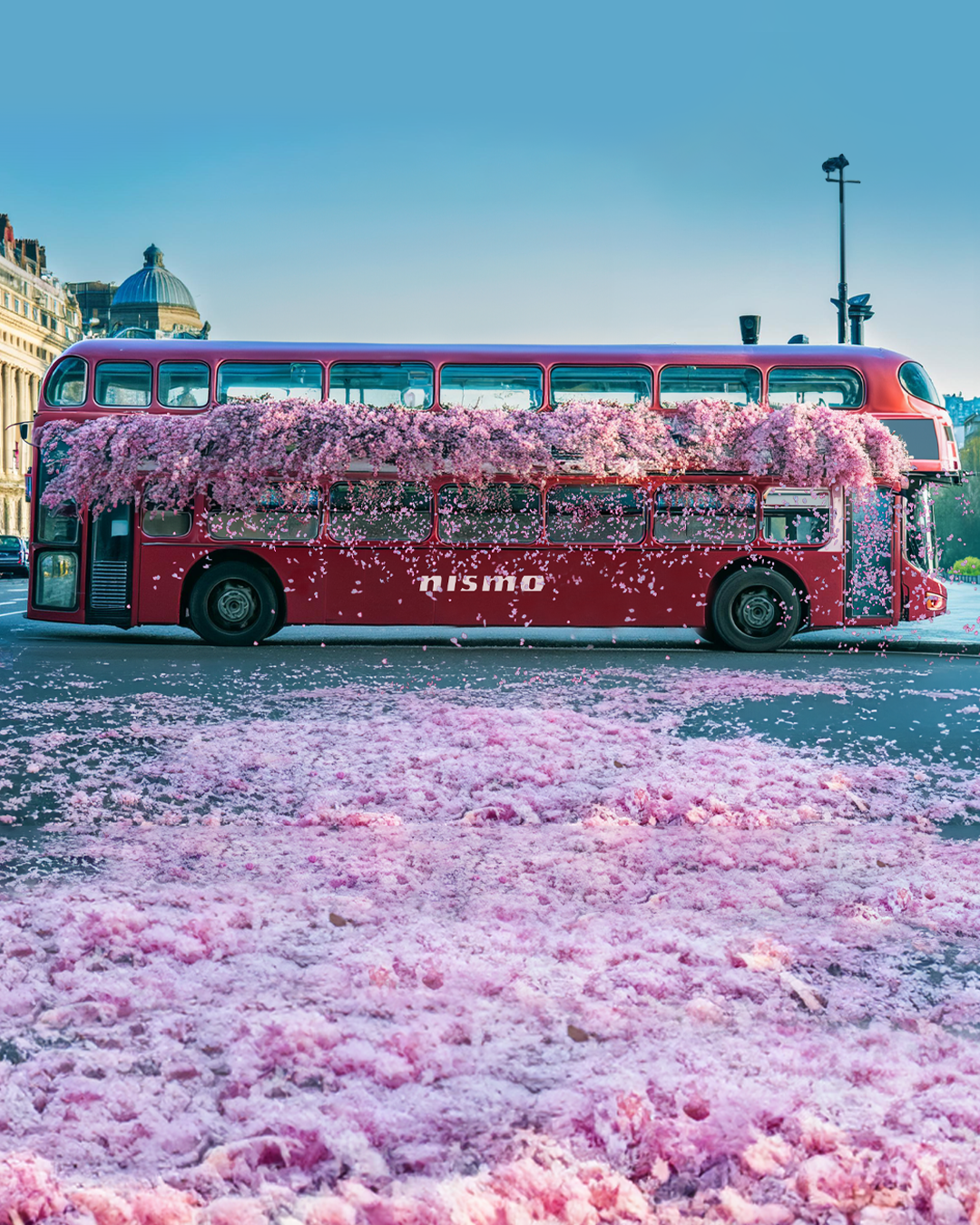
As part of Nismo: Electric Racer, an 8-bit game created to celebrate Nissan’s home Formula E race, worked with Japanese illustrator Kentaro Yoshida to bring a pixelated dream to life on a real track.

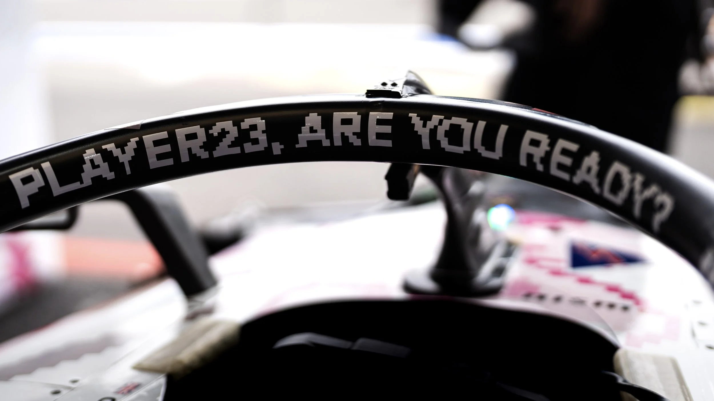
From the pixel-perfect bodywork and cherry blossom layout to the custom 8-bit type shouting “Player23, are you ready?” and “Insert coins,” every detail was crafted to blur the line between nostalgia and reality, and to inject a playful spark into the world of motorsport.
To achieve that, I developed a modular pixel grid system to guide the livery layout, balancing movement and legibility at high speeds. The colour palette was between Nissan red and an arcade-inspired brightness, and the typography was fully custom-built to echo a retro game aesthetics while staying bold and playful.
We explored multiple versions of the cherry blossom layout, experimenting with petal size, rhythm, and density to find a visual balance between elegance and energy. Even the placement of red pixels was tested and refined: they needed to convey dynamism without disrupting the overall flow.
Each concept was simulated in 3D to make sure it worked from any angle. A playful livery, grounded in detail.The chance to design a special livery for the Tokyo race felt like a win,
even before it made it to the track.
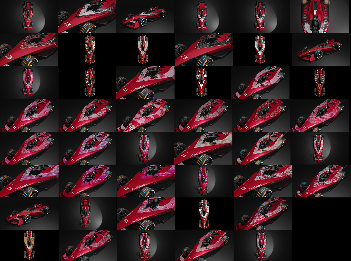
We developed and presented multiple concepts over time. Each one brought something bold and fresh to the table.

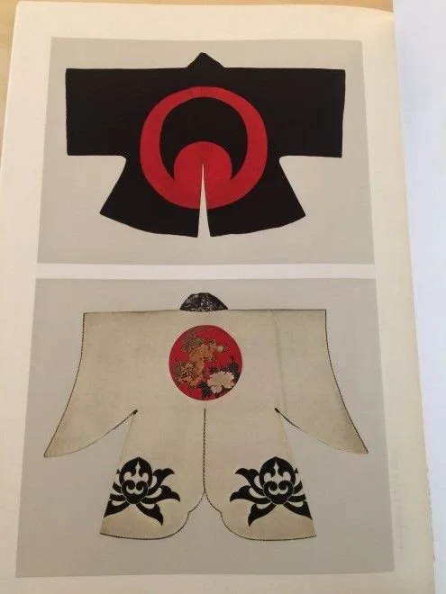
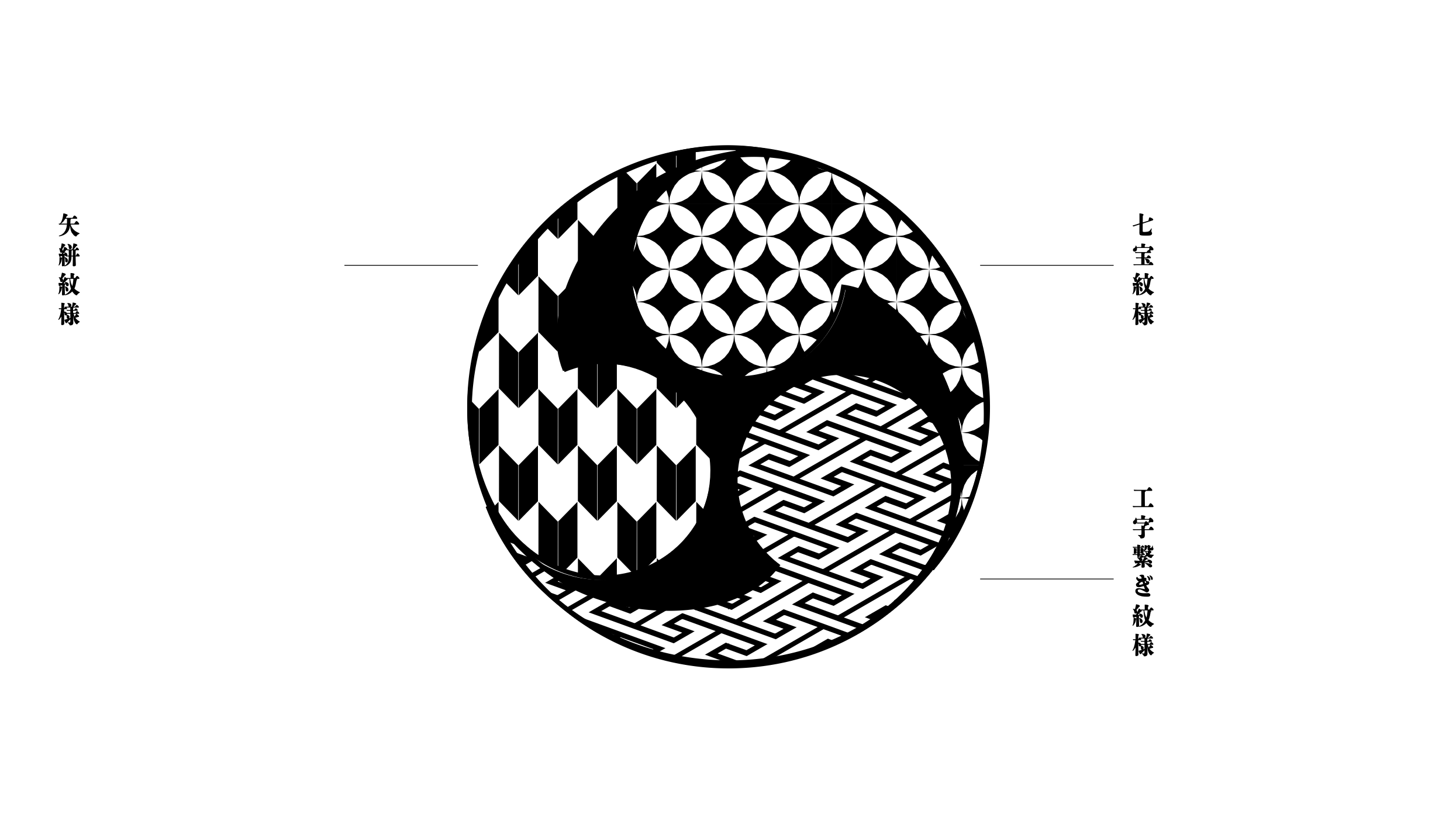
In exploring these ideas, I delved into Japanese visual heritage, researching traditional Japanese patterns and cultural symbols to build a visual language rooted in meaning, not just surface aesthetics. For me, design gains power when backed by story and cultural context. That belief shaped each proposal.
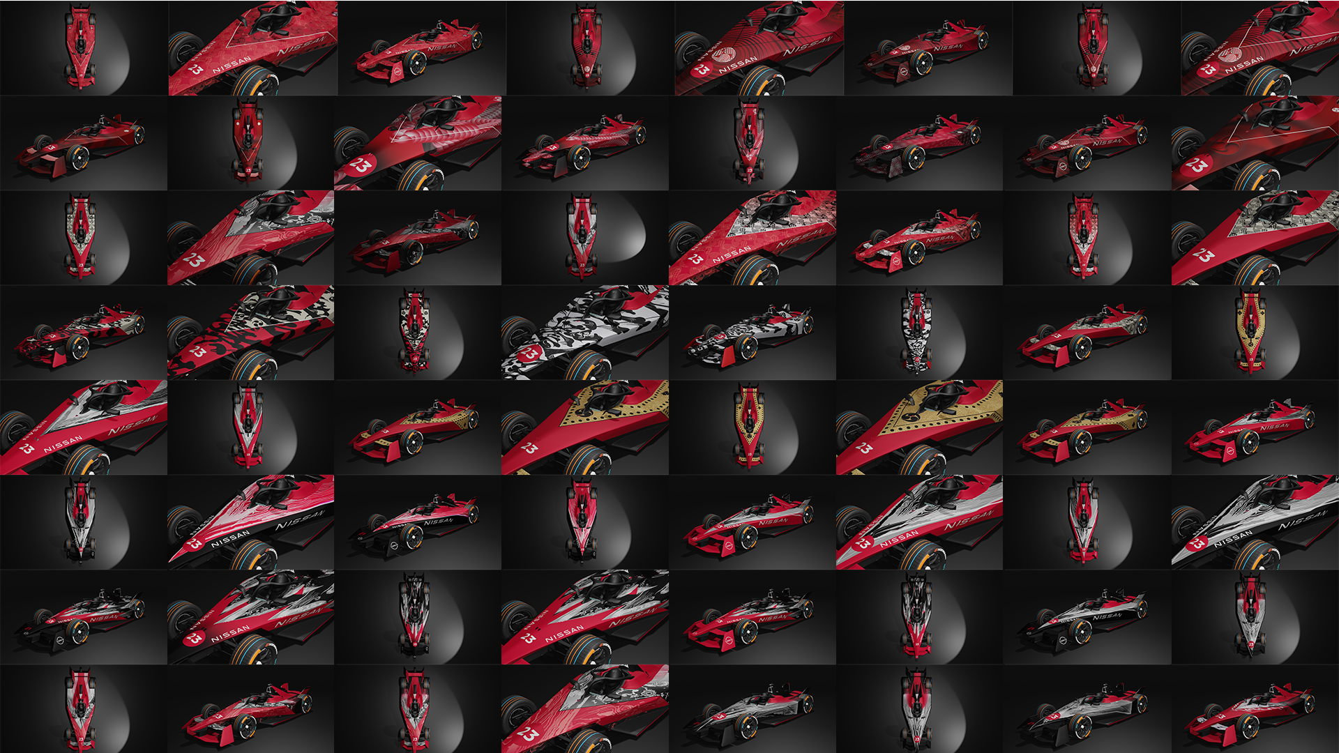
The client loved the directions, but in the end, they stuck with the existing look, as the stats said it was still resonating with the audience.
But none of those ideas were wasted. In fact, they became the foundation for the Tokyo livery that finally came to life. These earlier designs never made it out into the world, but they remain some of my hidden favourites. Here are a few of them:Advert and Social media
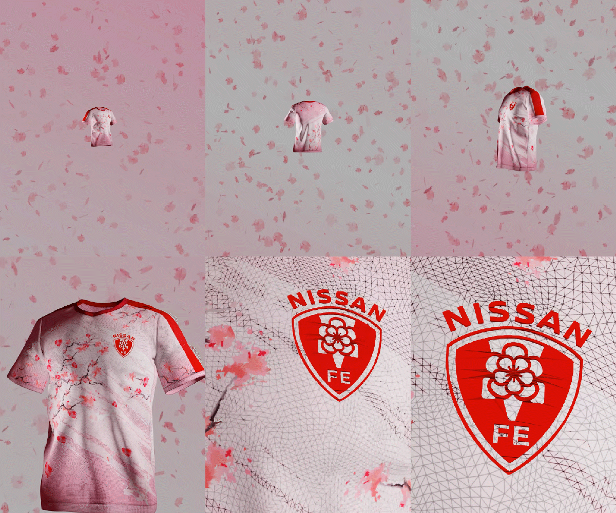
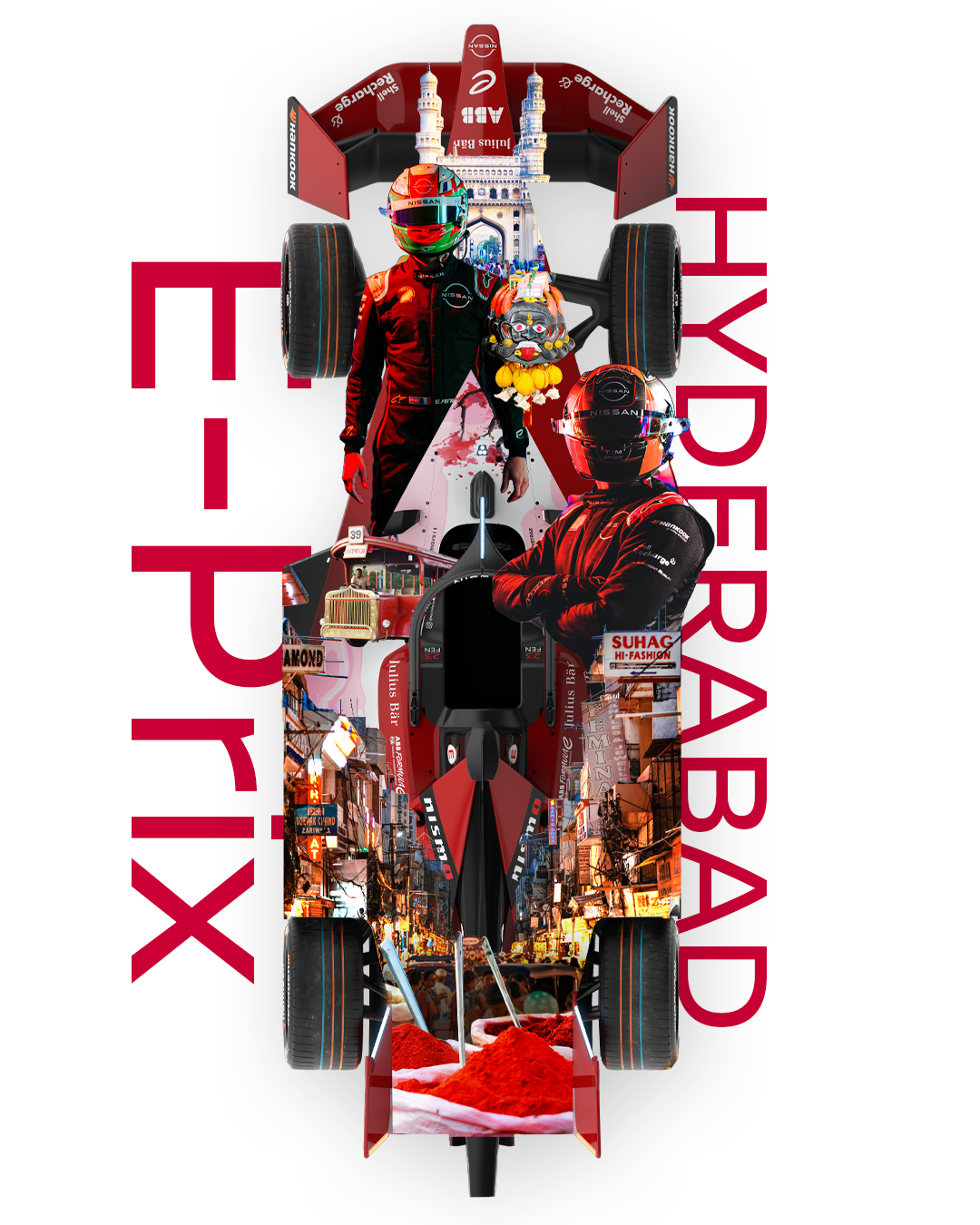
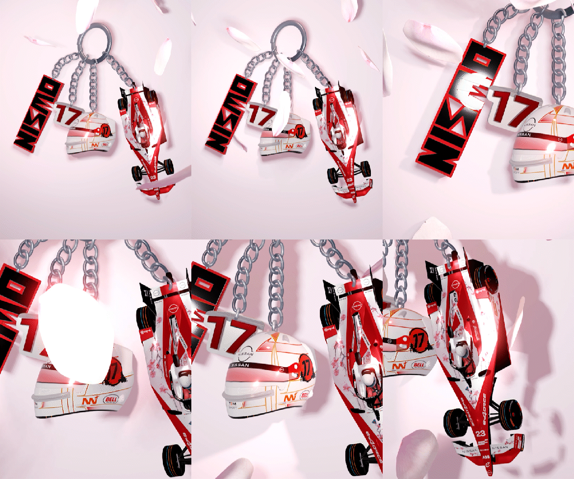
For Nissan FE Team, we developed visual content across a range of media, from large-scale advertising to daily social media communication. Platforms like Instagram, TikTok, Facebook, and X are key touchpoint where content needs to stay fresh, engaging, and visually distinctive.

With new design briefs arriving constantly, I’ve developed a diverse range of visual assets, from bold static graphics to playful 3D visuals and nuanced motion pieces. I tailor my creative approach to each brief, using a variety of tools, including some 3D software, to bring added depth, energy, and character to the content.
Now, leaving the racetrack for the racecourse.
ROYAL ASCOT
Contributing from idea to execution.
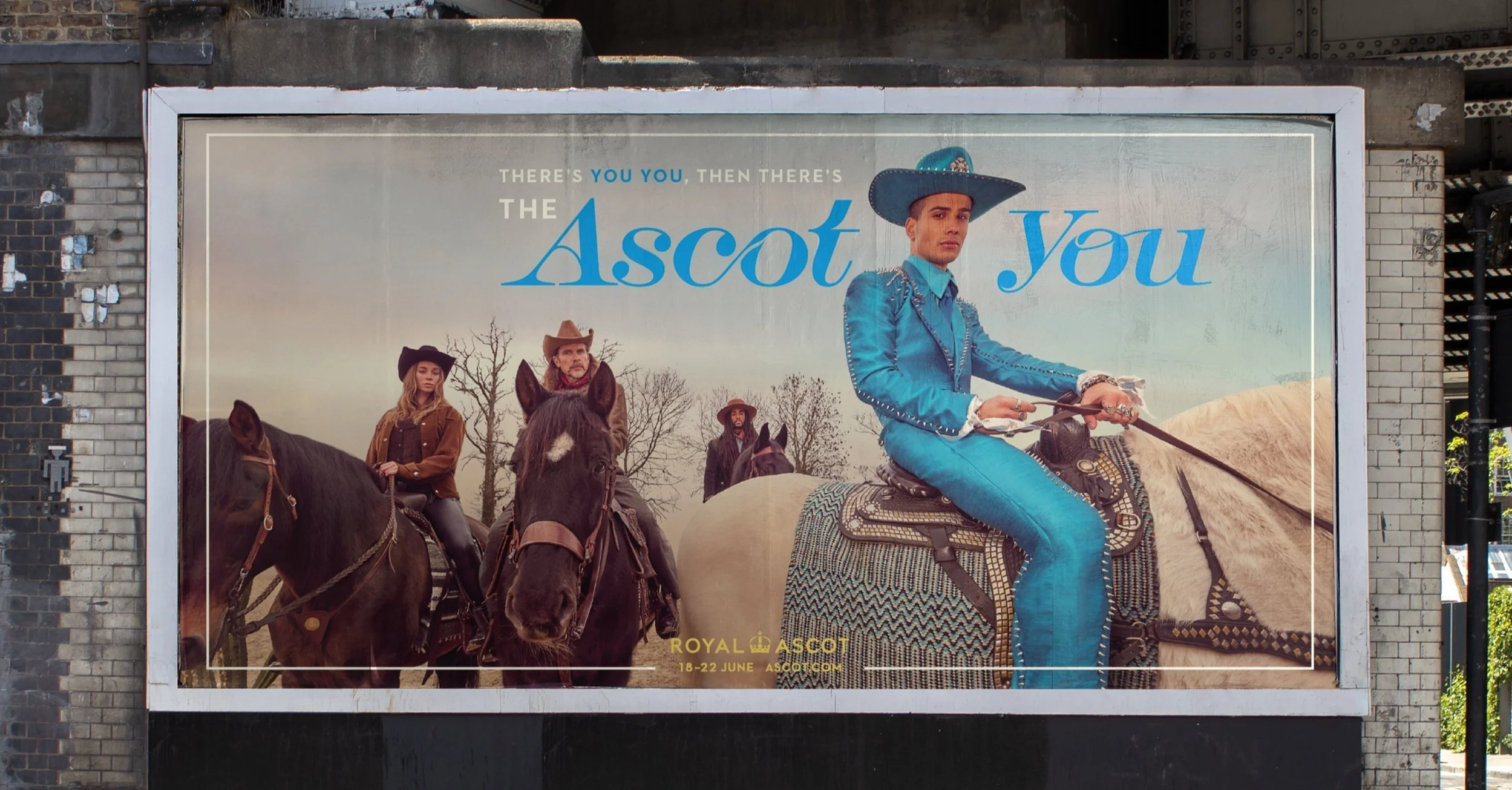
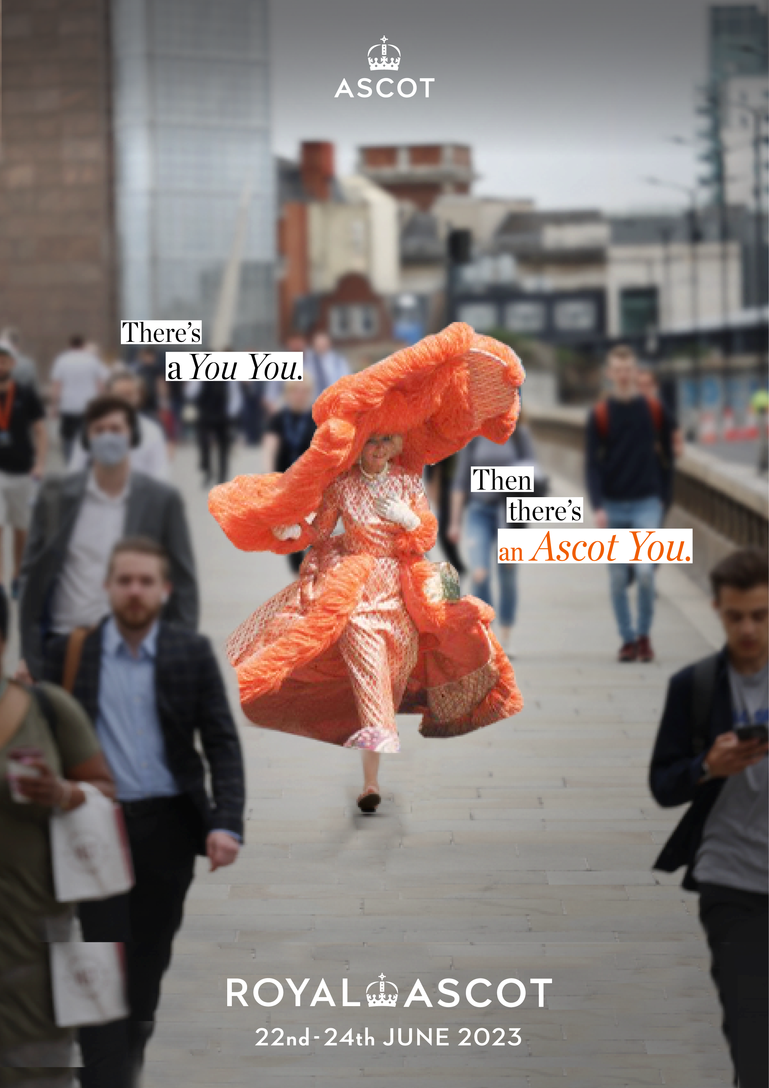
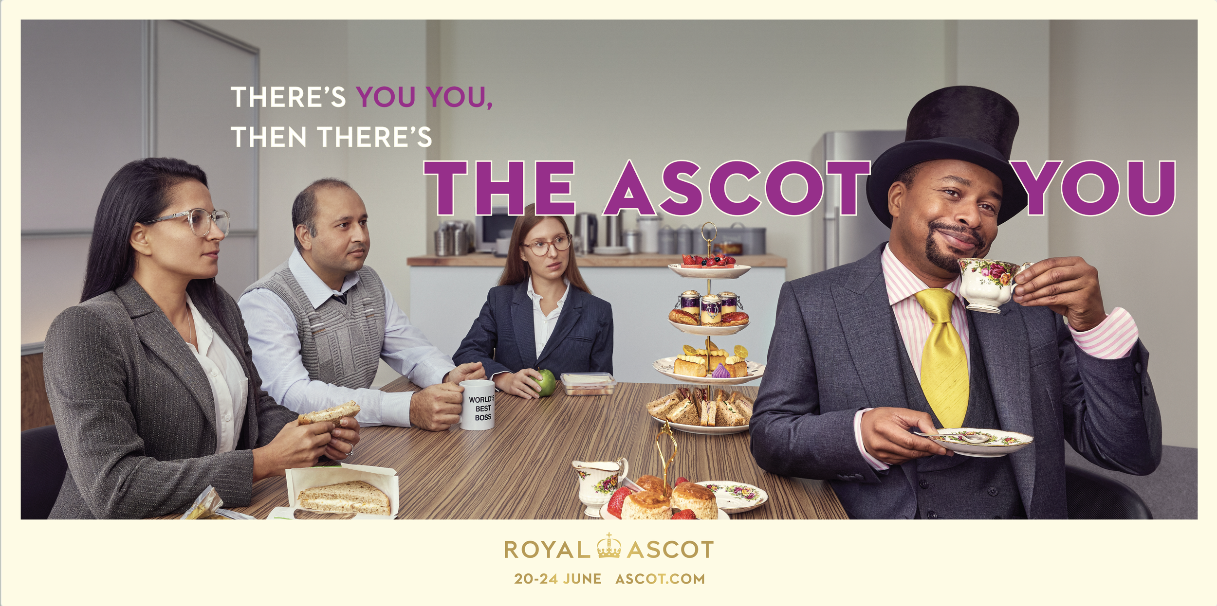
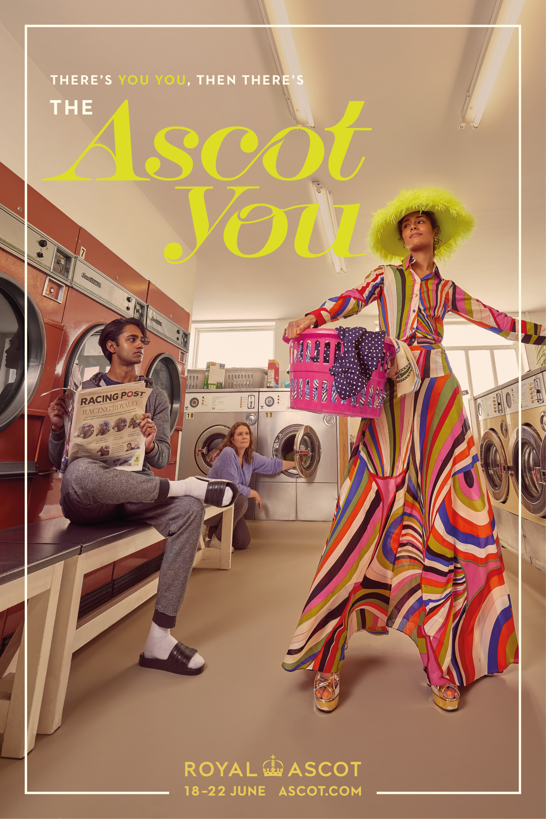
For two consecutive years, “The Ascot You” campaign has reminded audiences that everyone has an inner elegance, one that comes alive at the world-renowned Ascot Racecourse.

I joined the project from the pitch stage, helping to shape the core creative idea that ultimately won us the client. From there, I transitioned into the designer role, where I could fully focus on translating the concept into a compelling visual world.

It was a rare opportunity to stay with the work from idea to execution to think with the team, and then make with my hands.
THERE’S YOU YOU,
THEN THERE’S THE ASCOT YOU. This project began long before a single line was drawn.
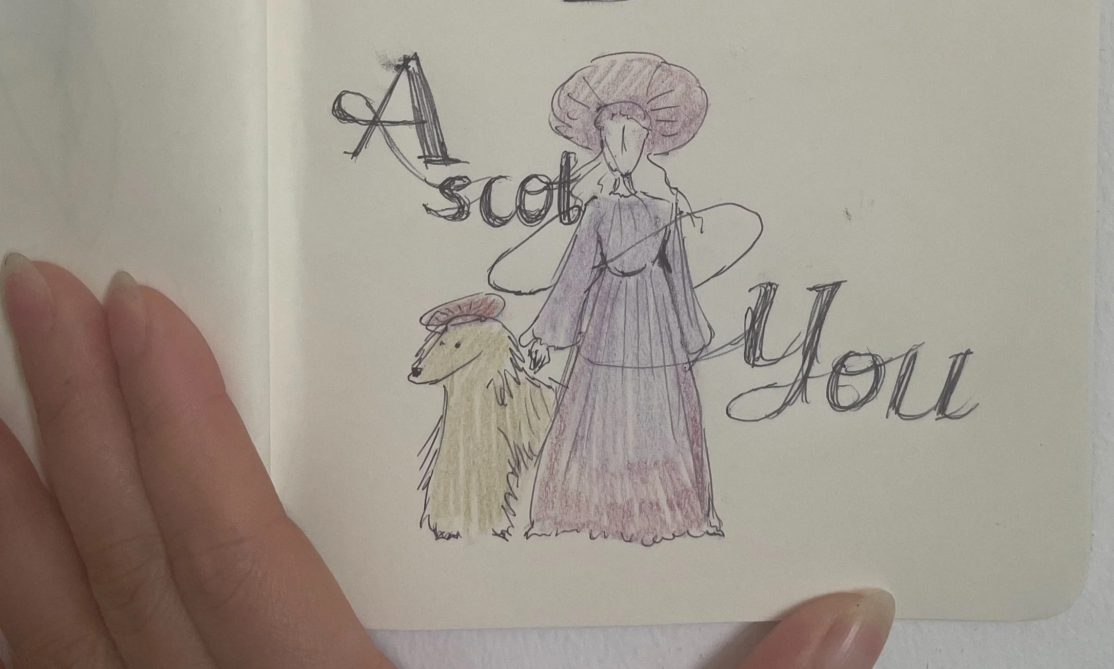
Pitch
The second yearWhen an idea wears
its finest form.
Our first visual approach stayed within the traditional brand guidelines. Still, we pushed the edges, injecting modern energy and fashion-forward confidence into a world known for restraint.

It was a careful process between tradition and transformation. The layouts, typography, and palette were crafted to feel timeless, yet unexpected.
2024
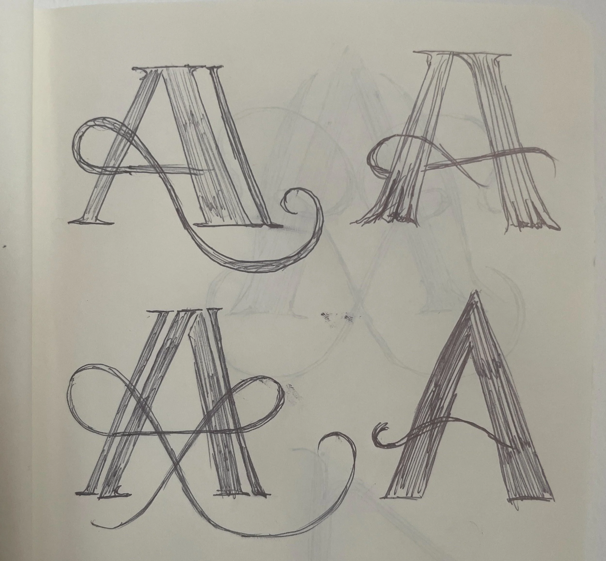
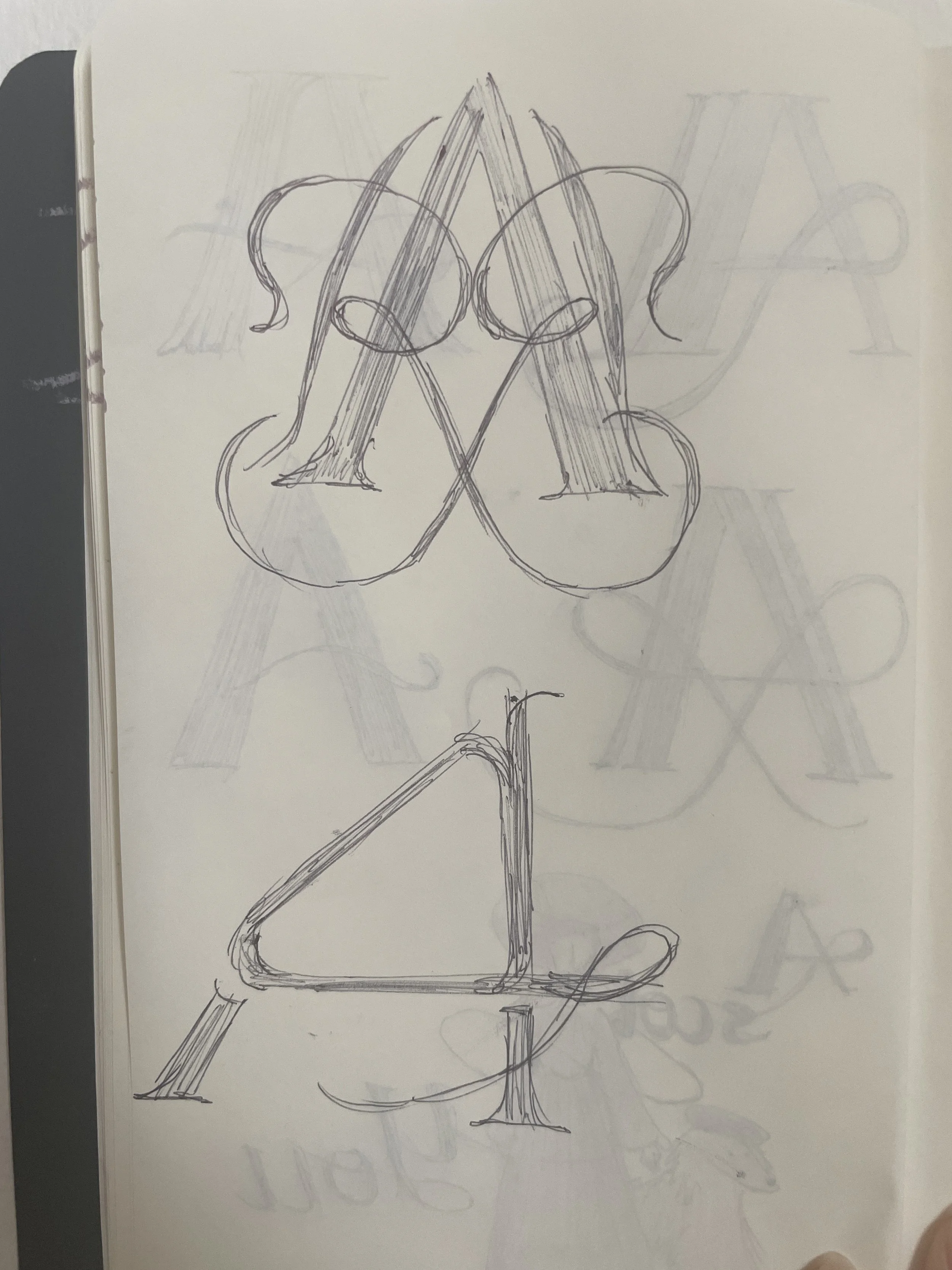
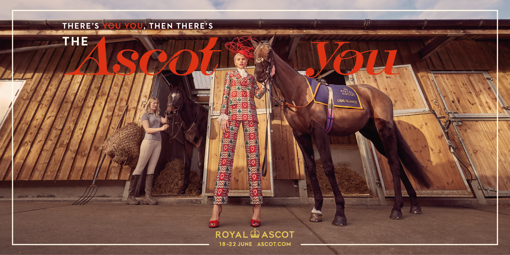
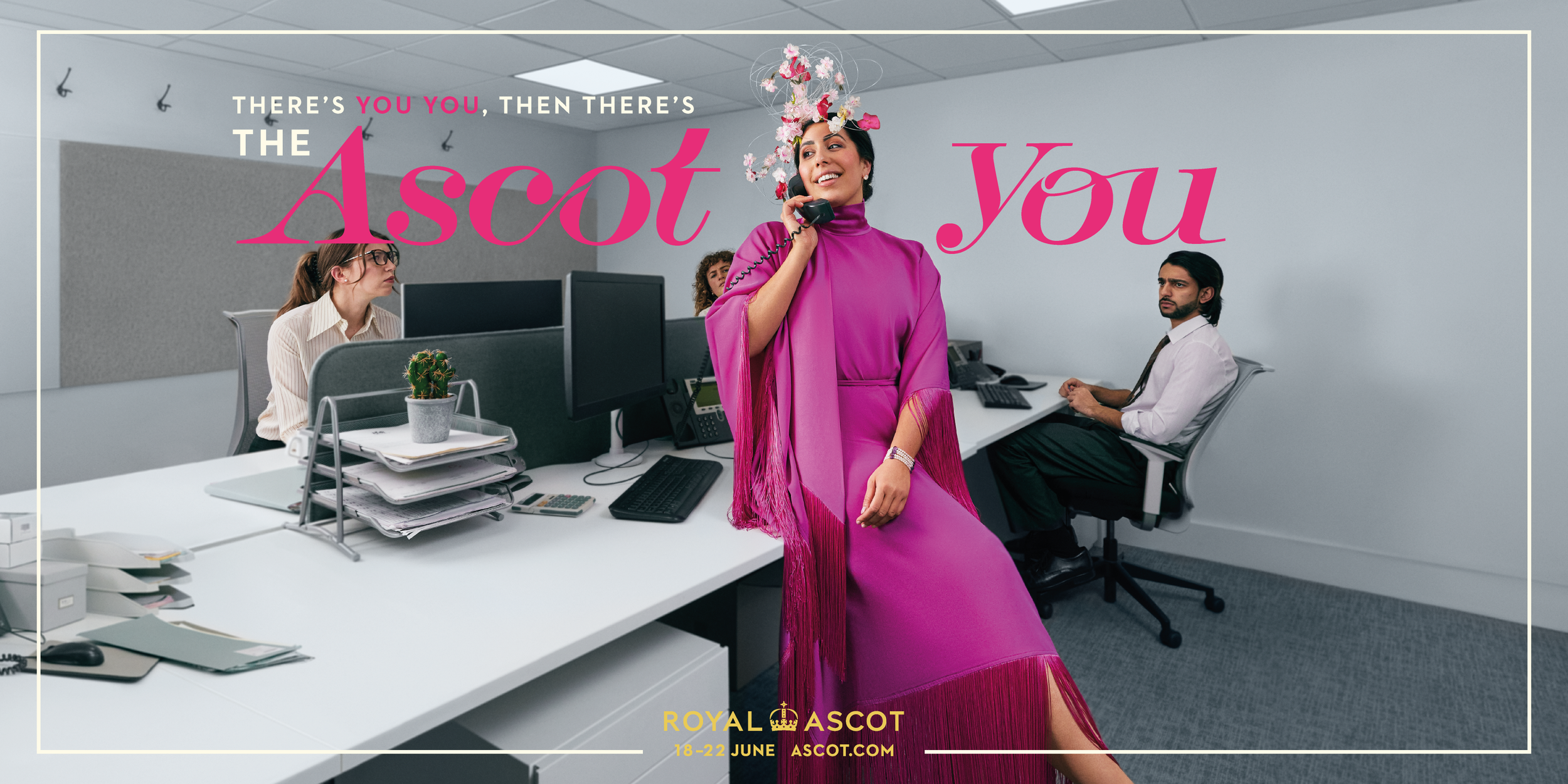
For the 2024 edition, I focused on pushing the visual language to its most refined extreme, especially through a custom typeface I designed specifically for the campaign.

The colour took cues from luxurious fabrics, and the layouts echoed the confidence of fashion editorials. The typeface captured the campaign’s sense of glamour and transformation: exaggerated, confident, and elegant. Every element, from the curves of the letters to the surrounding negative space was crafted to feel entirely at home in a world where elegance isn’t optional, it’s expected.
This marked the first time we went beyond Royal Ascot’s formal brand guidelines. It was a shift that came not from rebellion, but from trust, earned through months of client discussions and careful iteration.
We did it, and it worth it.A few more from the journey so far, small steps, bold questions.
