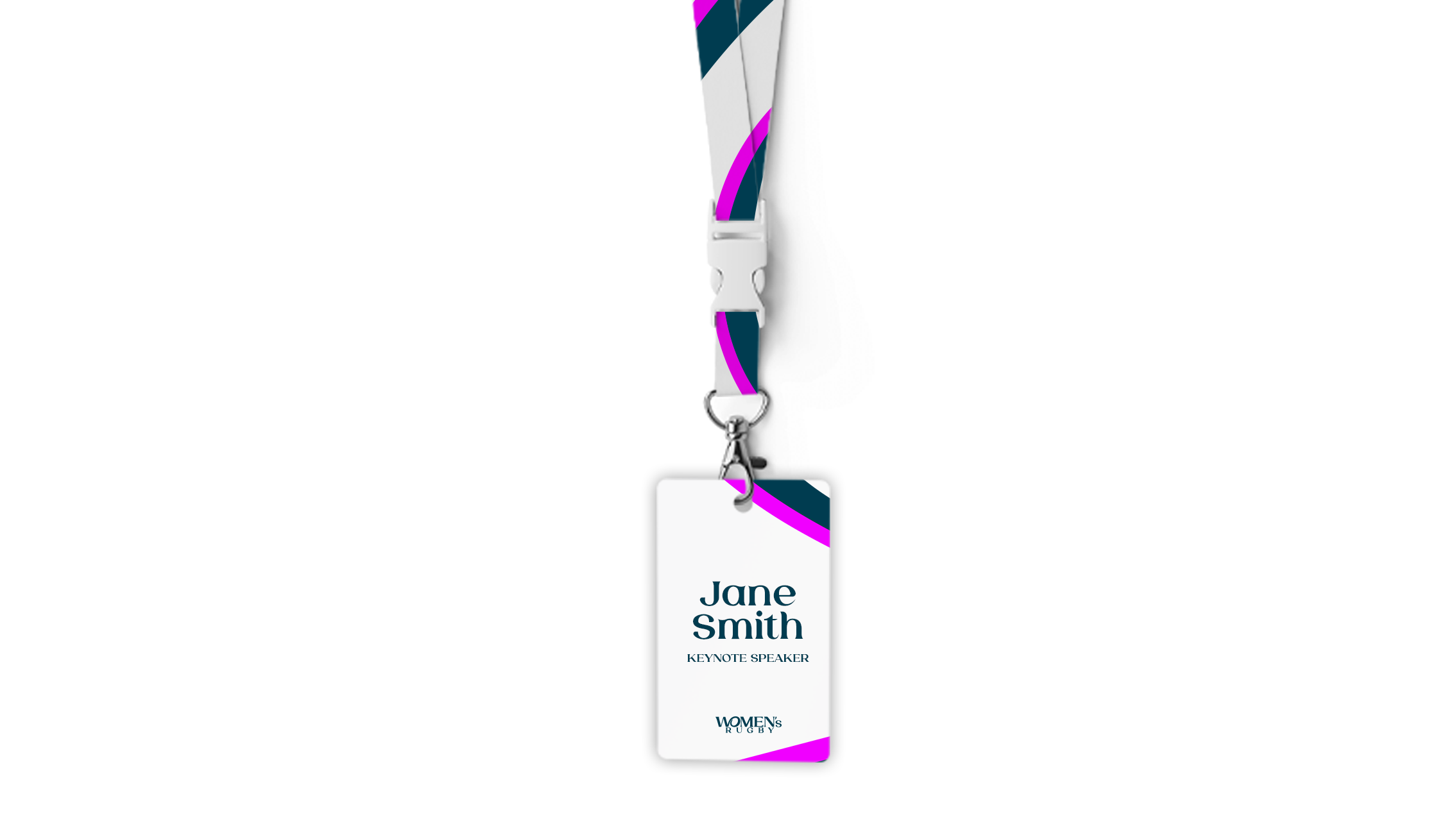
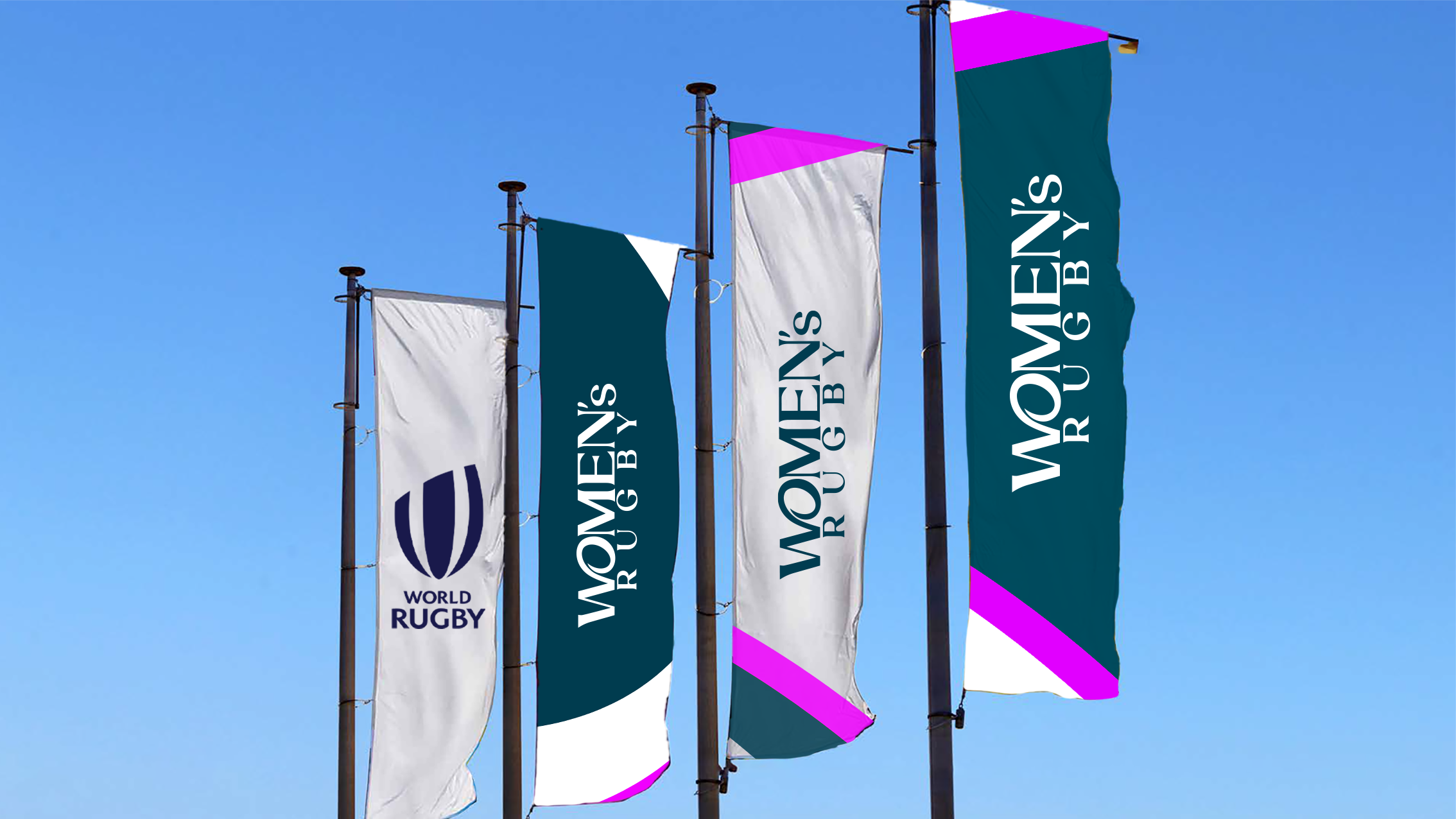
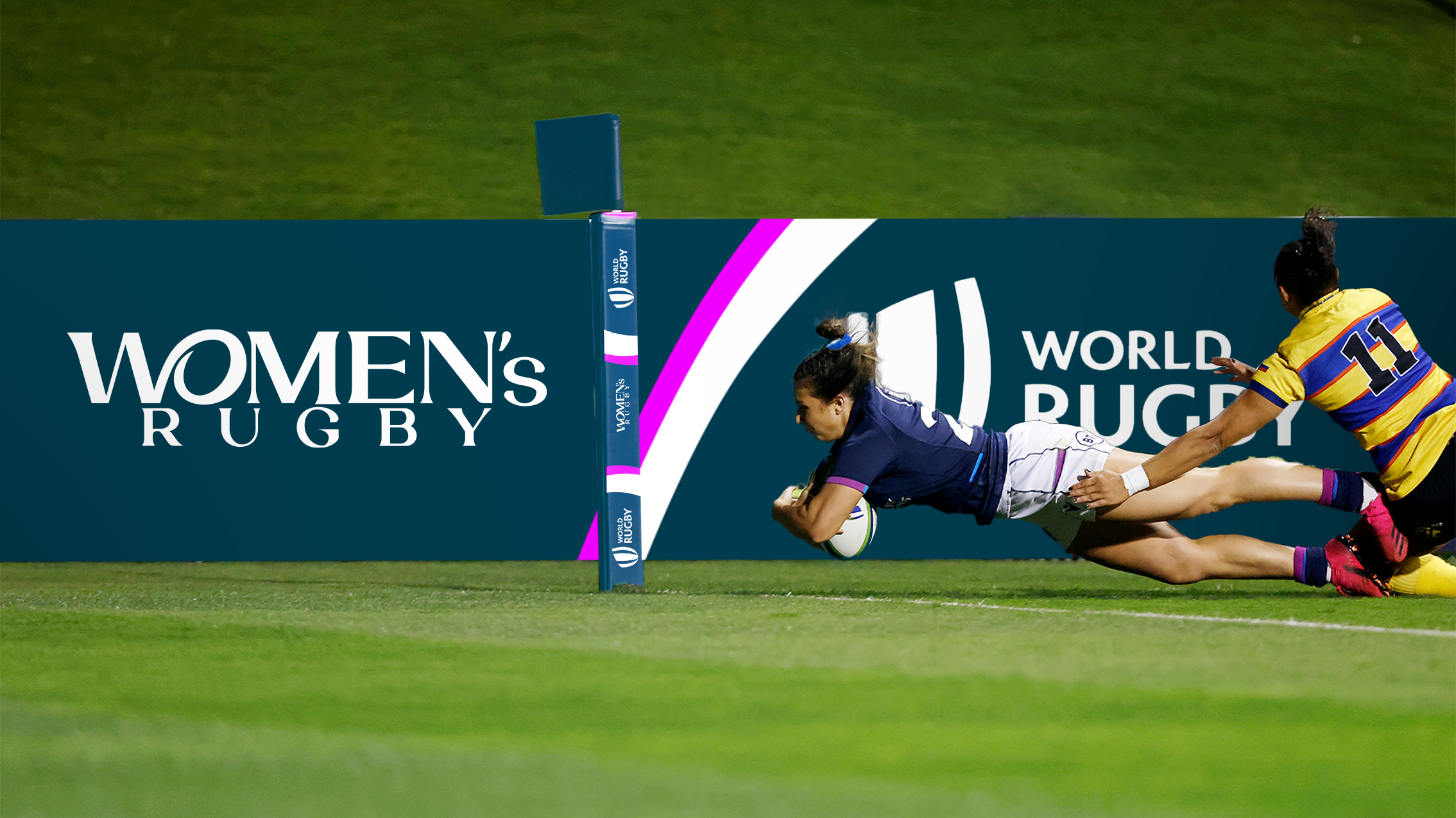
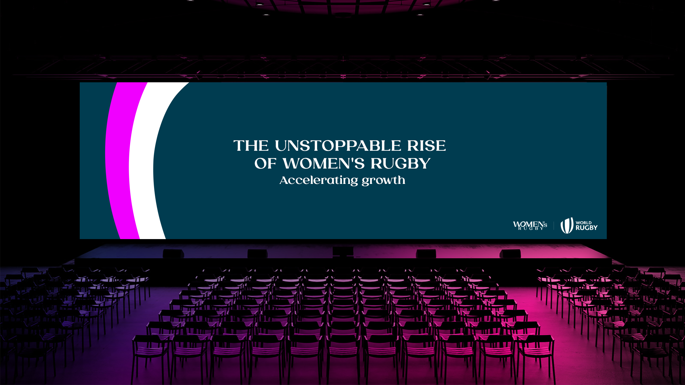
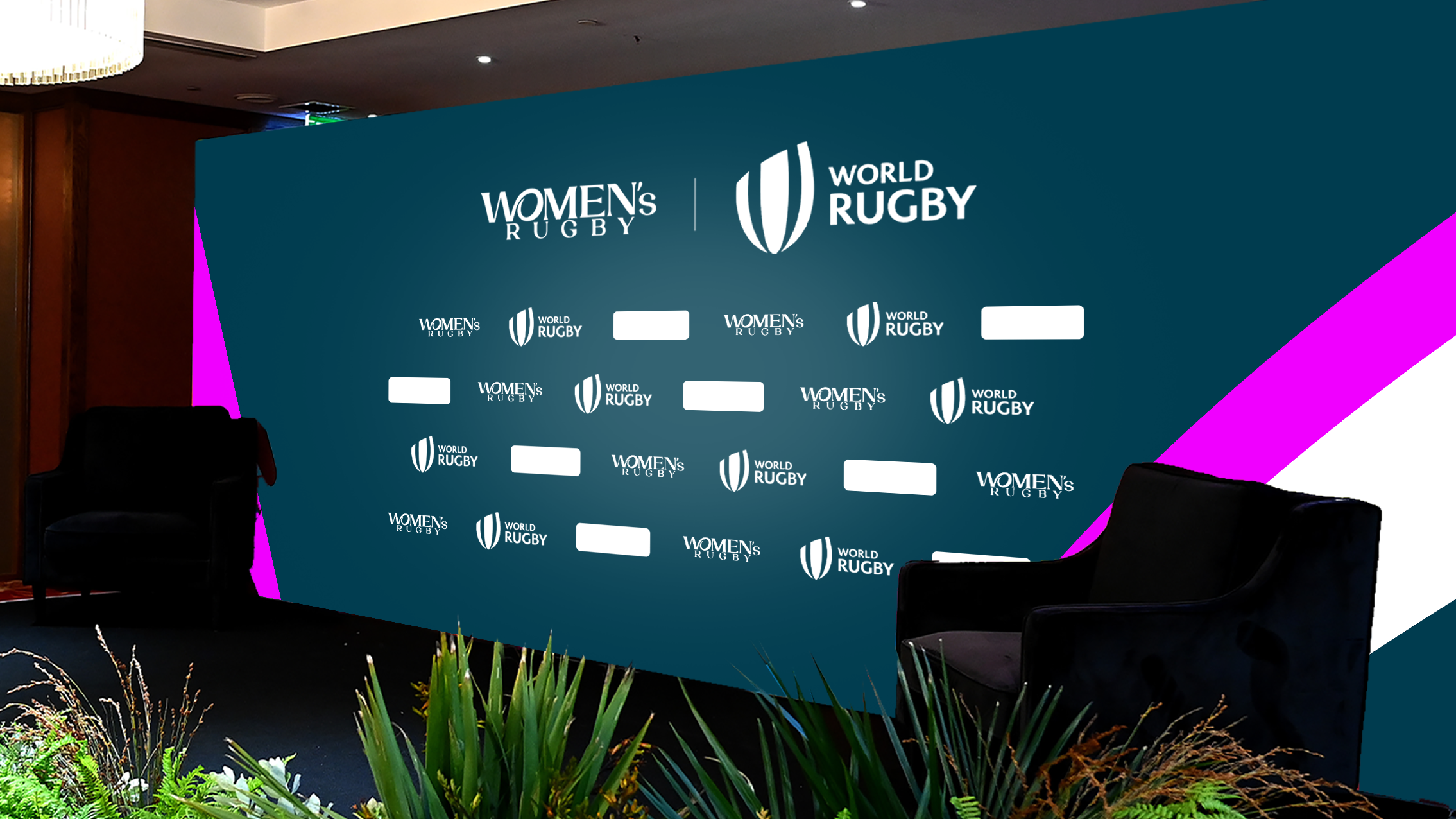
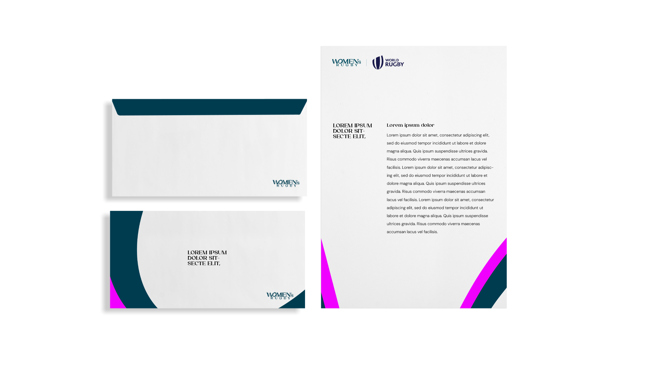
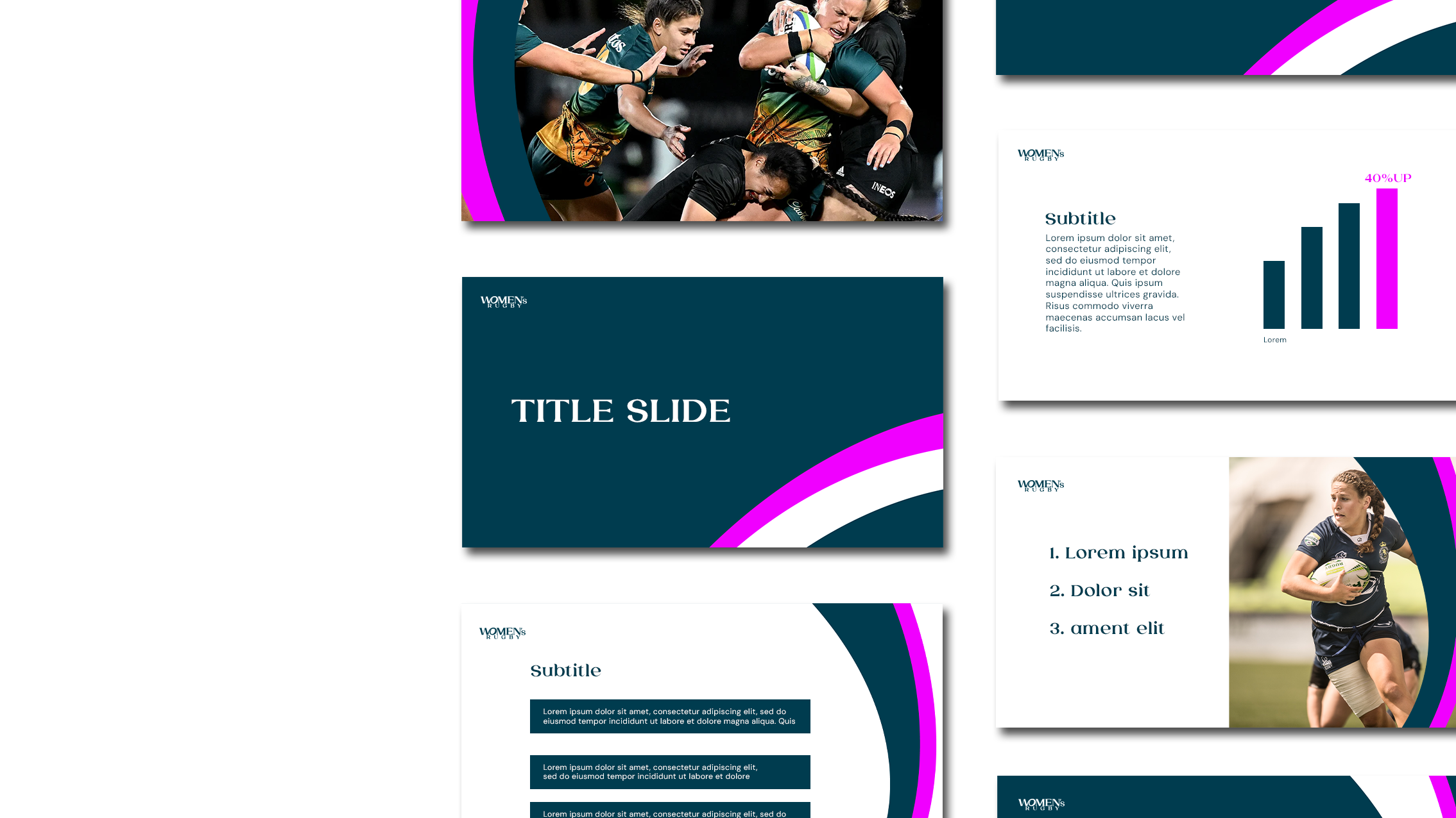
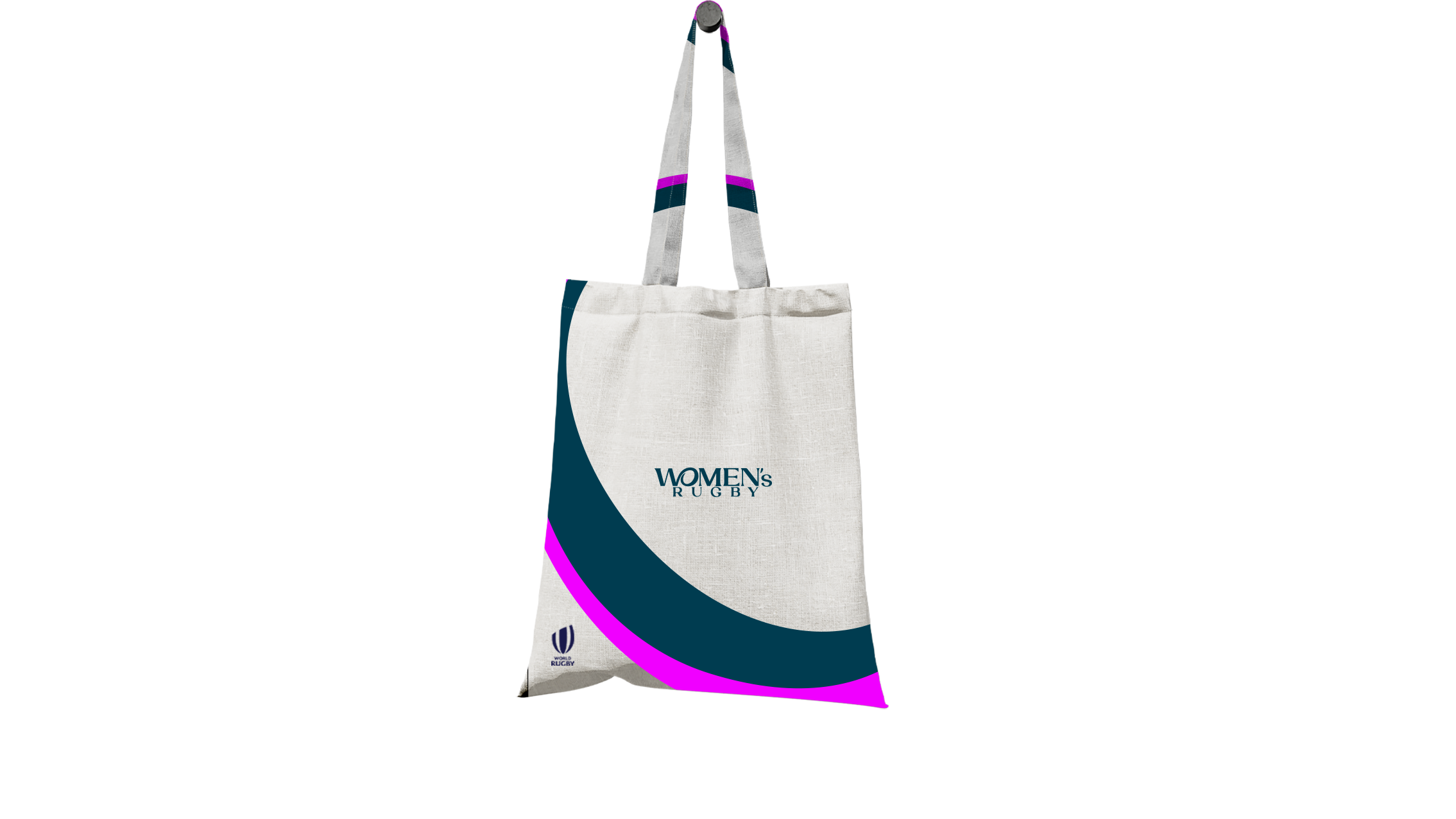
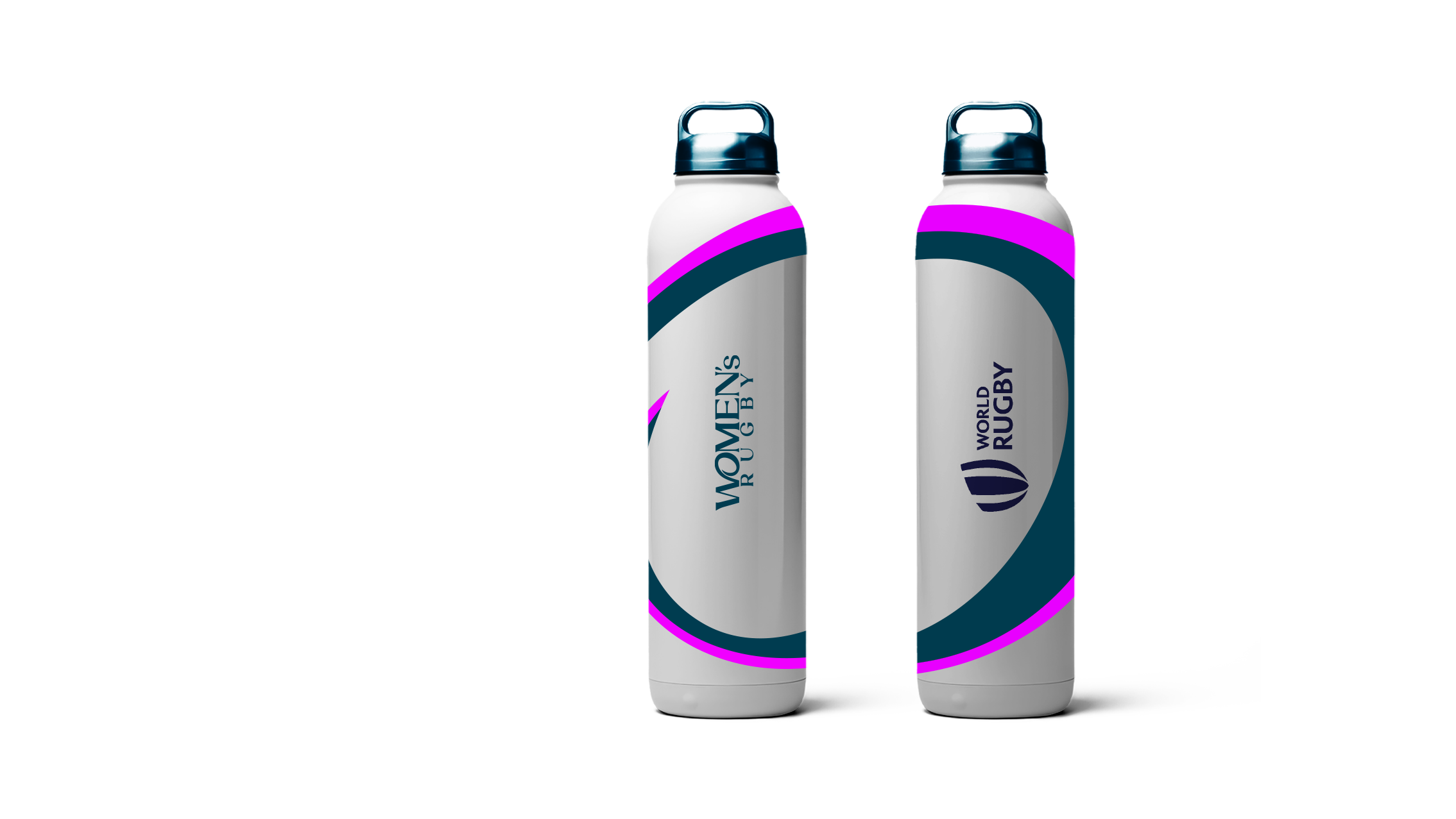
World Rugby

Women’s Rugby

Unstoppable Campaign 2022

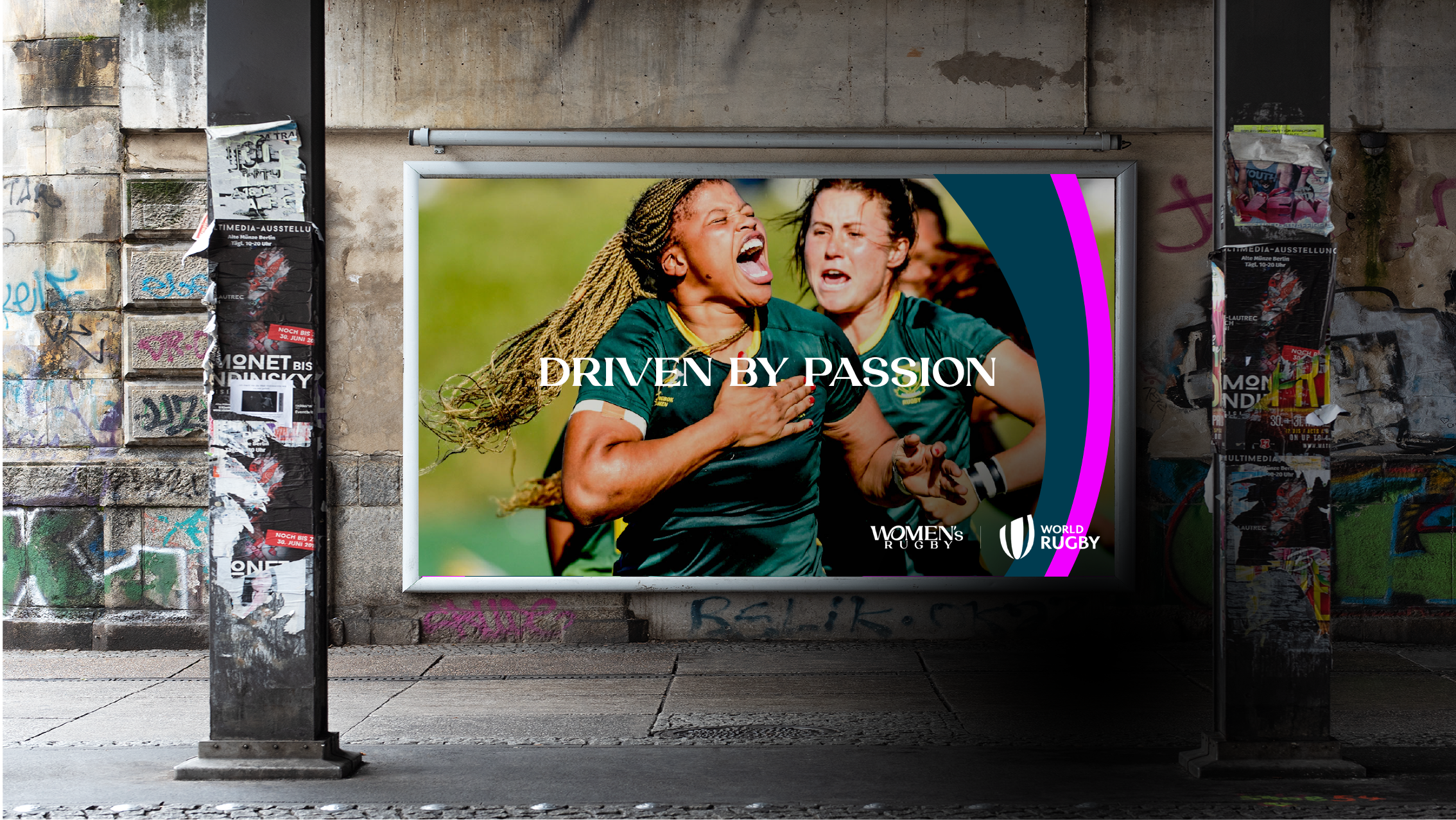
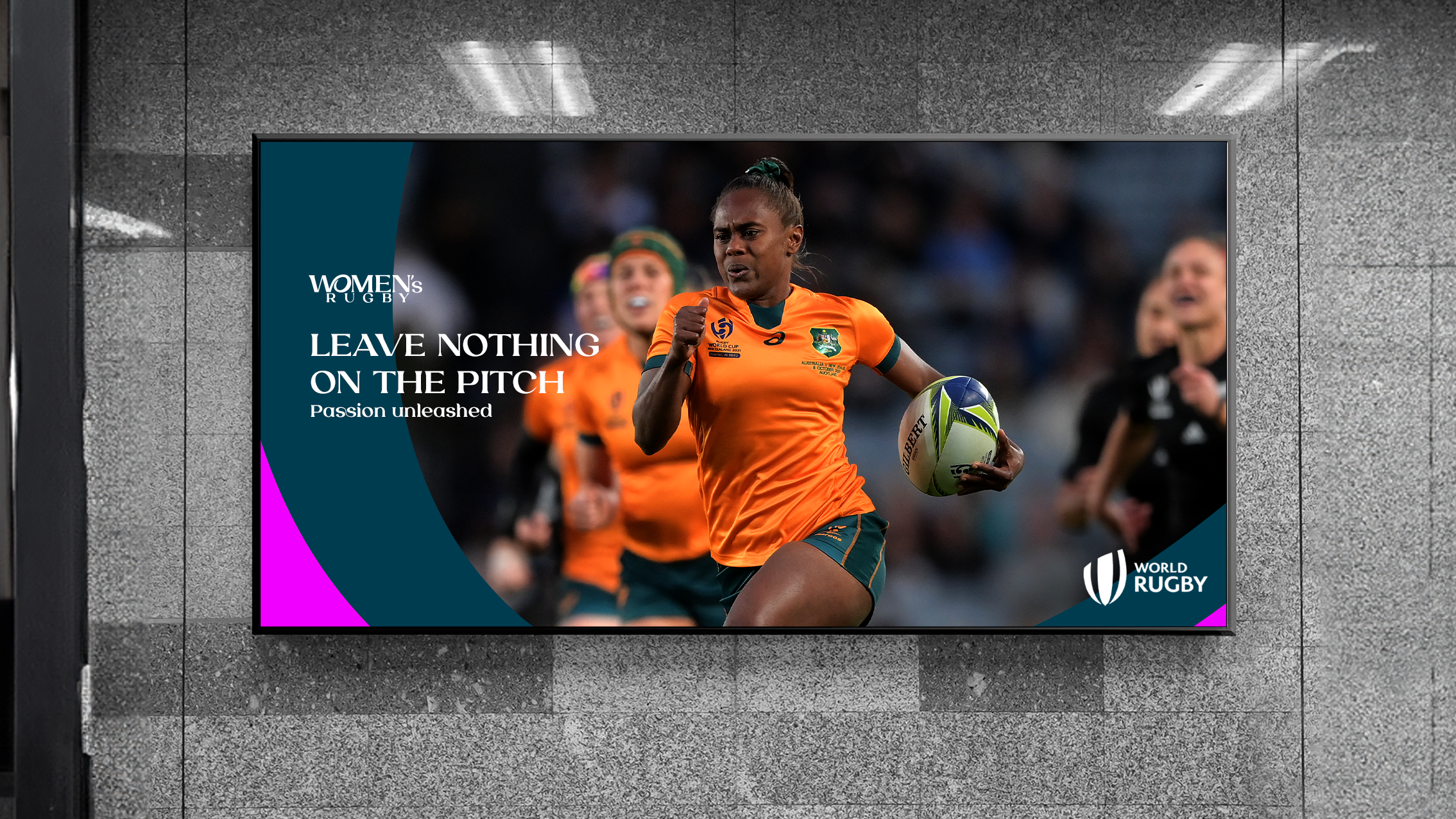
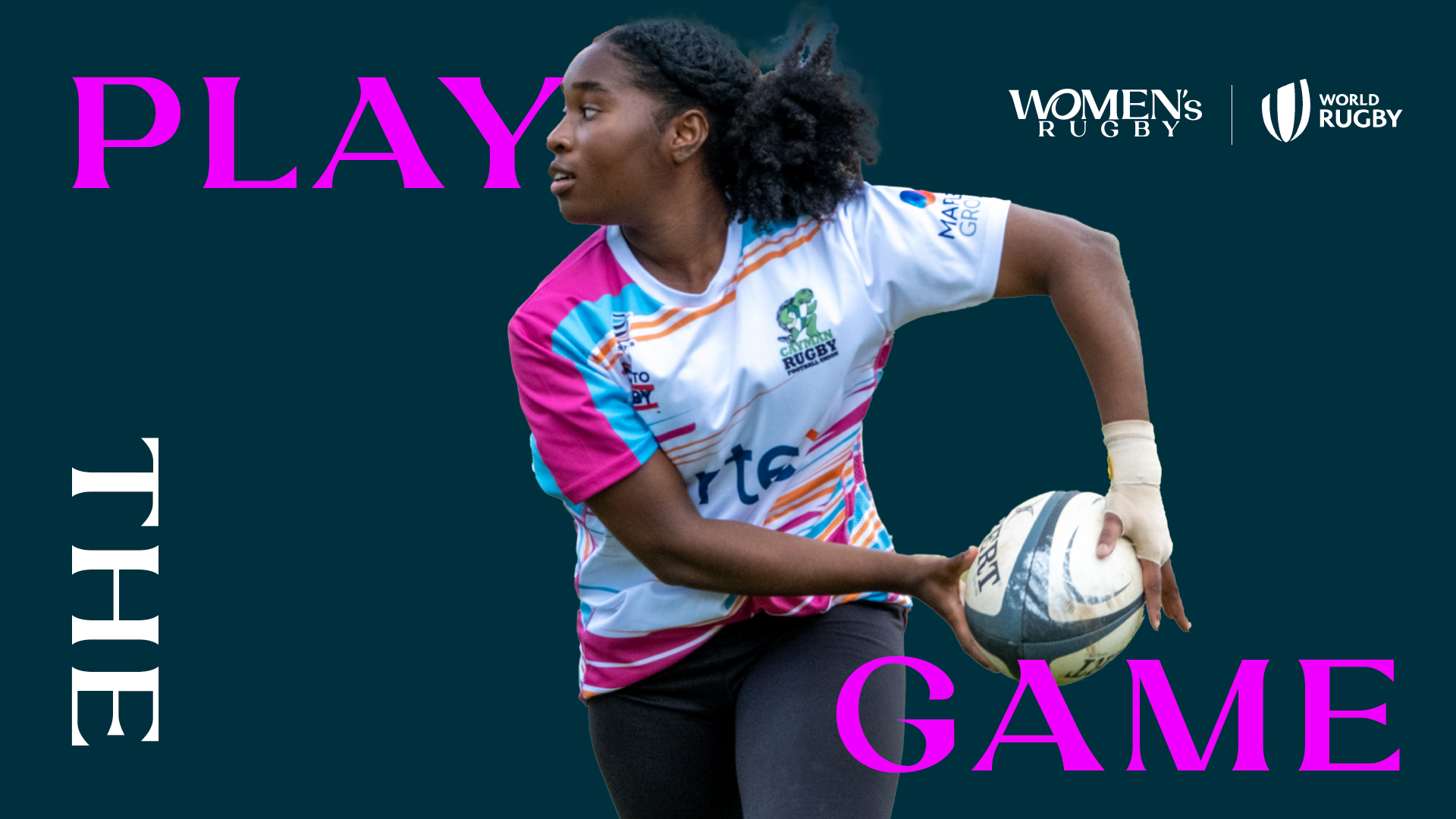
Ahead of the biggest ever Women’s Rugby World Cup in 2025, World Rugby asked us to create a refreshed brand - one that reflects not just the scale of the moment, but the future of the women’s game itself.

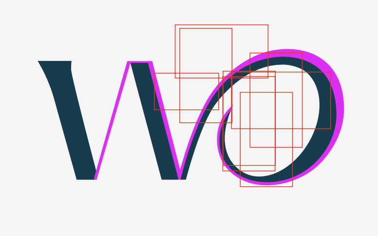
The new identity connects the ‘W’ and ‘O’ to form a symbol of a woman with her arm around a rugby ball - a small gesture that carries a big message: women belong in this game, at every level.

For me, this wasn’t just about sport branding, it was about expressing a belief: that rugby belongs to everyone. I wanted the design to feel open, modern, and unapologetically confident, something that resonates across generations, cultures, and identities.
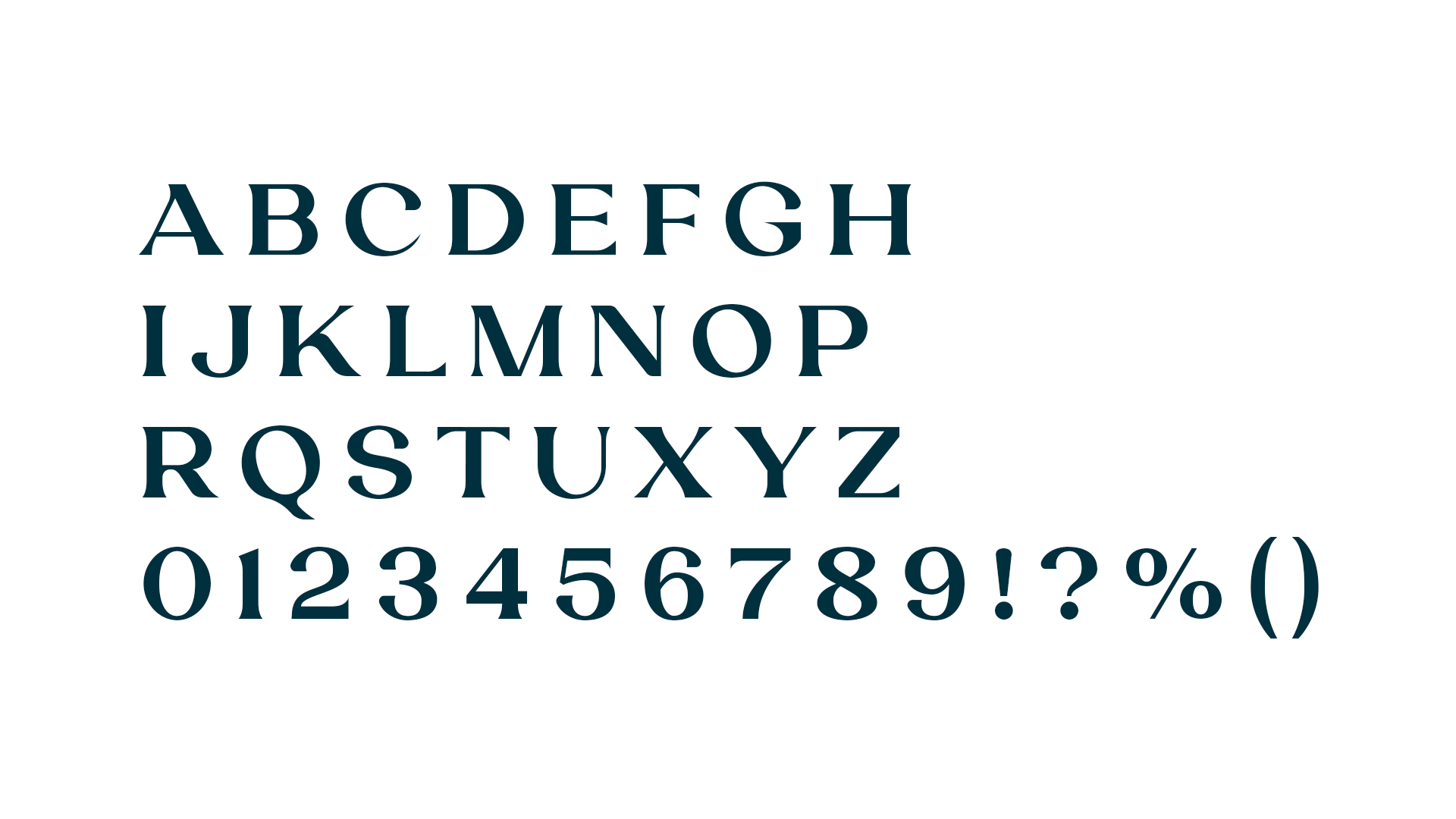
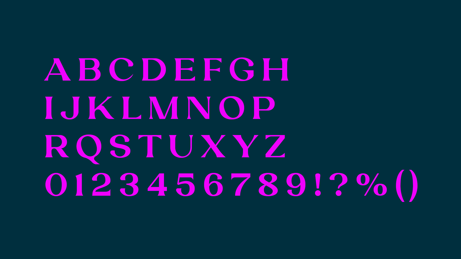
Branding Design
Client: World Rugby
Role: Design Concept, Lead Designer
ECD: Steve Howell
Creative Director: Sean and Josh
Creative: Lara and Hannah
Produced in 2024 at Dark Horses

WORLD RUGBY

Not a version, a new standard.
It’s rugby.

What does it mean to design a world where women’s sport isn’t the exception, but simply sport?

How do we build a path grounded in continuity and confidence? And what does it mean to shape a future where this space grows wide open, and stays open? When World Rugby asked us to create a refreshed brand ahead of the biggest ever Women’s Rugby World Cup in 2025, I didn’t see it as just a rebrand. It felt like a cultural shift. We worked with World Rugby to reshape how women’s rugby shows up in the world, not as a version of something else, but as a powerful force in its own right. The new brand had to feel unapologetically confident, stylish, and bold, like the women who play the game. Not a copy. Not a comparison. Just the new standard.

The journey.

It wasn't a smooth journey. The brand name changed. The key sponsor changed twice. Reworked colour palettes, type, applications. Then we reworked them again. Momentum came and went. Directions shifted. So did the brief. At one point, I said: “I need Mr. Motivator to sit next to me while I update this.” (It ended up being nominated for ‘quote of the year’ at the company!) But still, we stayed with the idea. We held the line on what mattered. And in the end, it paid off. Here is the final output.

She holds the ball, and carries the game into the future.

The new identity connects the ‘W’ and ‘O’ to form a symbol of a woman holding a rugby ball, powerfully showing that women don’t just belong in this game, at every level, they carry it forward with energy, and elegance. This gesture became the core of the brand: a visual representation of leadership, motion, and pride. It reflects the belief that women aren’t stepping into a version of rugby, but defining the game on their own terms.

Font, colour, graphic device.

I leaned into a rich teal palette paired with energetic pink accents, a combination that feels both bold and elegant. For typography, I used Laviossa, a typeface that balances softness and strength. Its graceful curves and refined structure reflect the unapologetic elegance of the women’s game.

By extracting and enlarging parts of the logo, we created dynamic graphic patterns that capture the energy and movement of the women’s game, almost like the rhythm of a match frozen mid-motion.

The answer, in motion.

Together, these elements became more than a brand, they became a quiet answer to a loud question: What if women’s sport wasn’t the exception, but simply sport?

The identity carries that answer with grace and power. It moves with the rhythm of change, grounded in confidence and built to last, so that this space not only opens, but stays wide open.