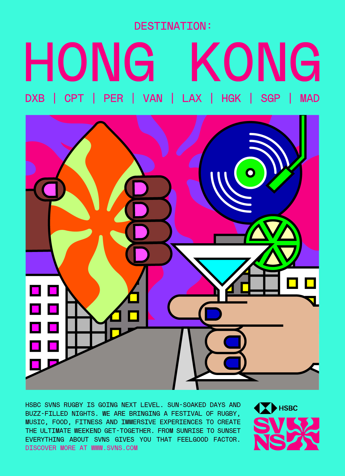
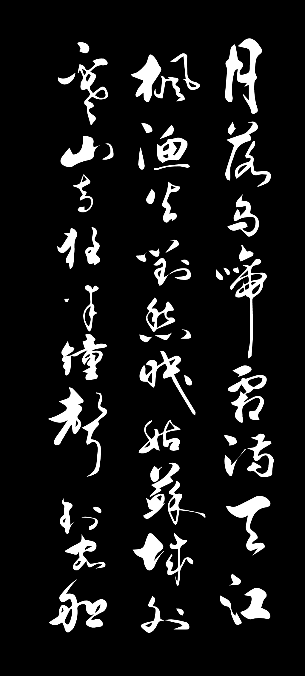
Konichiwa.
Yuriko is shaped by two cities, two tongues, two time zones, two cups of tea, Green & PG tips.
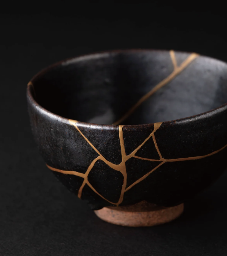
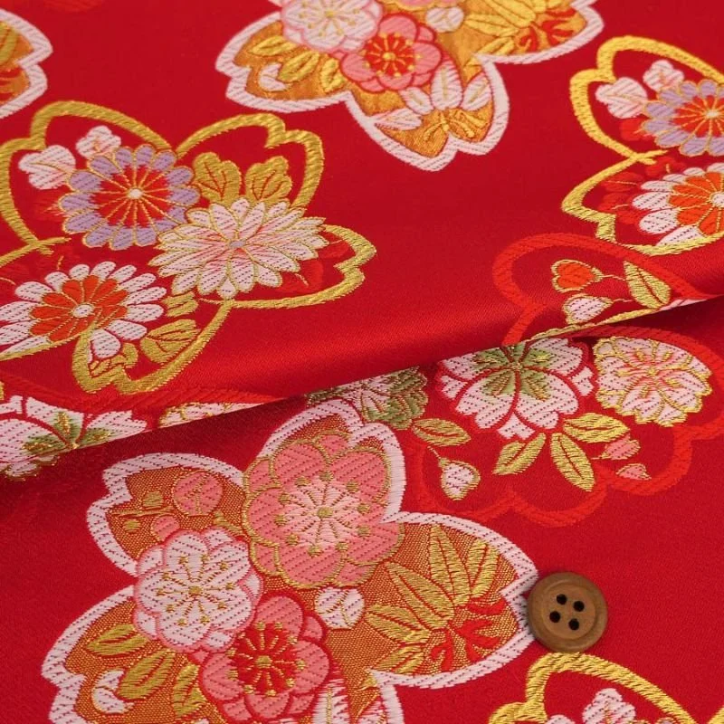
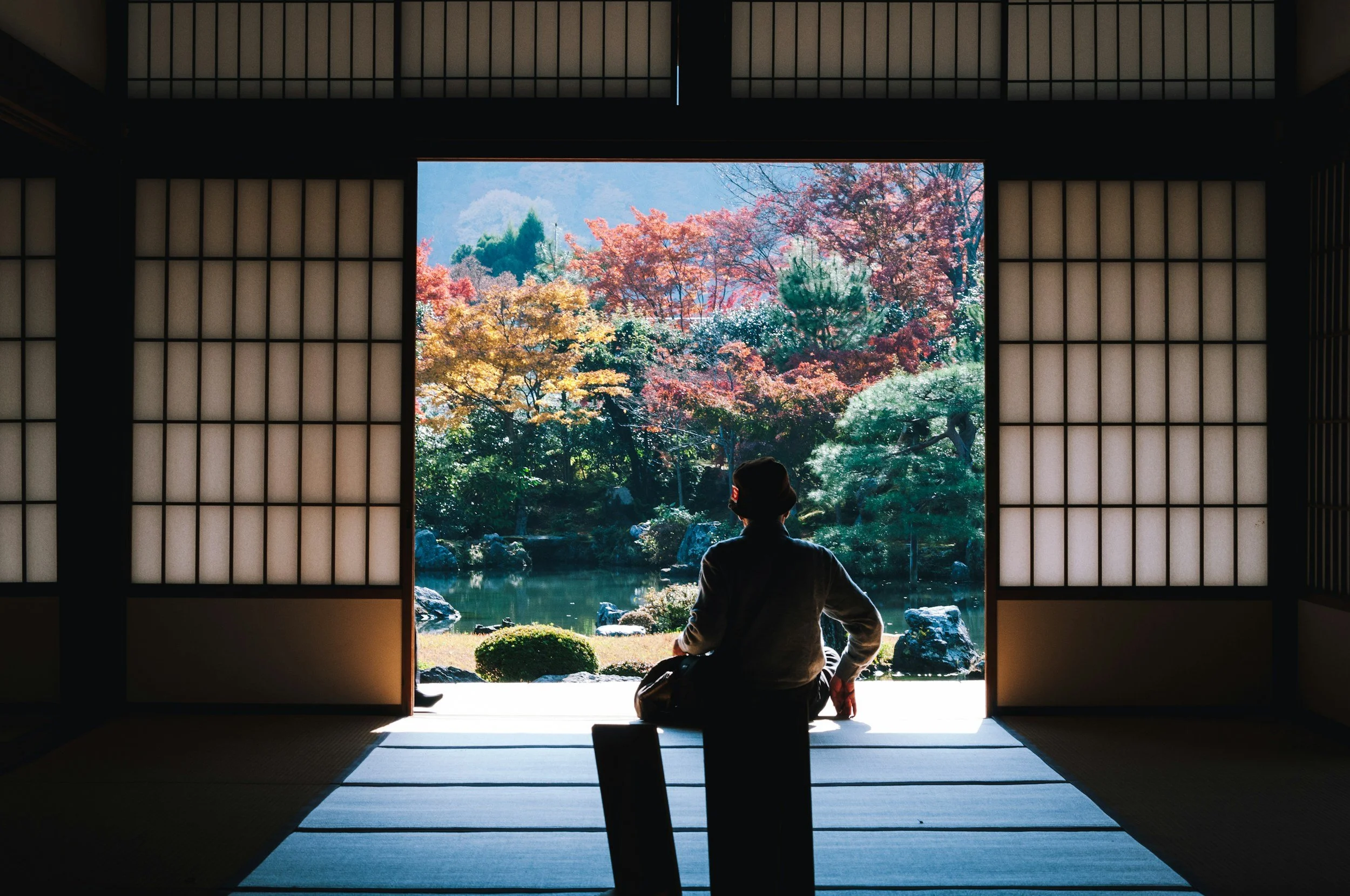
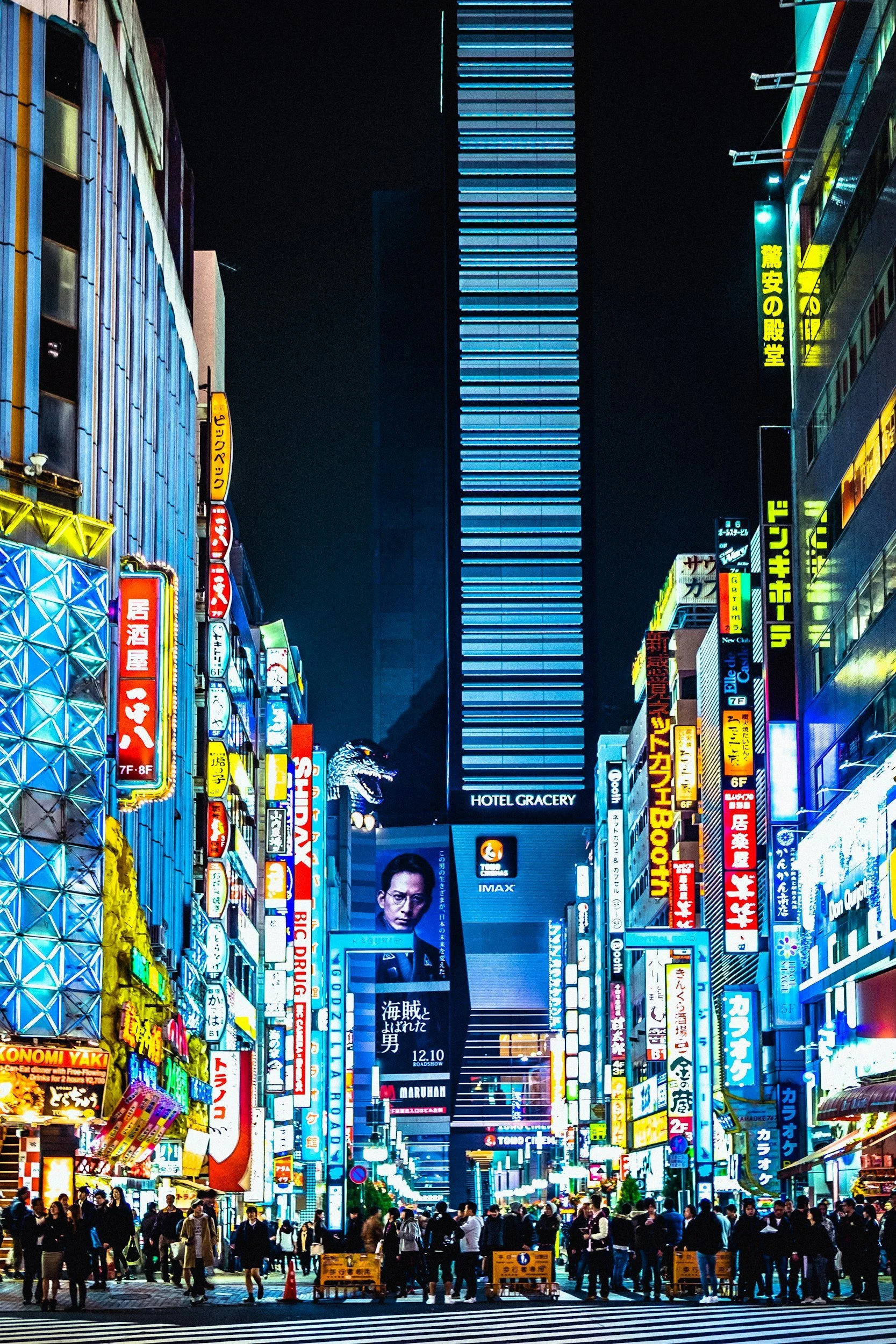
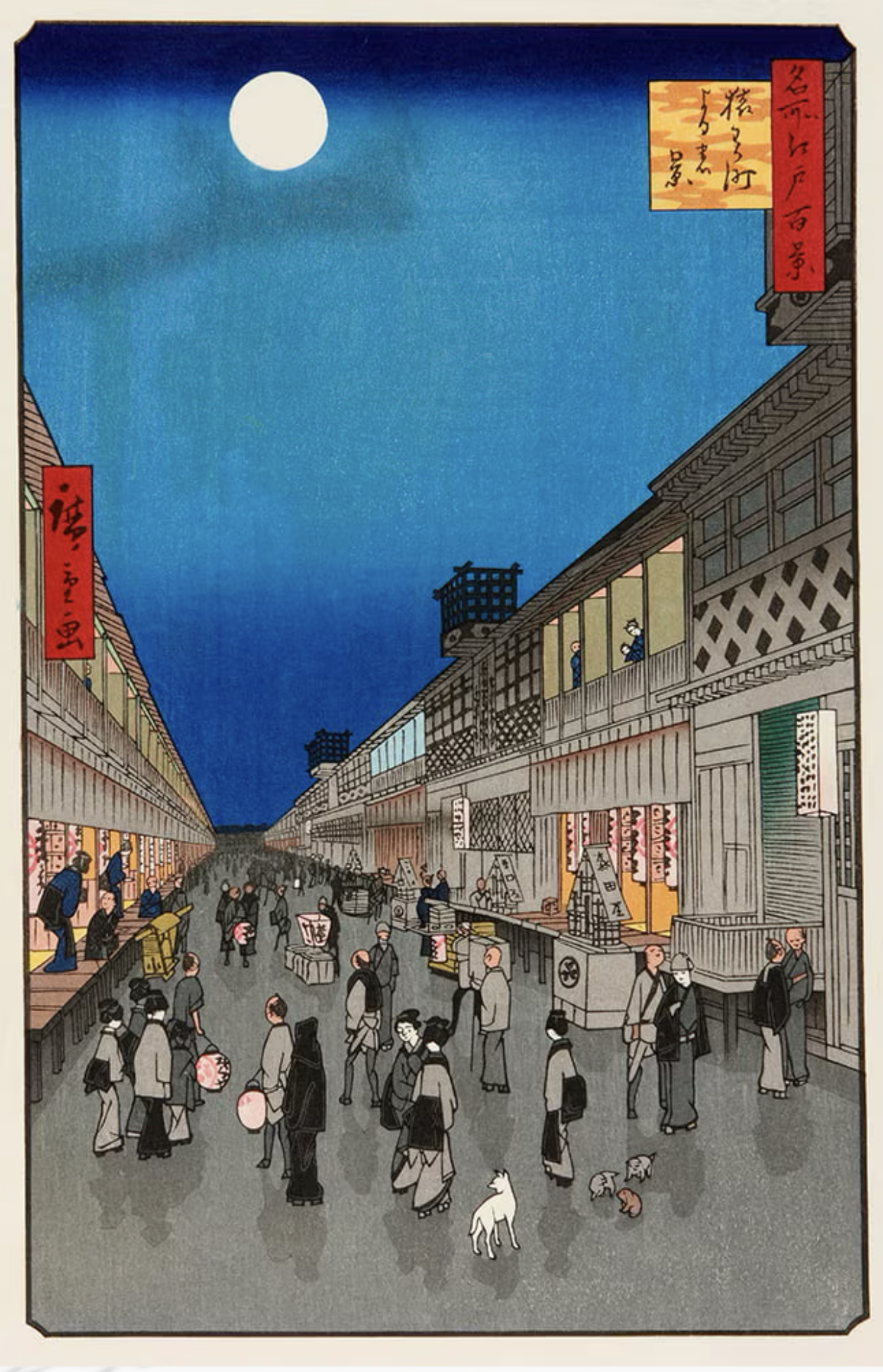
From: Born in Tokyo, raised in Kanagawa, Japan
Love : Seeing and doing Art, vintage & antique finds, and spotting bench plaques
Love and Hate: Playing chess (so stressful)
Hate: MarmiteSome people called me “the little book girl” at W+K Tokyo.
because of the risky application I sent.

Step1: Sent a big box measuring 100cm×100cm to apply for the job.

Step 2: The box had many cushioned pads stuffed inside. It contained my portfolio, which was a very “little book”. Along side it a magnifying glass.

Step 3: On the front cover of this “little book” a message was written ‘You have a good eye that you find my tiny work’.

Step 4: A receptionist received a box, and sent an email to the whole building, after nobody claimed it. ‘Hi, everyone. Mysterious package arrived, addressed with Wieden with only plastic bubble cushion things inside. Does this belong to anyone? Thank you.’

Step 5: Someone thought it was odd and when the box was checked amongst the plastic pads, there was a very “little book”. Approx 3cm×3cm in size. An email was sent out again within the building. ‘Hi guys, This was a Kennedy’s entry! Check it out :) Sooo neat!’

Then, W+K contacted me via a phone call and their opening line to me was, “Hello, is this the little book girl”.
I hoped that by challenging my fear, the little book might be found, and begin a story no one else could write.
Turns out, it did.
Working at W+K Tokyo with international talents opened something up in me, I just realised how big the world actually is.
That’s when I knew I needed to step outside of my comfort zone. So I came to London.
(Nobody warned me I’d be offered tea 6 times a day.)But I stayed. And I grew.
My works

A shift from aesthetic to essence.
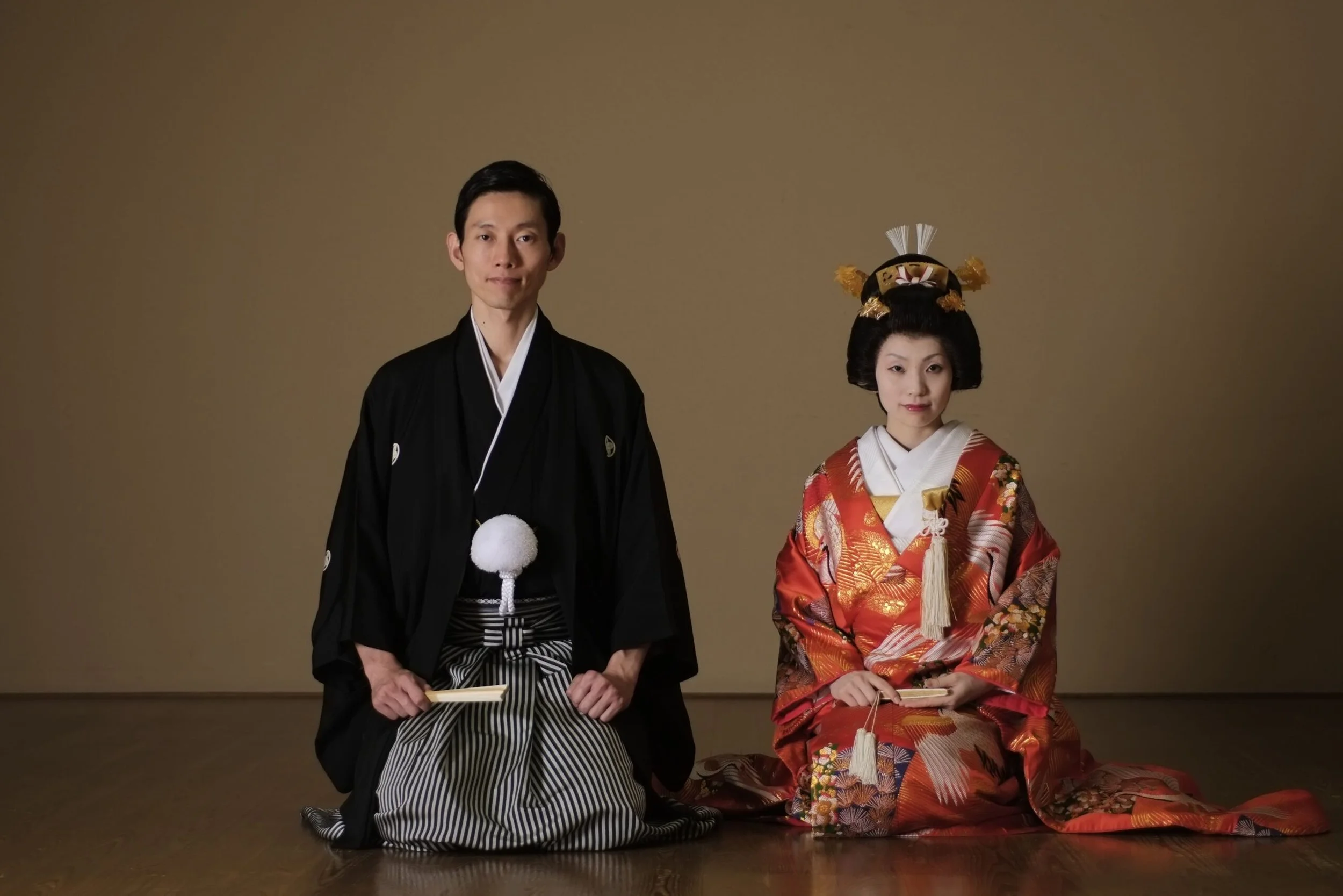
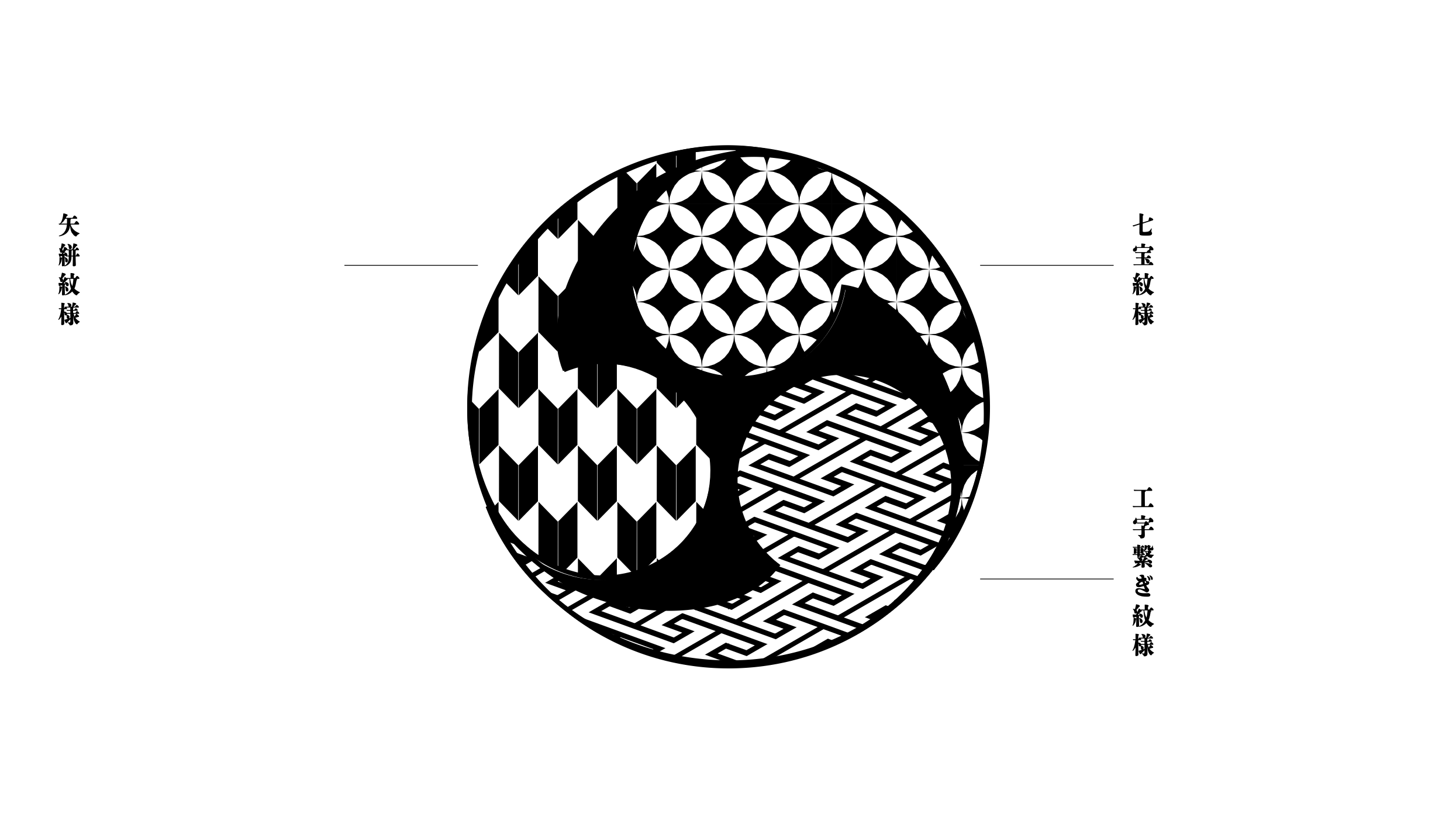
I worked across a range of creative outputs for Nissan Formula E, from livery design to design system, office design, advertising, social content, and beyond. But throughout all of it, I kept coming back to the same question: How can I shift from aesthetic to essence? From designing how Japan looks, to designing how Japan feels. This idea became my compass as I explored how to bring Japanese identity into global motorsport, not through surface-level symbols, but through emotional texture, movement, and tone.
Not just something recognisably Japanese, but something that could energise people, unite a team, and move with purpose.
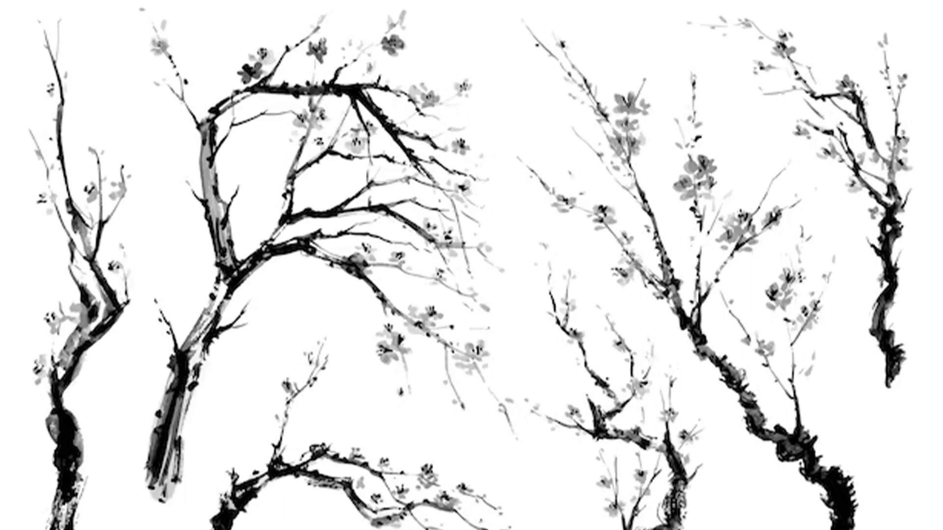
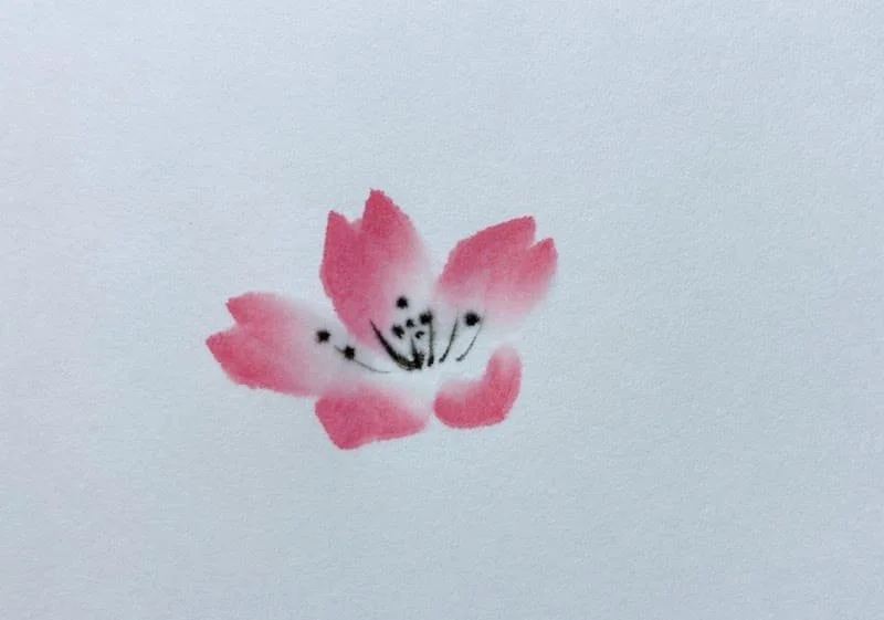
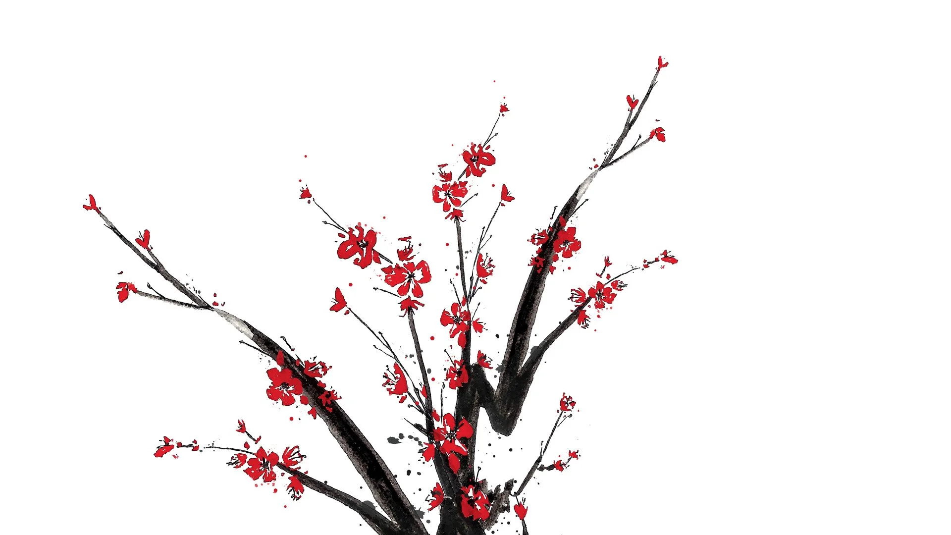
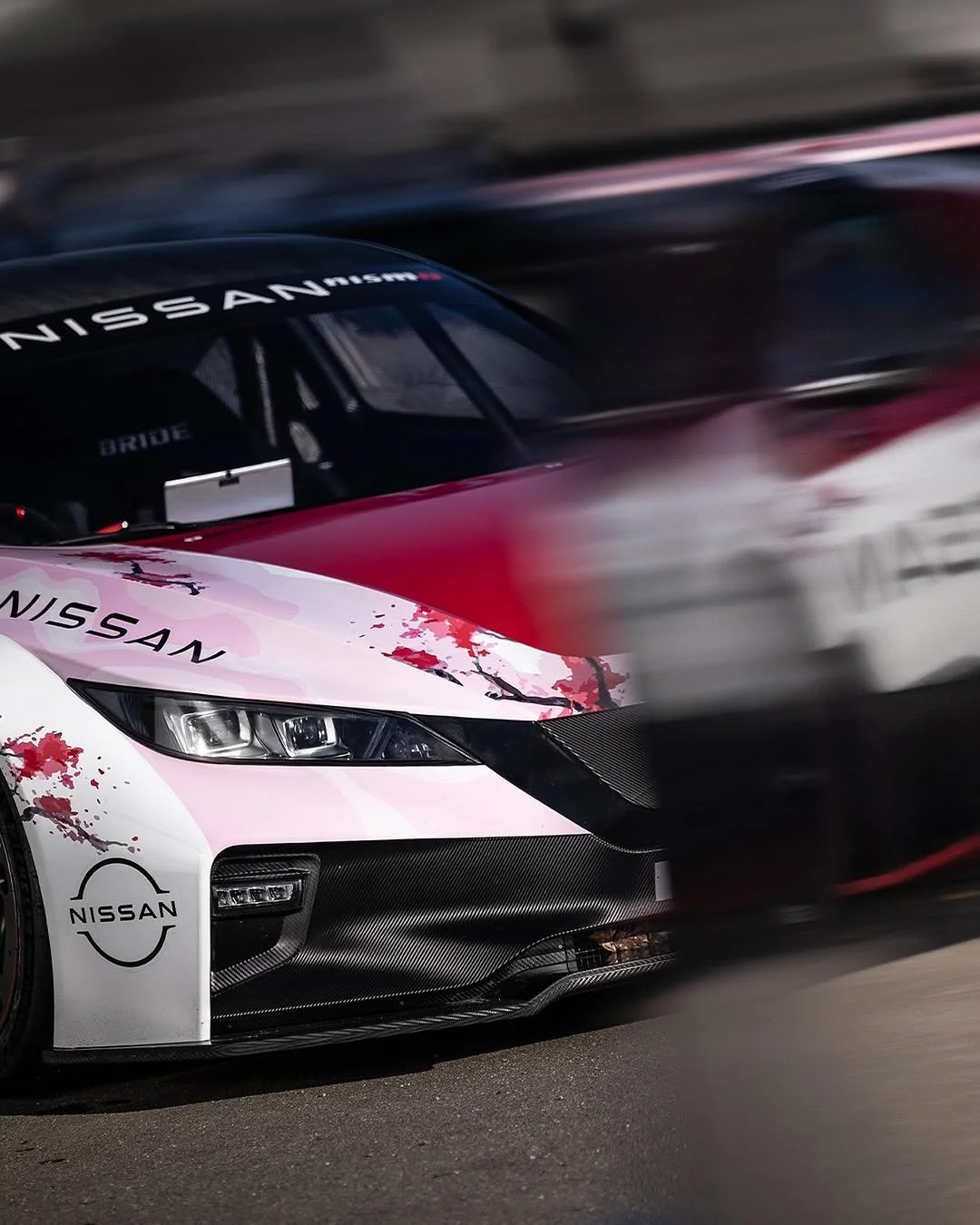
This journey began with a single blossom.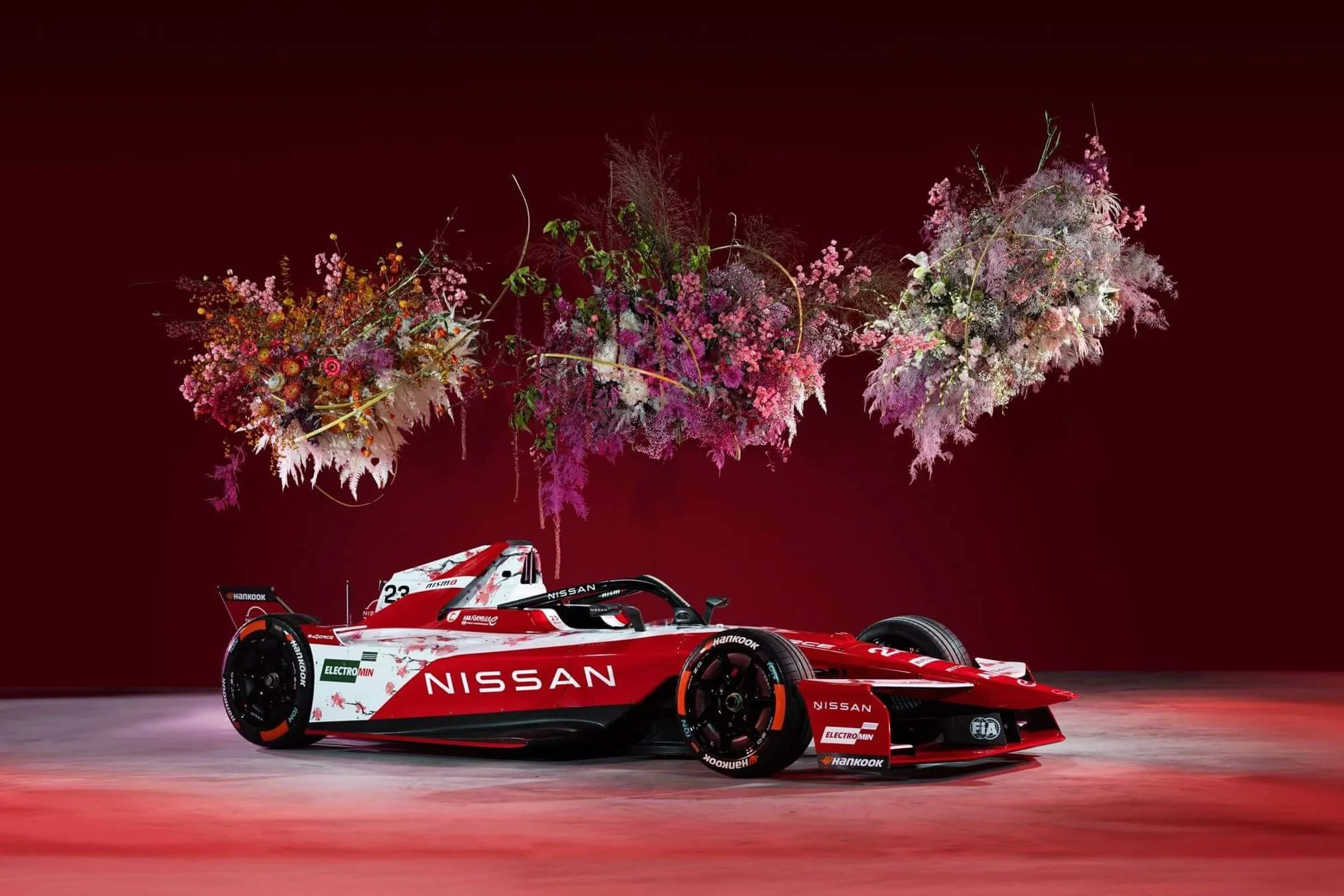
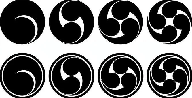
Finding the symbol, was the first spark.
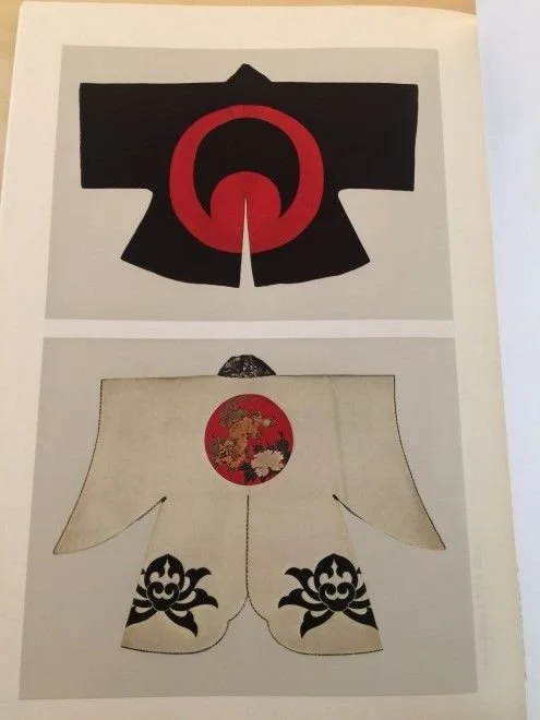


Together with the creative team, we brought forward symbols from Japanese culture that could represent Nissan FE. My role was to shape ideas, then work closely with the ECD to test their meaning and deepen their relevance. From many possibilities, a few strong directions emerged.Designing belief.


This was never just about designing a car. Nissan was entering a new chapter, welcoming new mechanics and hunger to win. My role was to find a concept that could unite the team, and live beyond the track, across kit, race assets, identity and space. Not just a Japanese-thing as an image, but as energy, rhythm and purpose.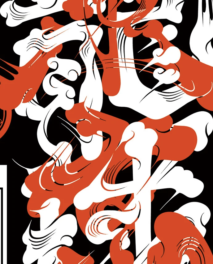
Designed to move belief.

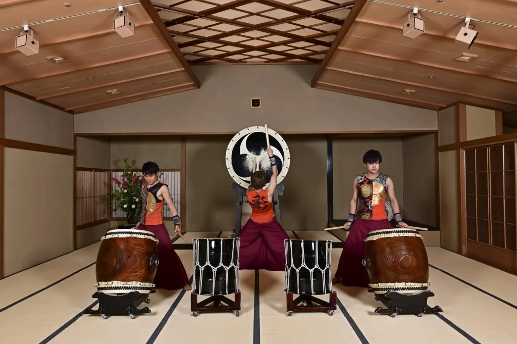
The challenge was to turn cultural ideas into something built for performance. How could the rhythm of Taiko, or the fleeting movement of blossom, come alive in motorsport 322 km/h?
Using 3D tools, I tested how those ideas translated into motion, proportion, speed and surface, until symbolism became something real.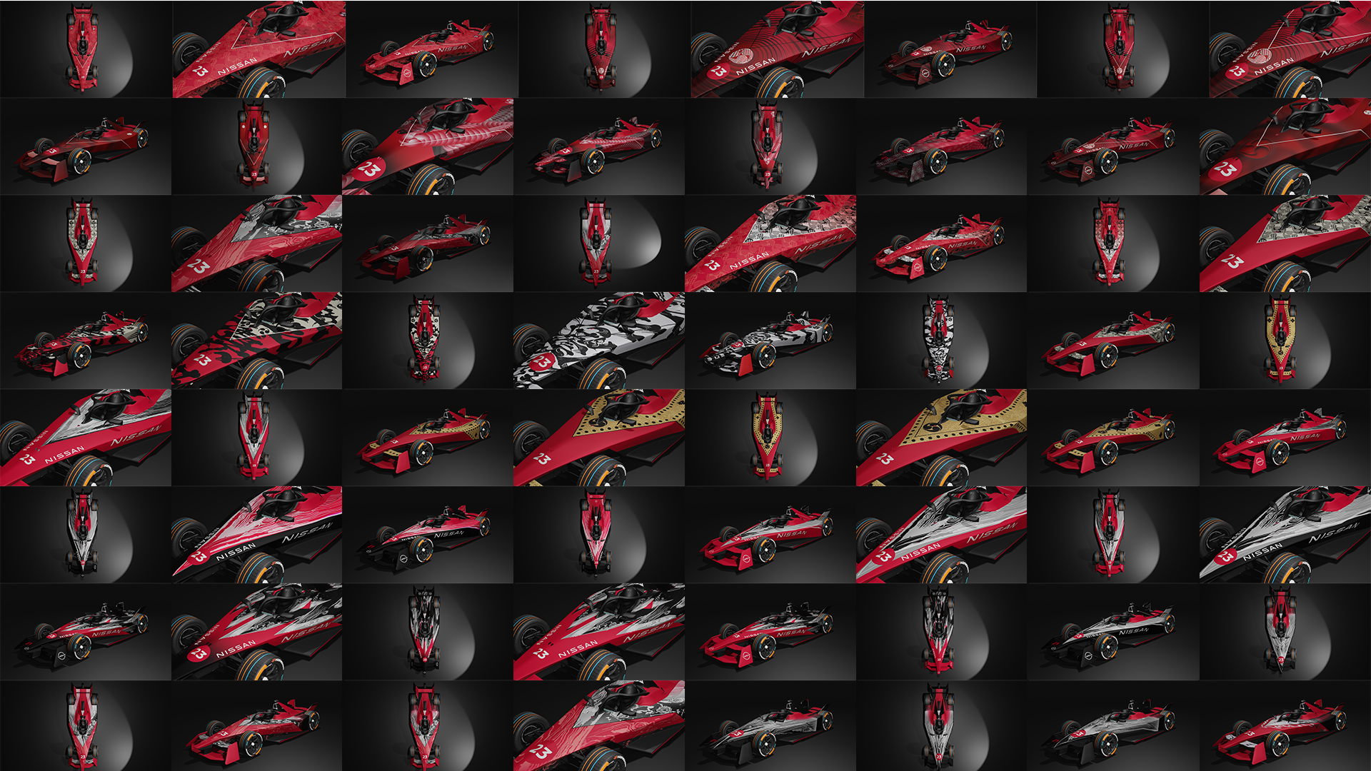
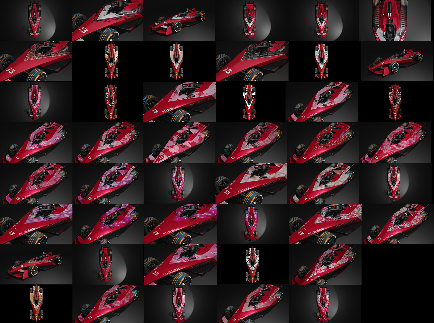
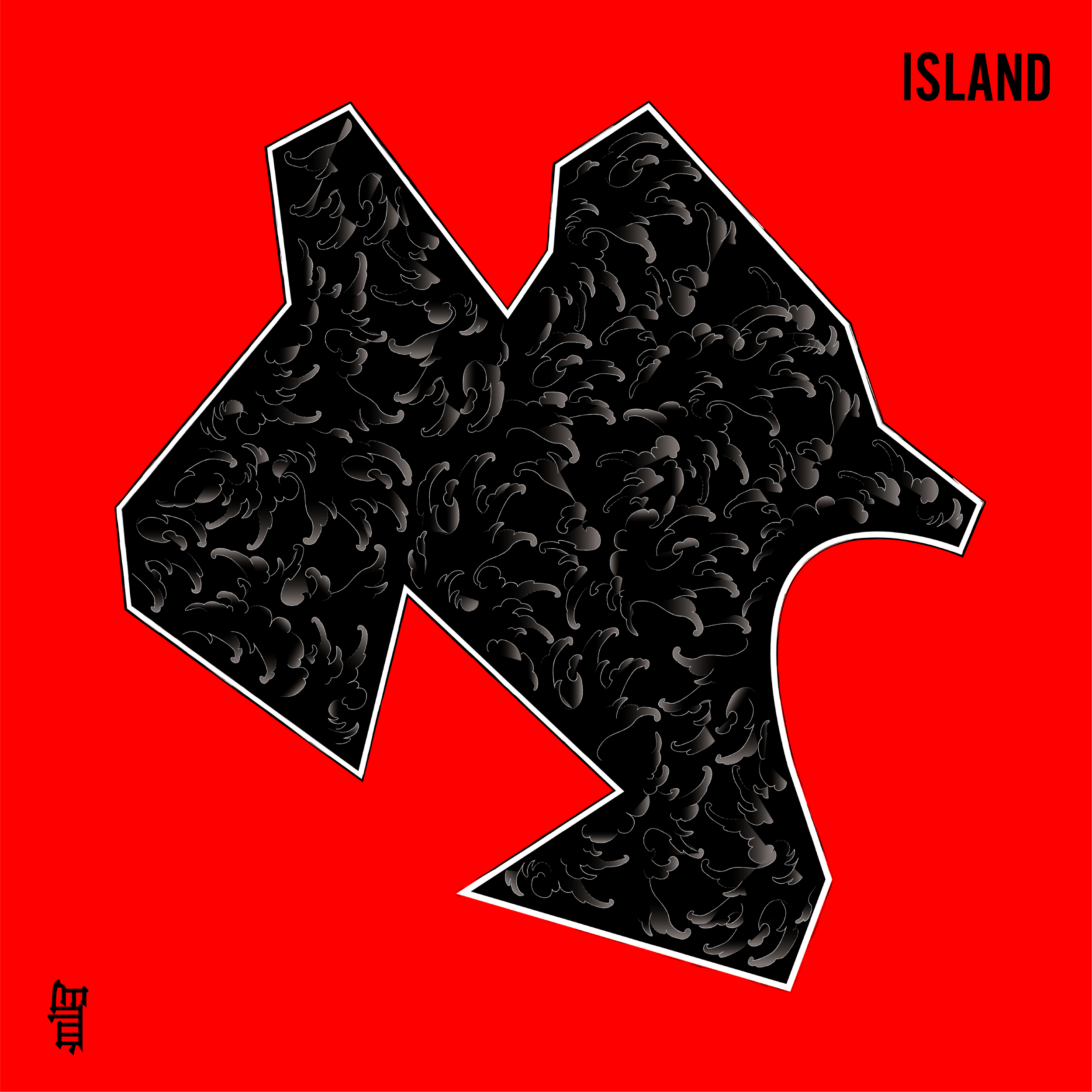
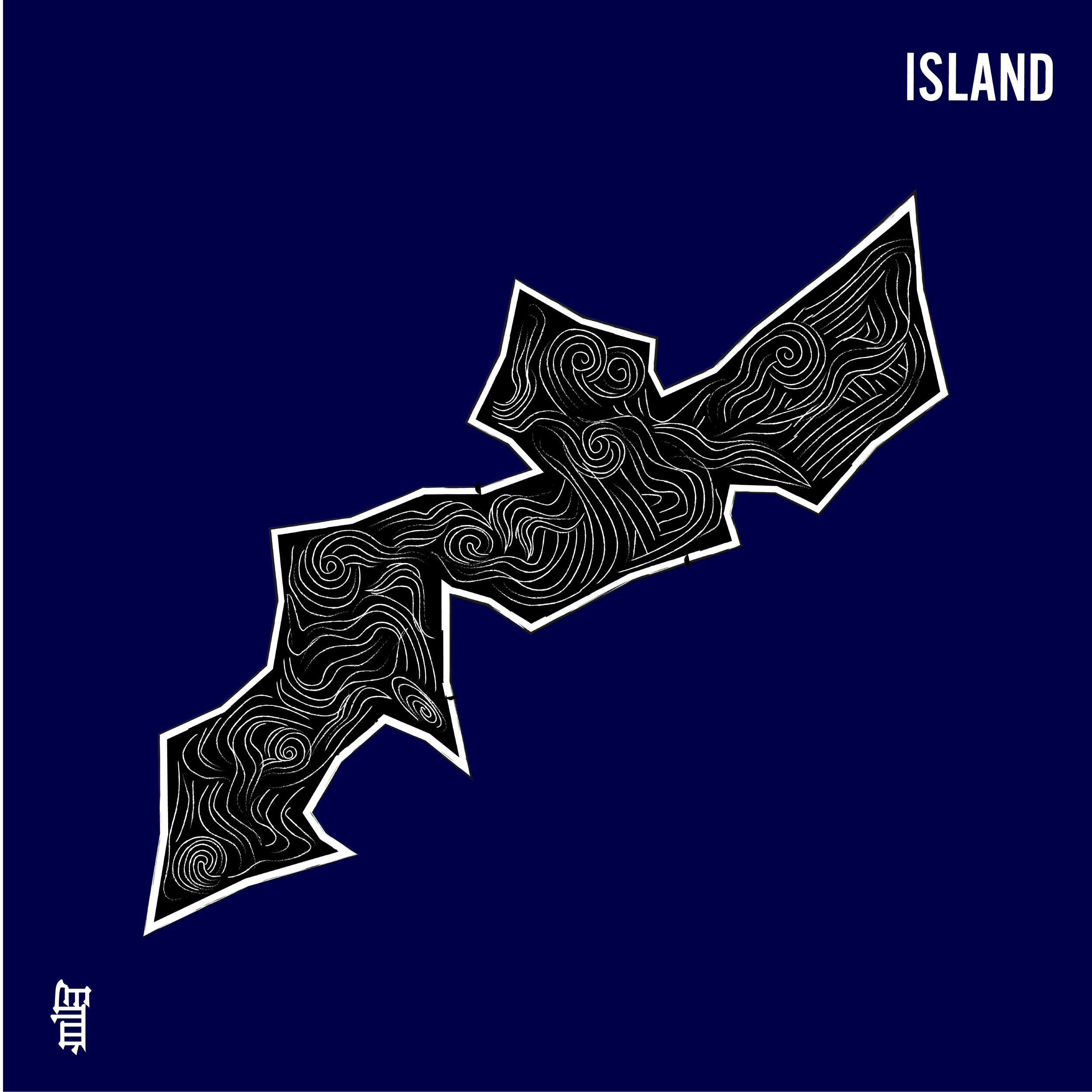
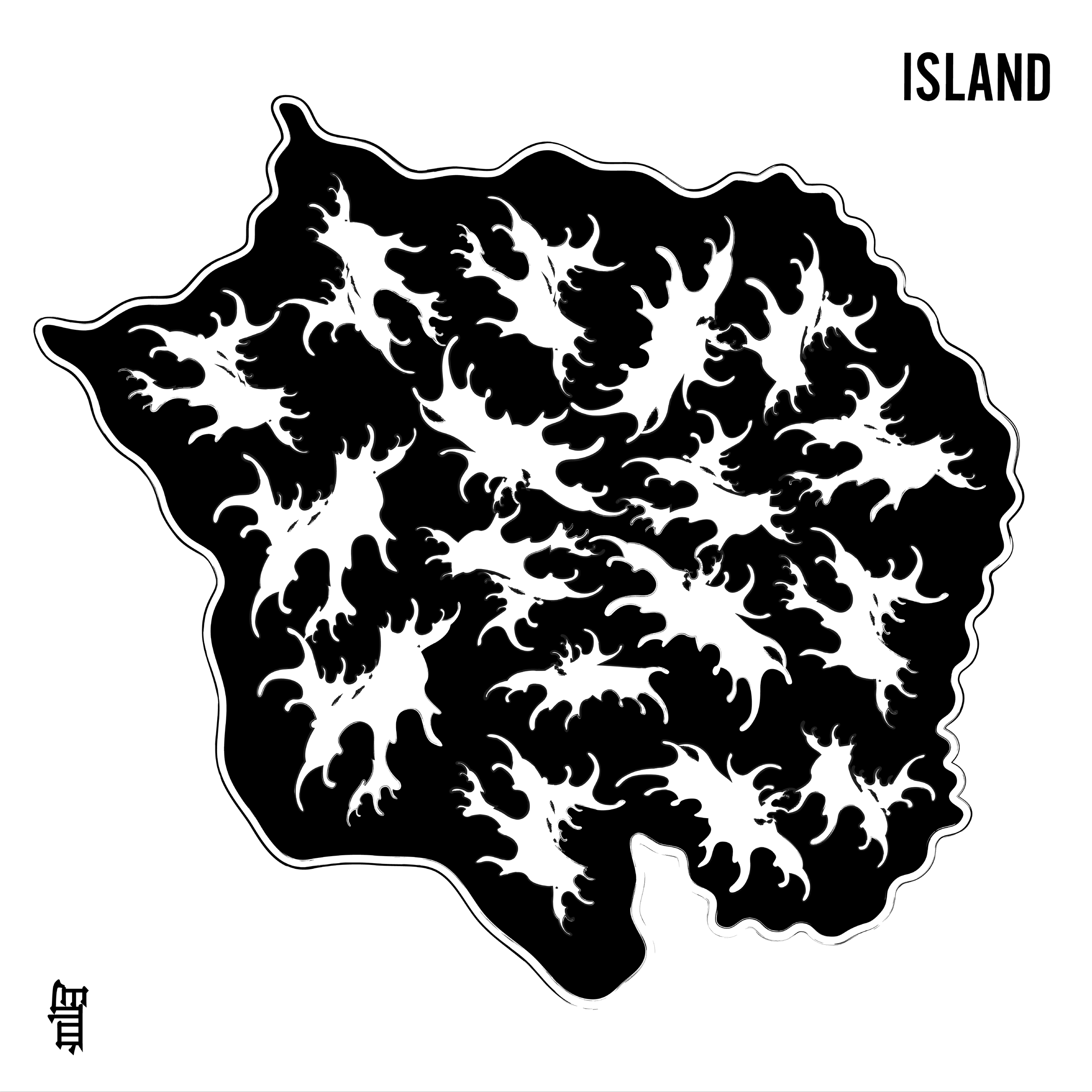
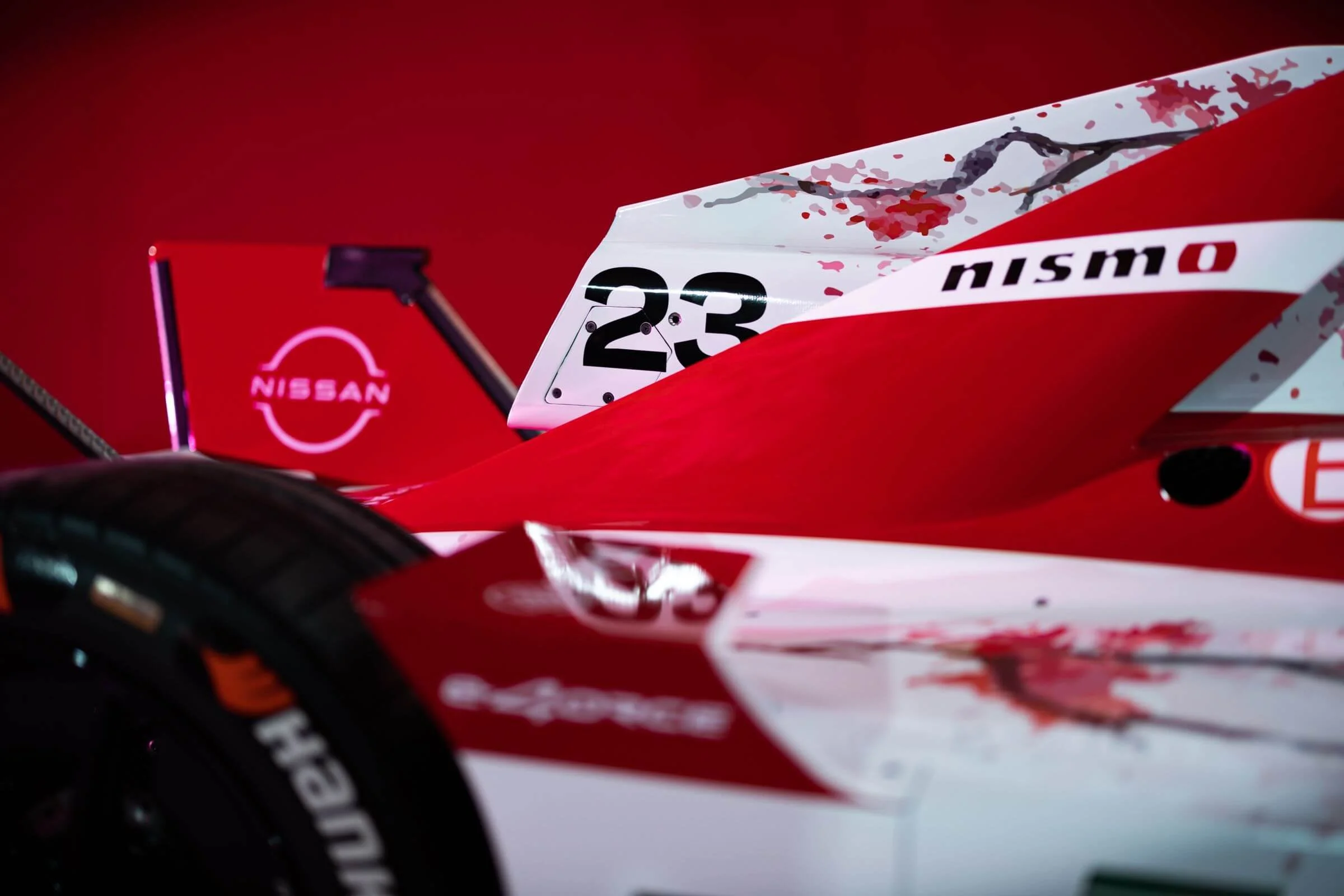
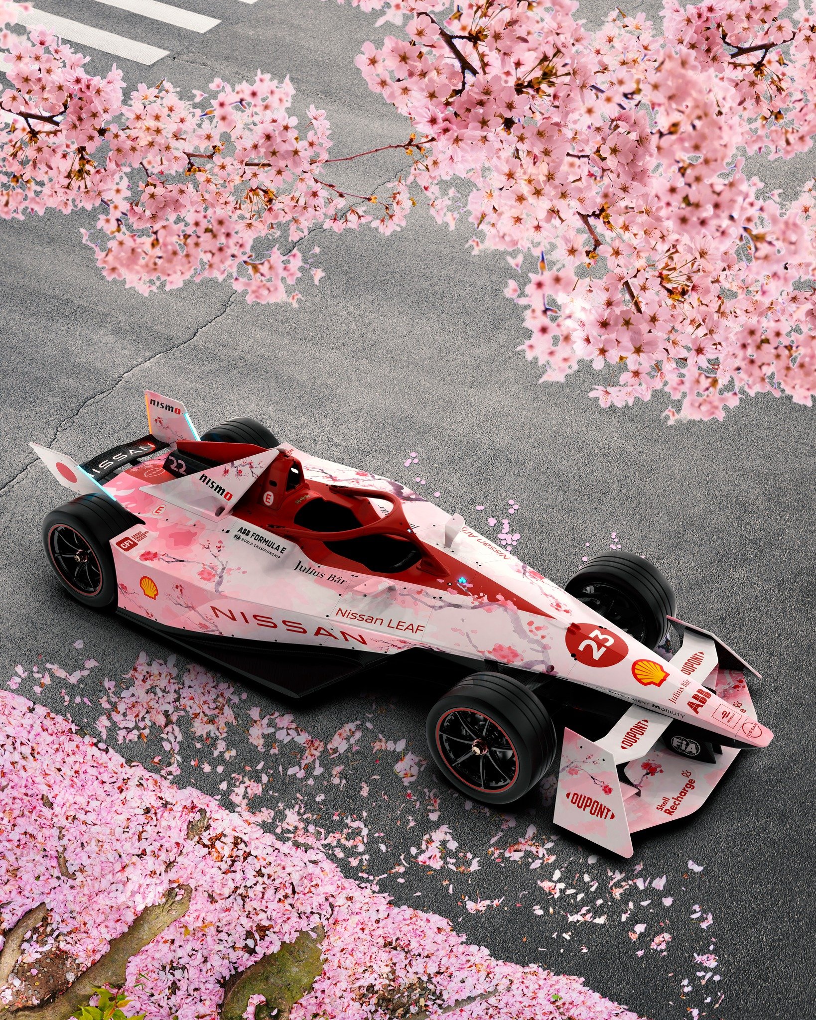
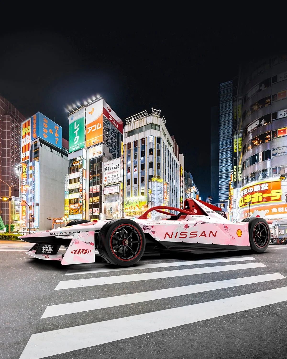
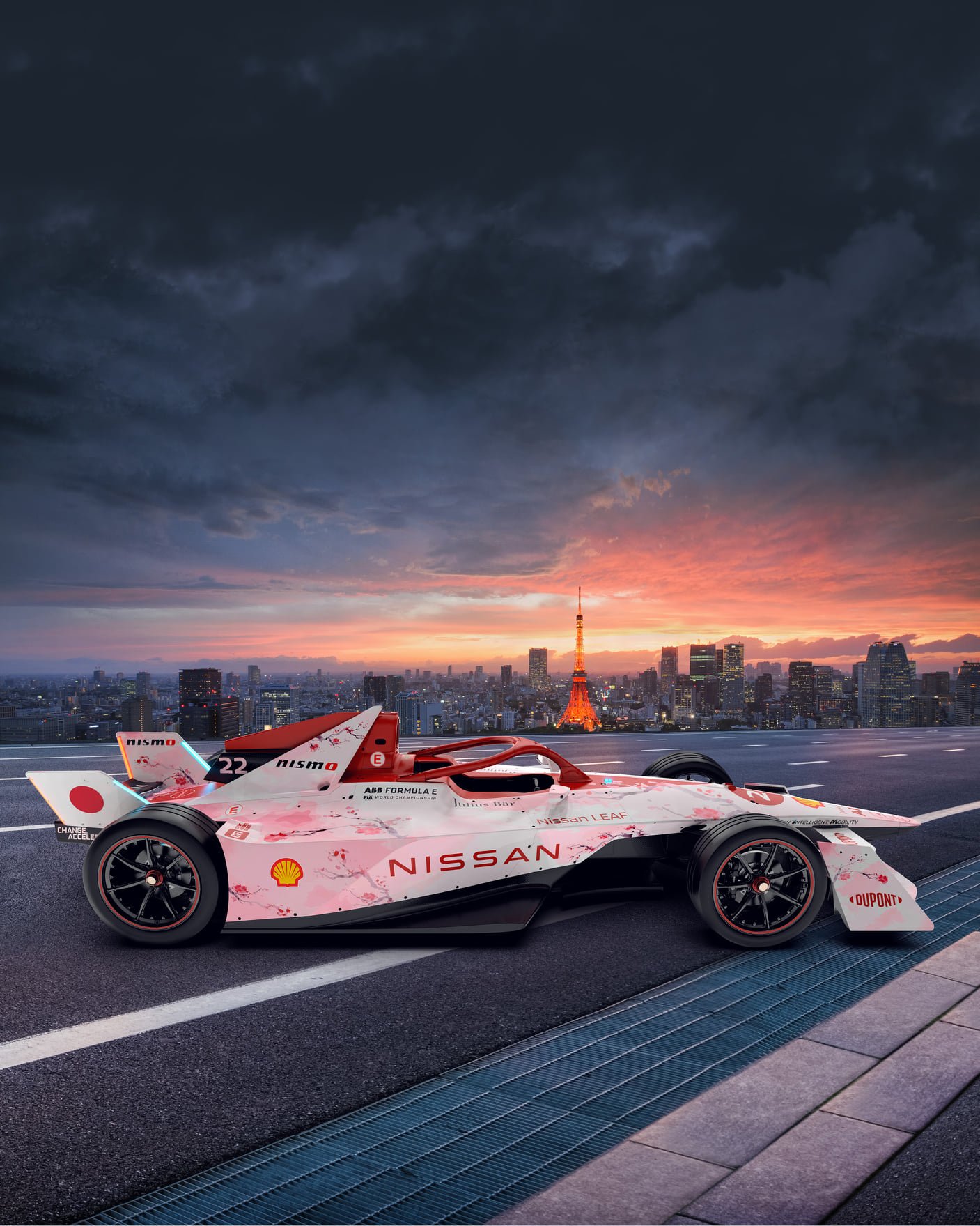
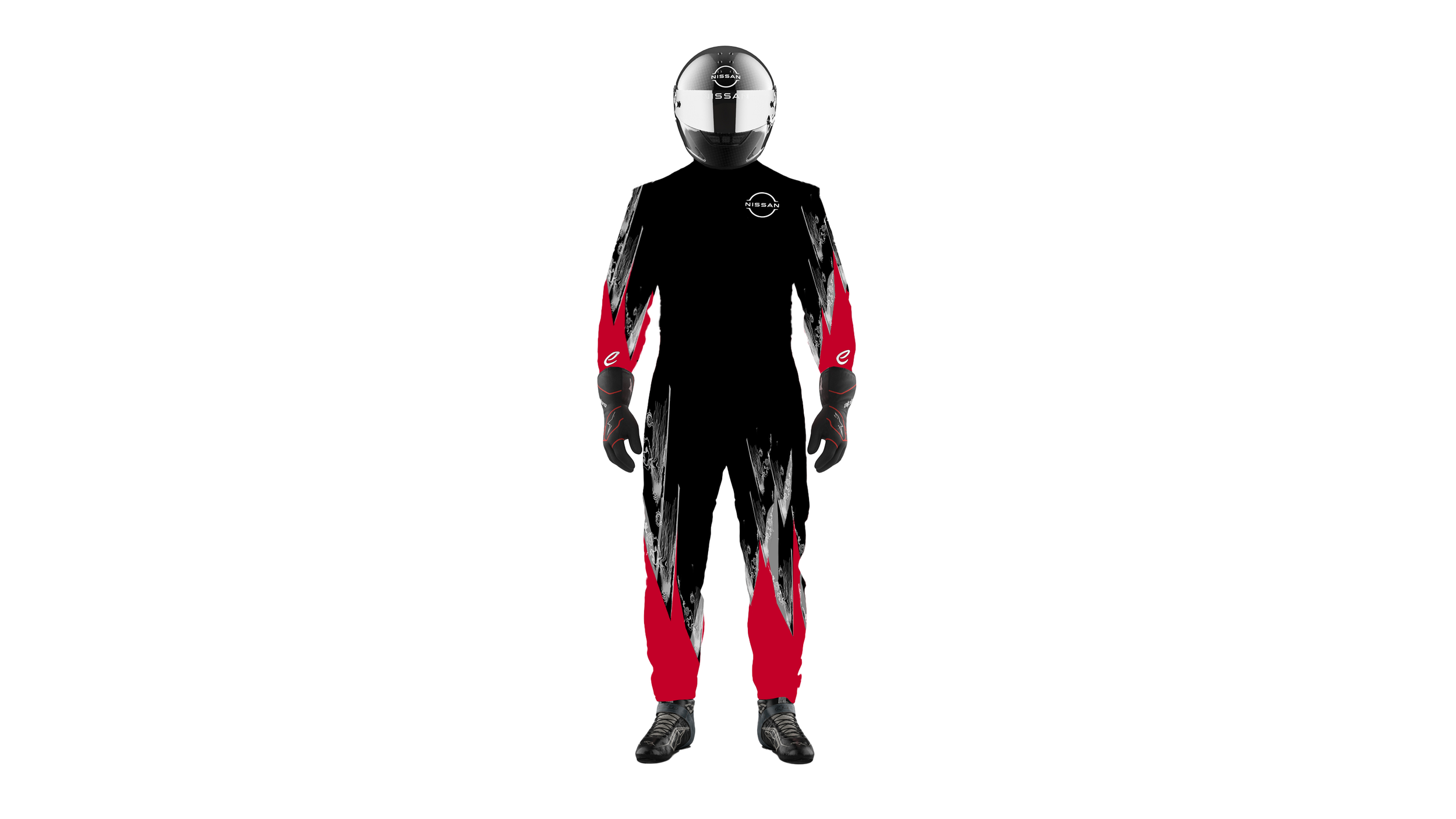
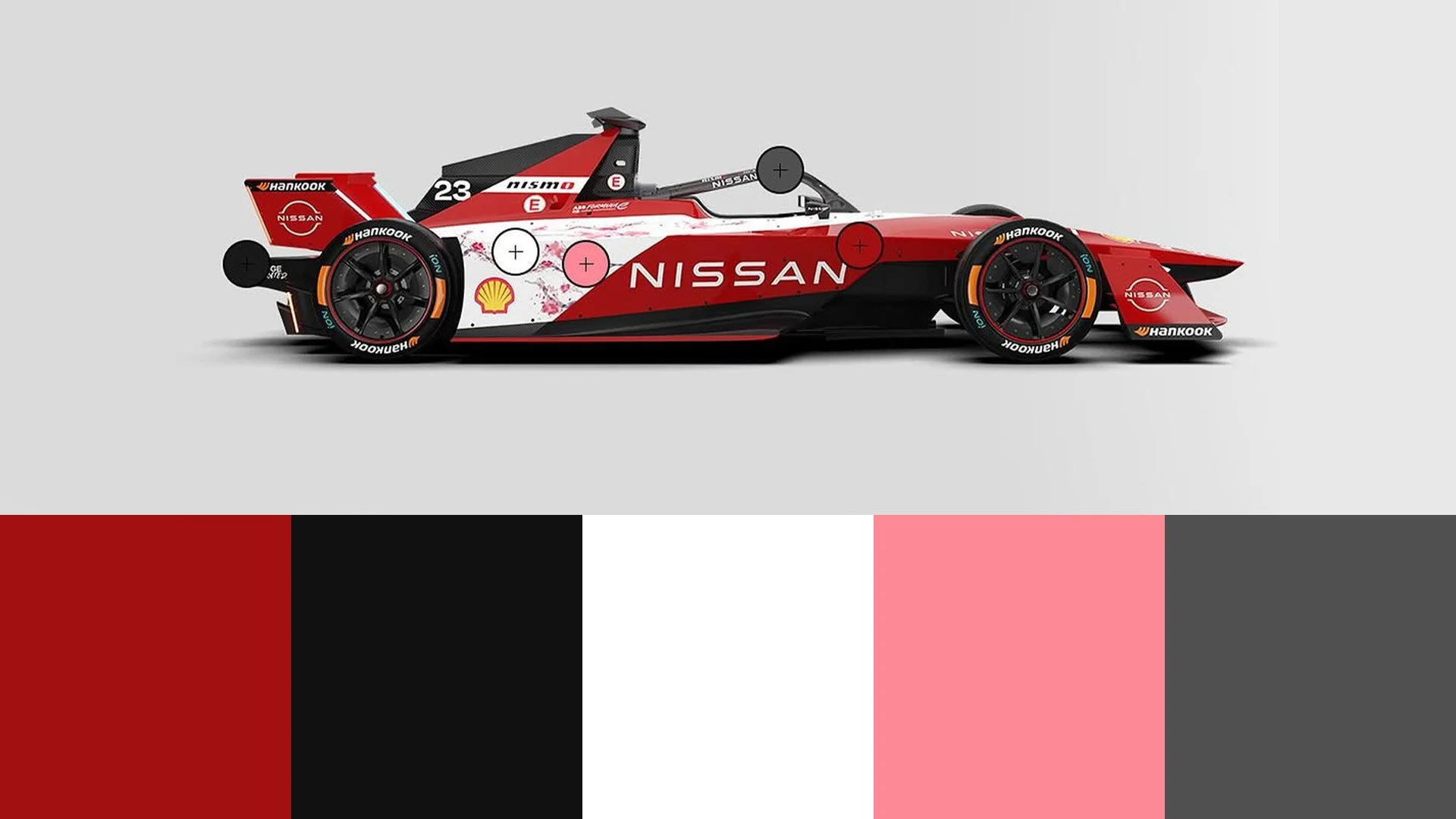
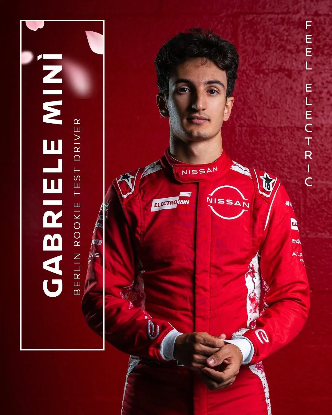
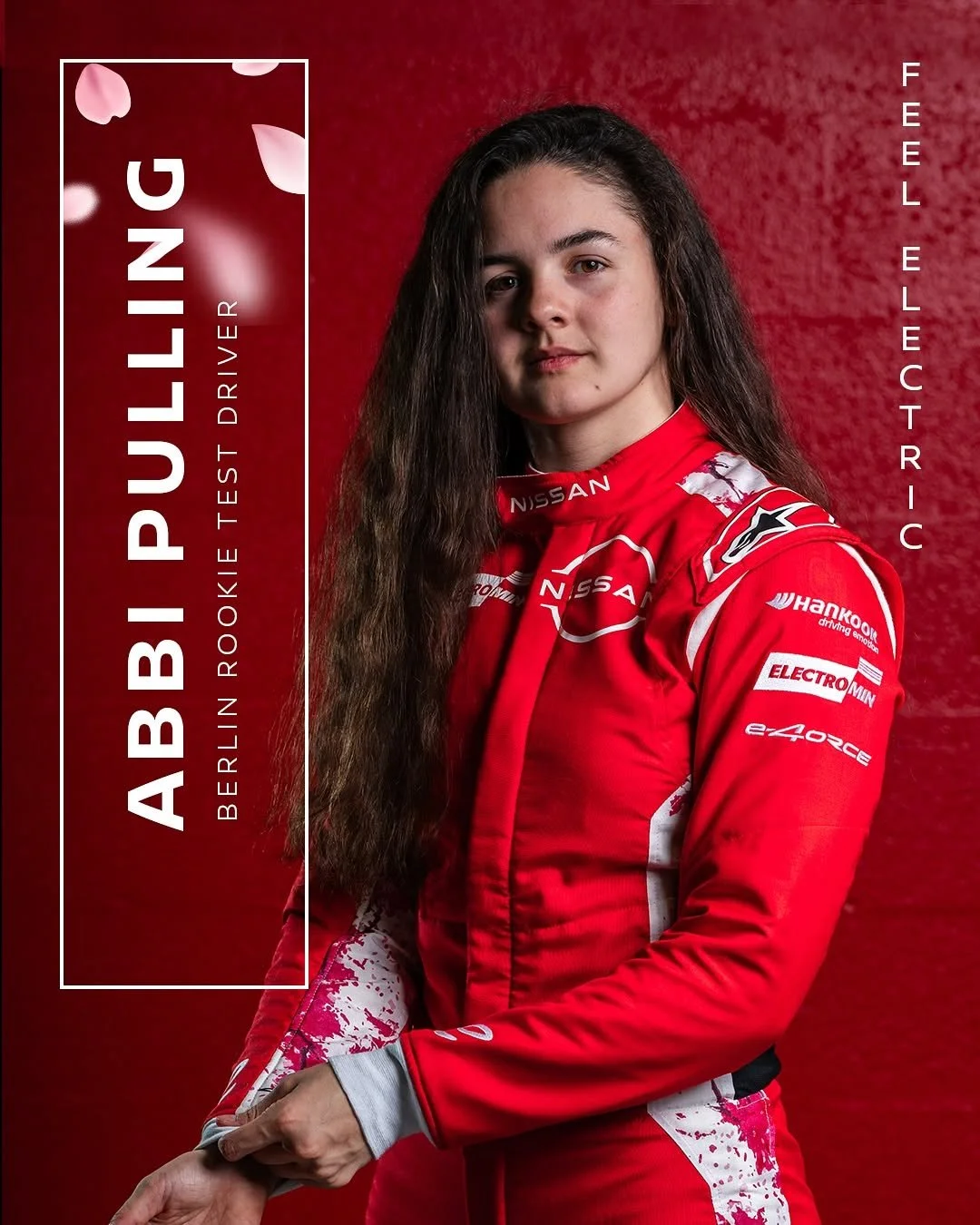
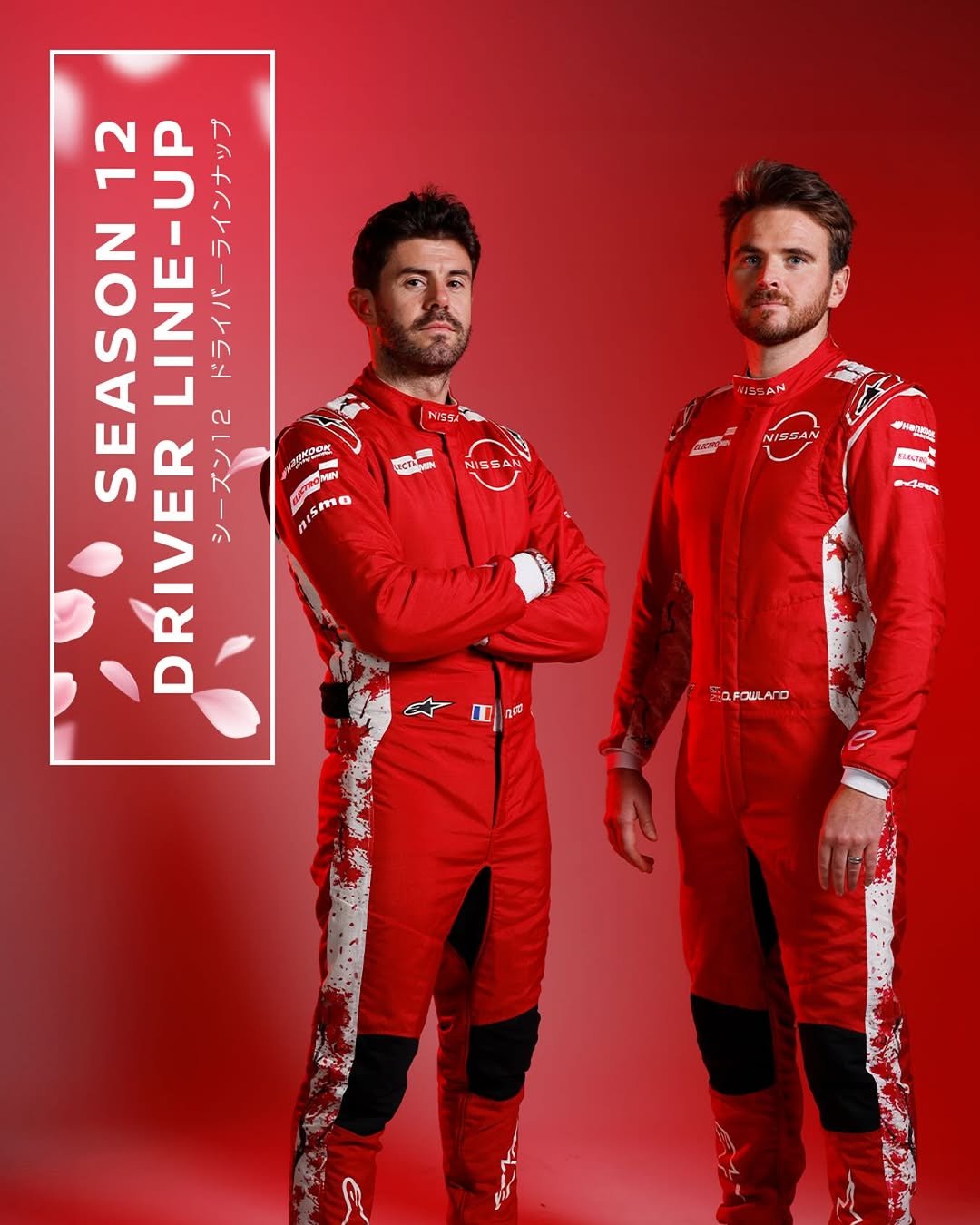
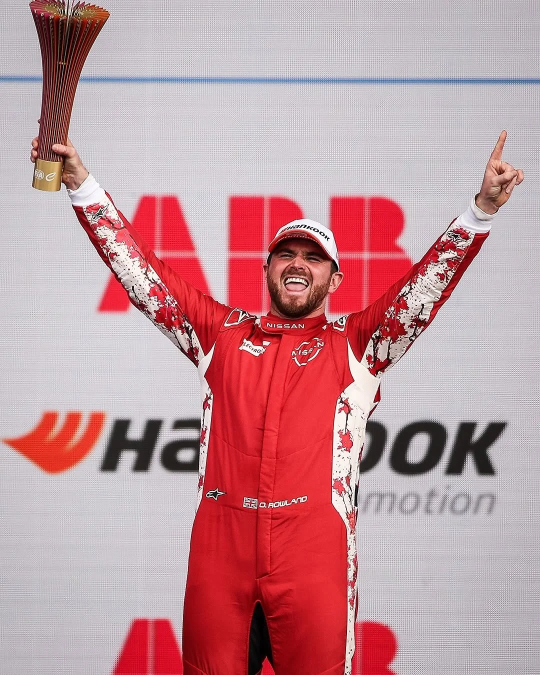
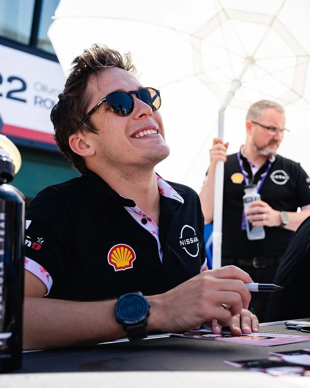
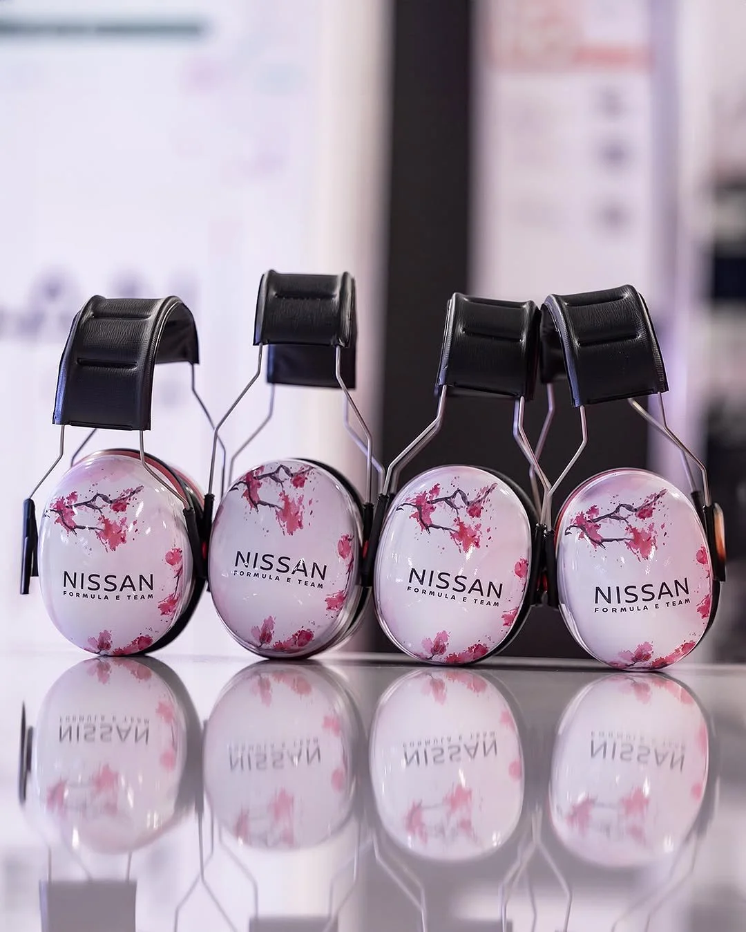
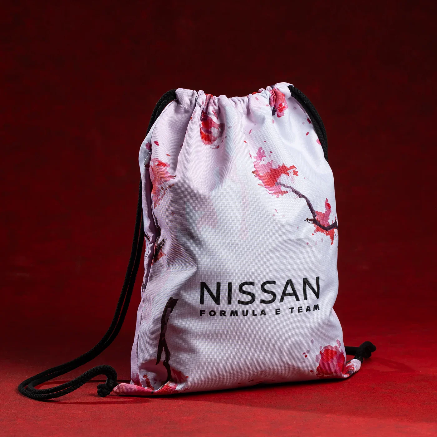
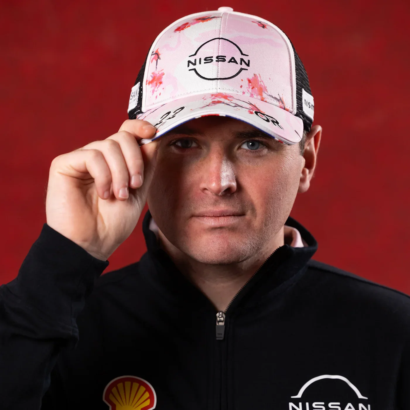
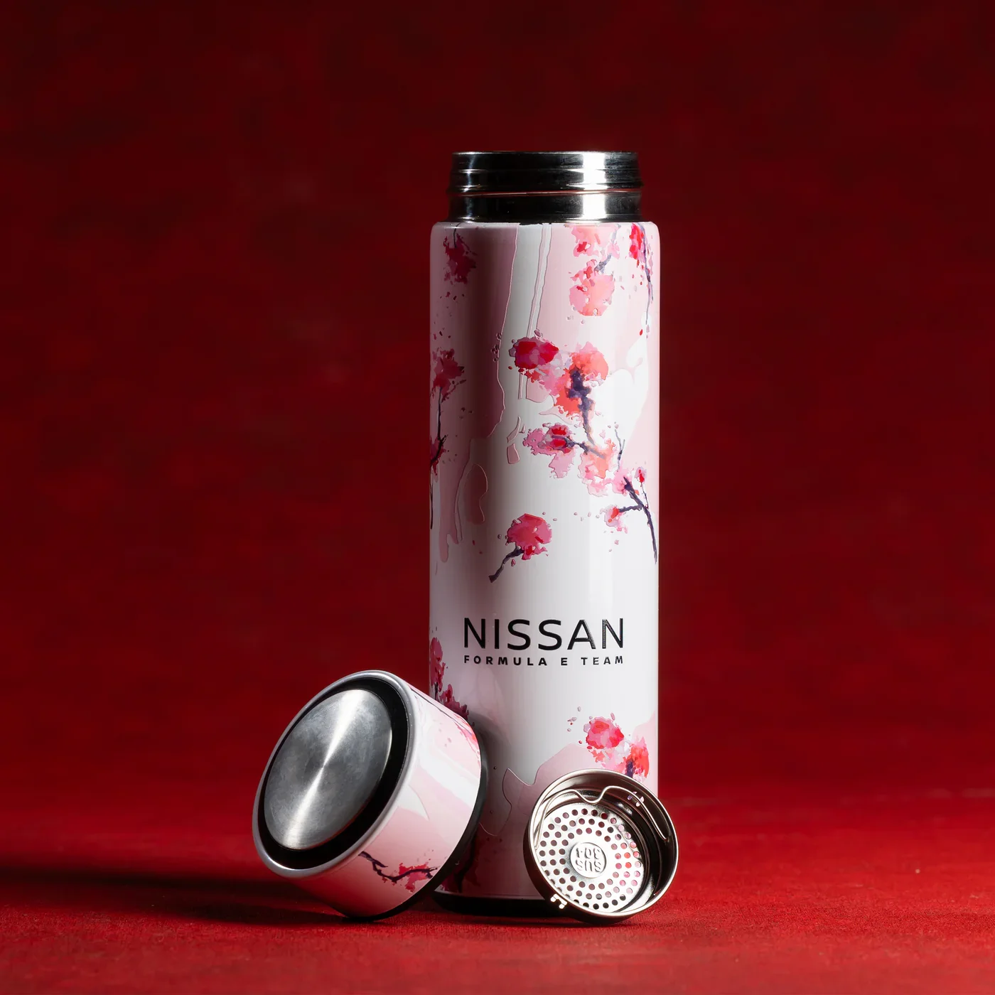
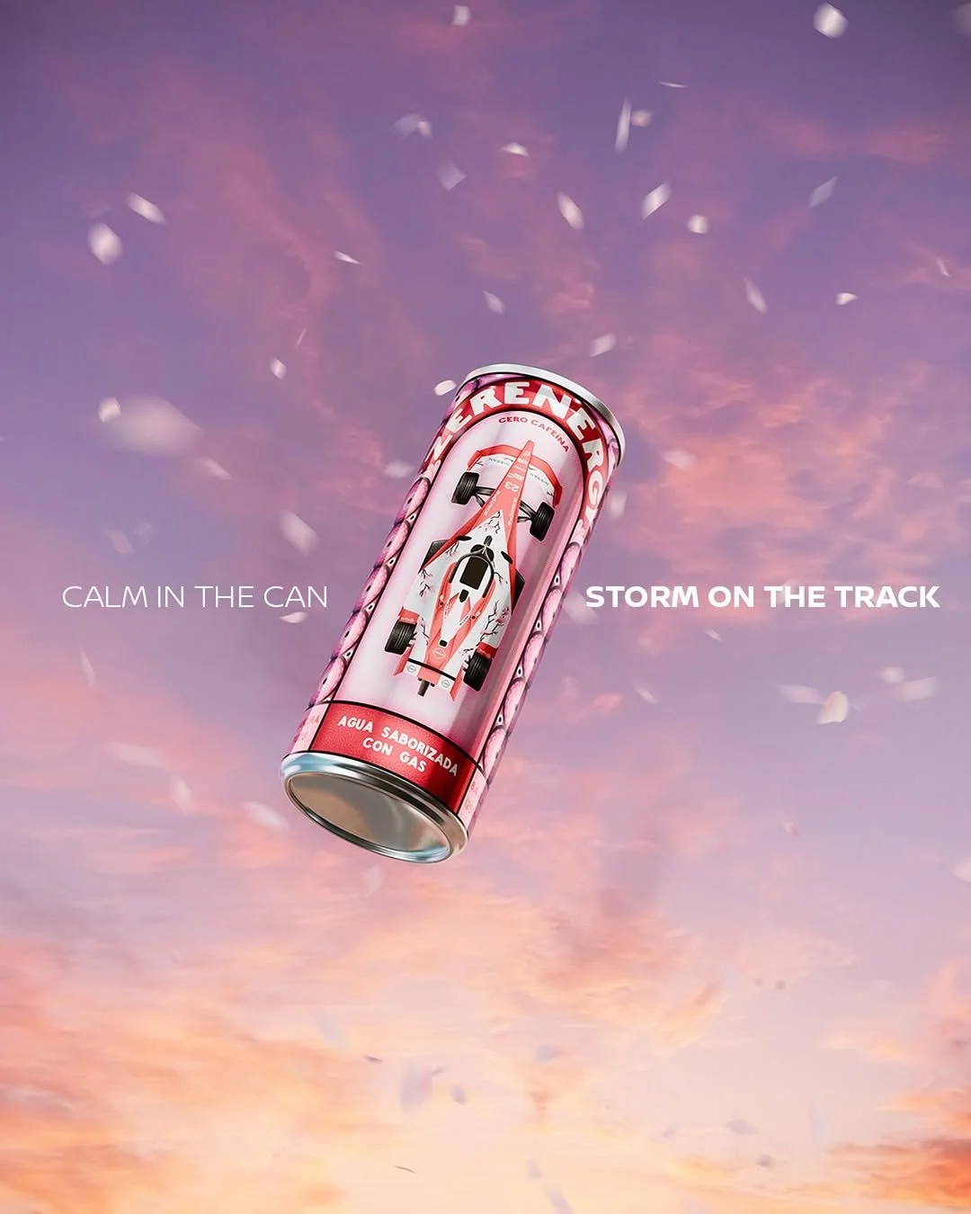
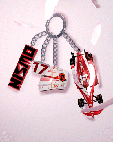
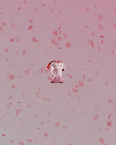
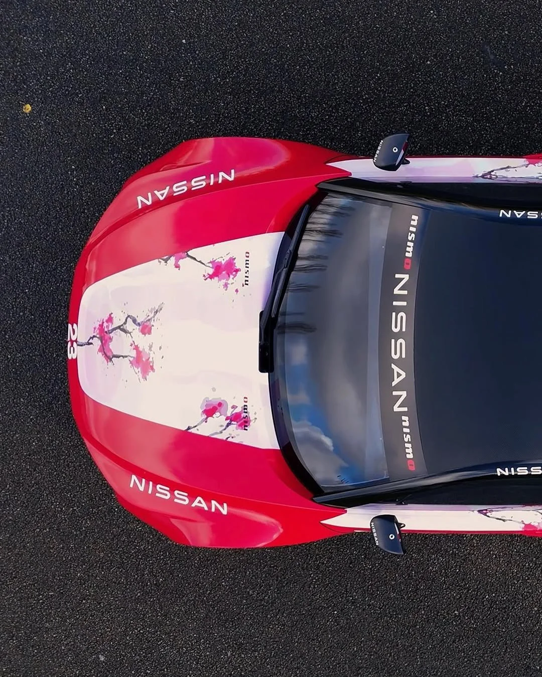
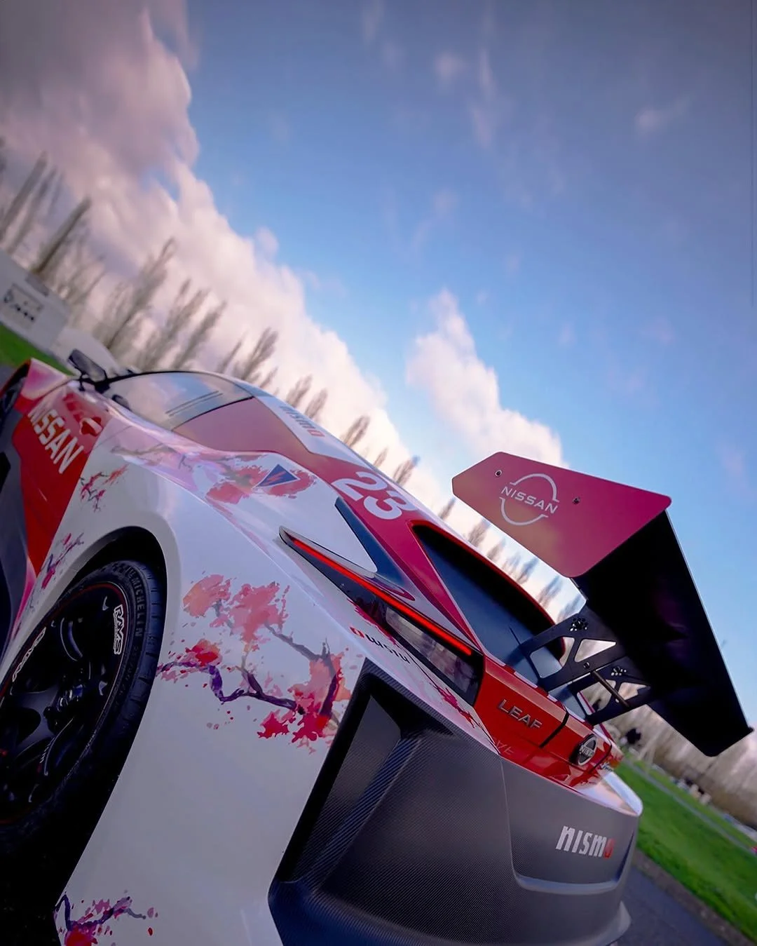
Nissan FE Livery.
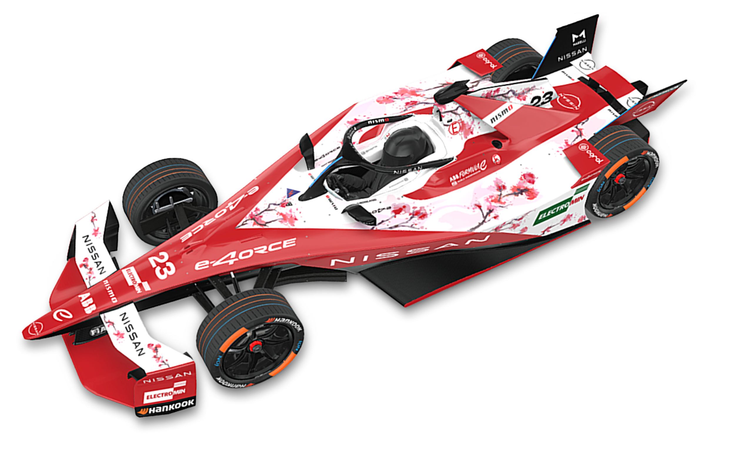
An abstract cherry blossom, built from an artist’s watercolor and reimagined into the livery. Paired with iconic Nissan red, it became a symbol of beginnings. Bringing something rare to motorsport: elegance, softness… and pink.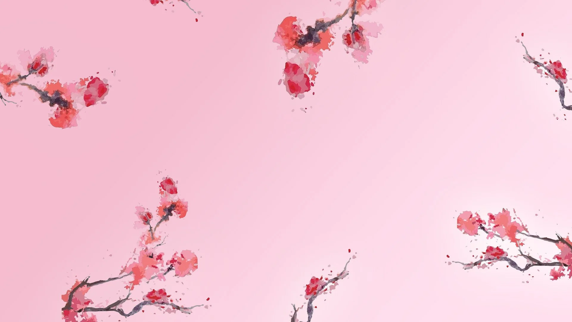

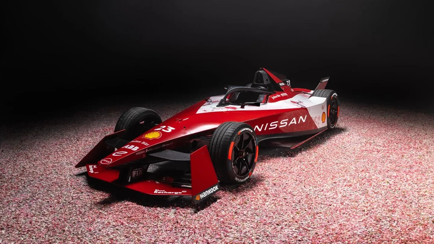
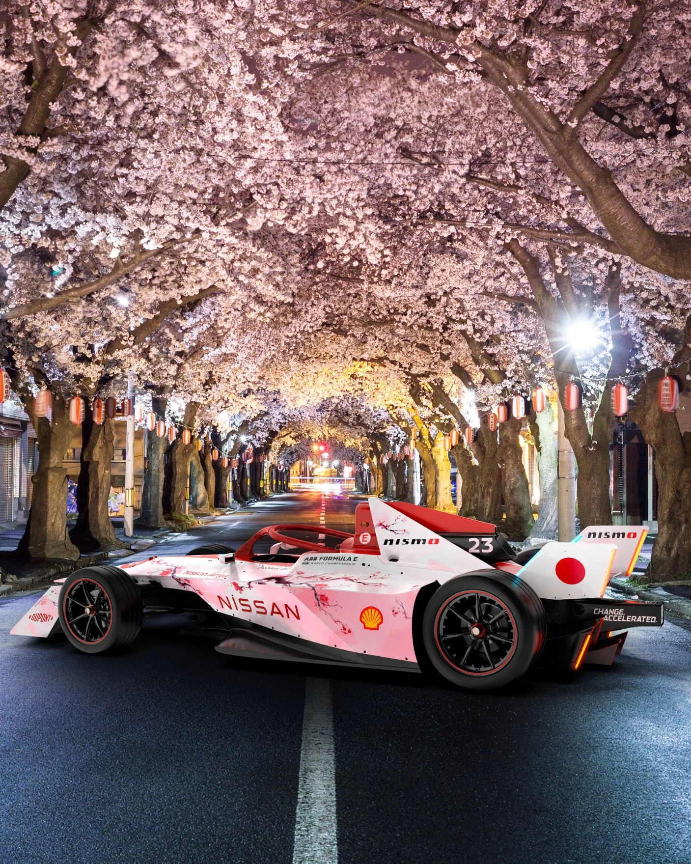
And more, Tokyo Livery.
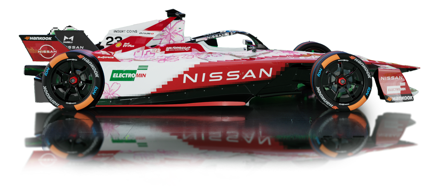
Designing the limited-edition livery for this year’s Tokyo race was truly exciting.
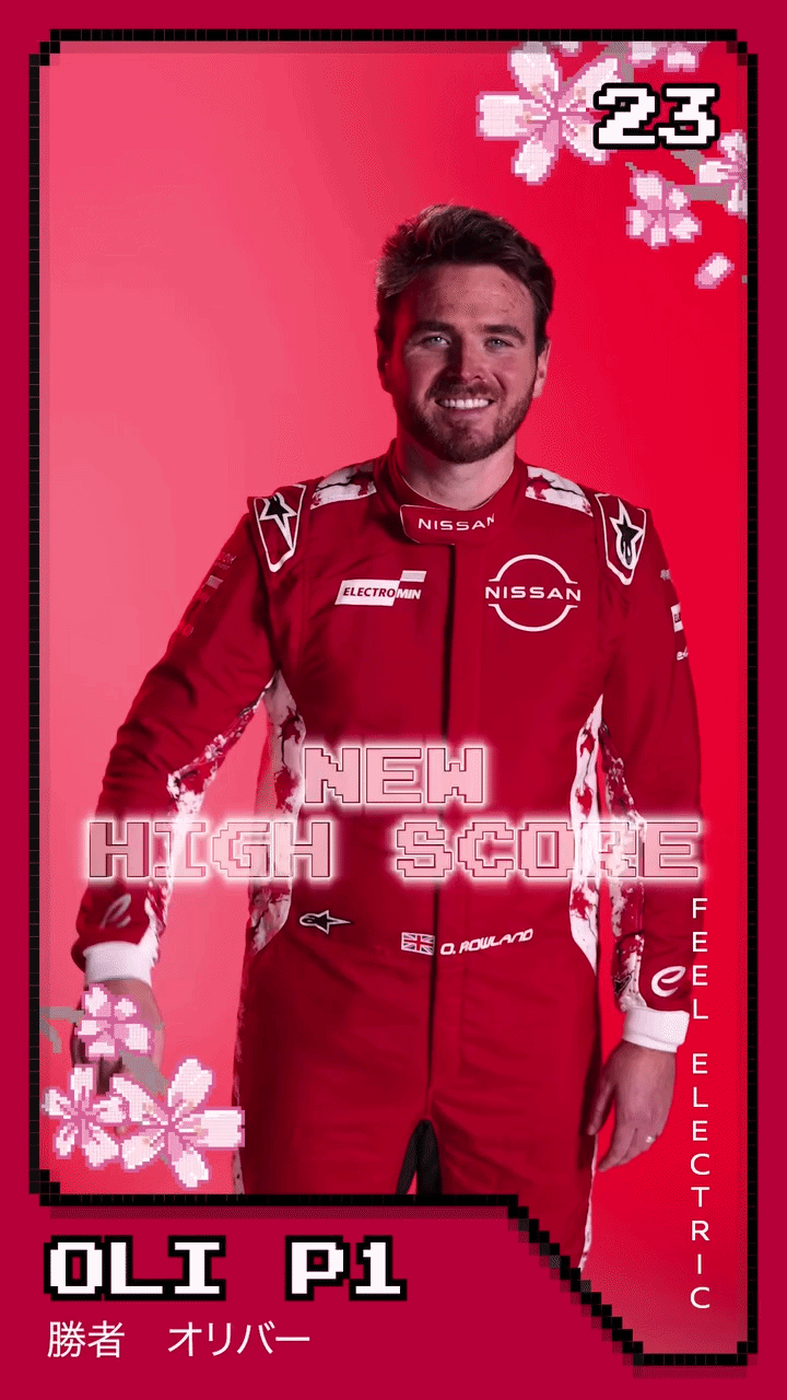
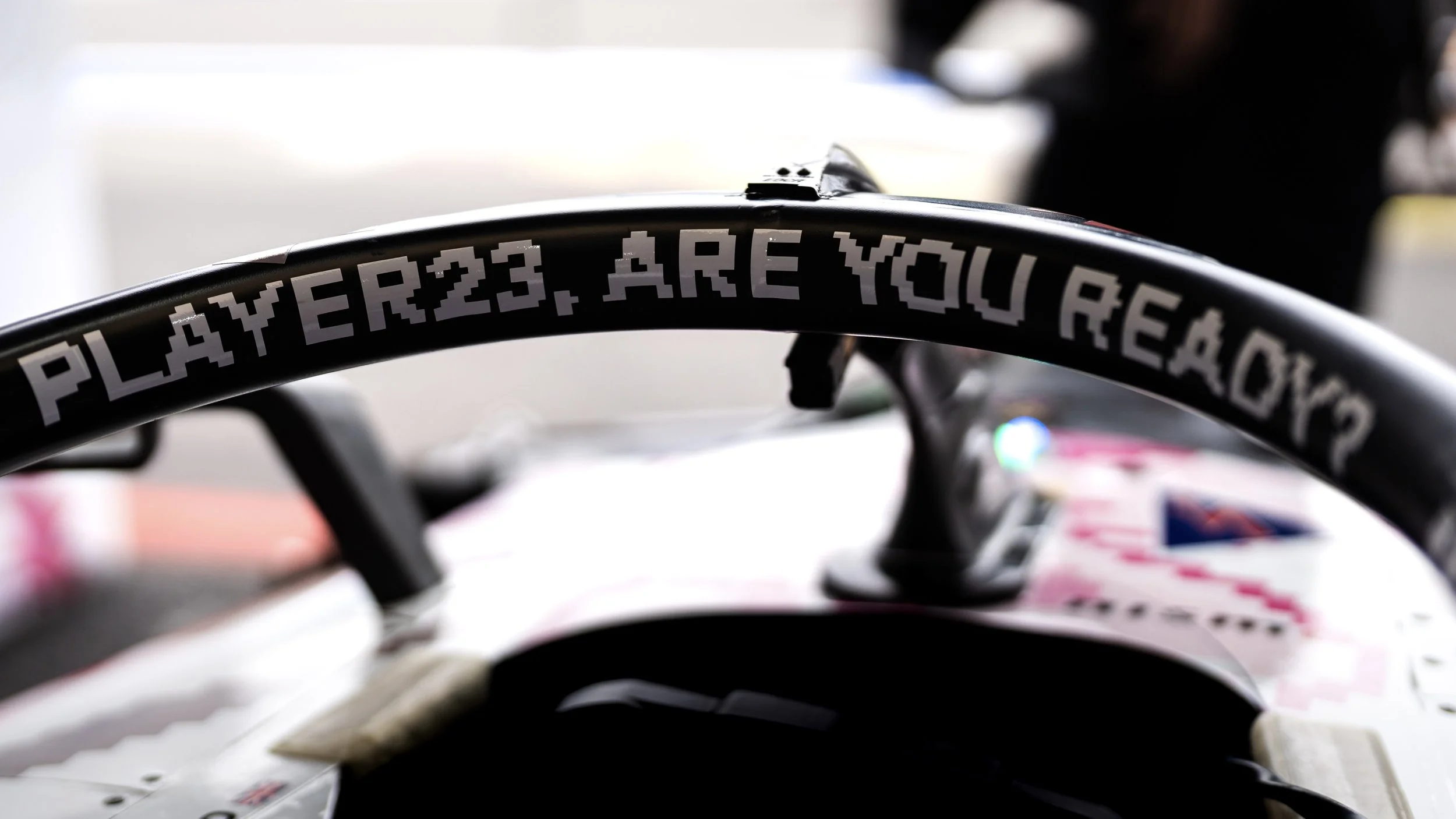
As part of Nismo: Electric Racer, an 8-bit game created to celebrate Nissan’s home Formula E race, worked with Japanese illustrator Kentaro Yoshida to bring a pixelated dream to life on a real track.
From the pixel-perfect bodywork and cherry blossom layout to the custom 8-bit type shouting “Player23, are you ready?” and “Insert coins,” every detail was crafted to blur the line between nostalgia and reality, and to inject a playful spark into the world of motorsport.


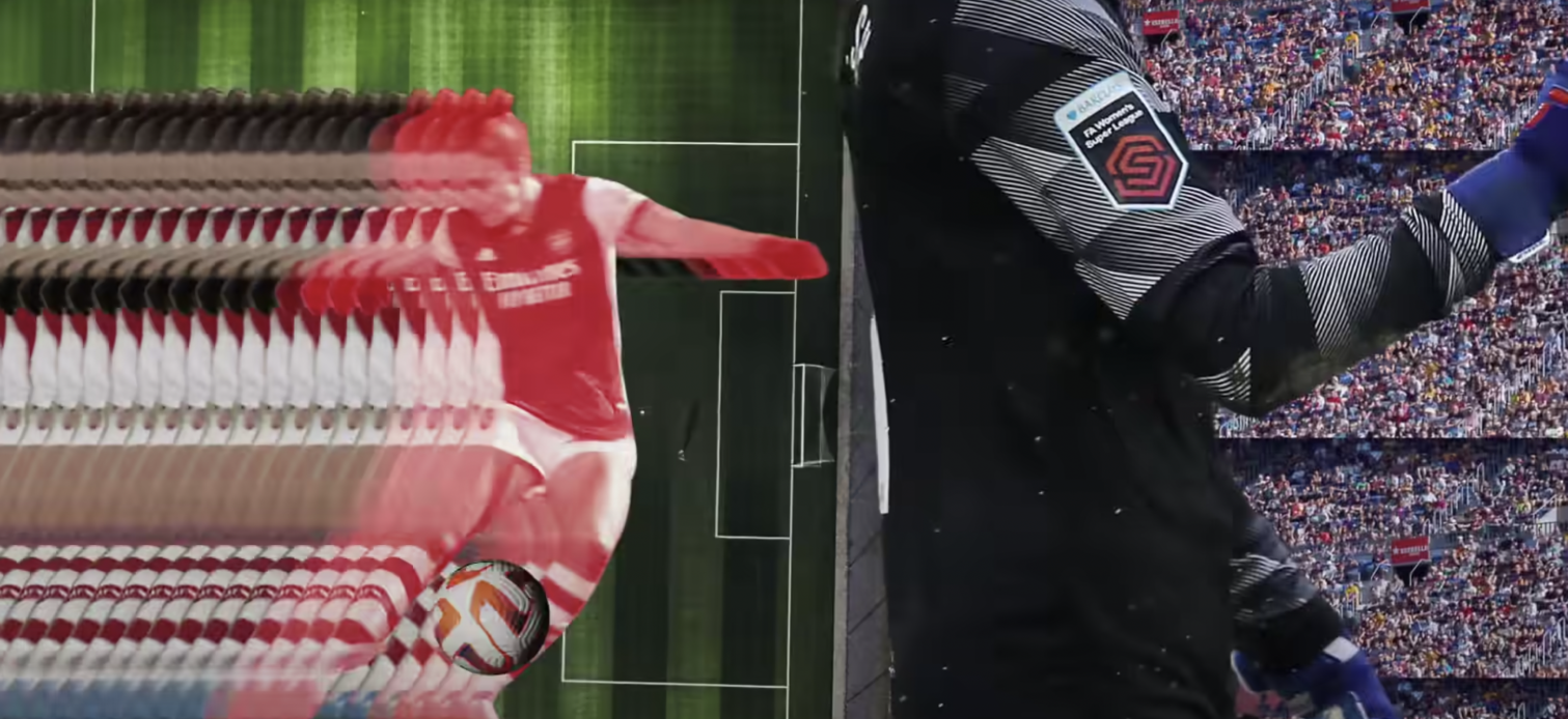
From the race track to the playing field. Different speed, same spirit.

Not a version,
A new standard.
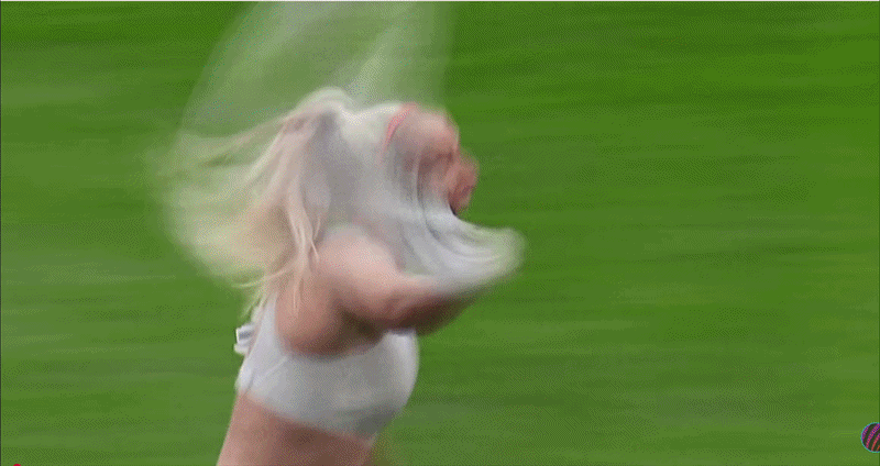
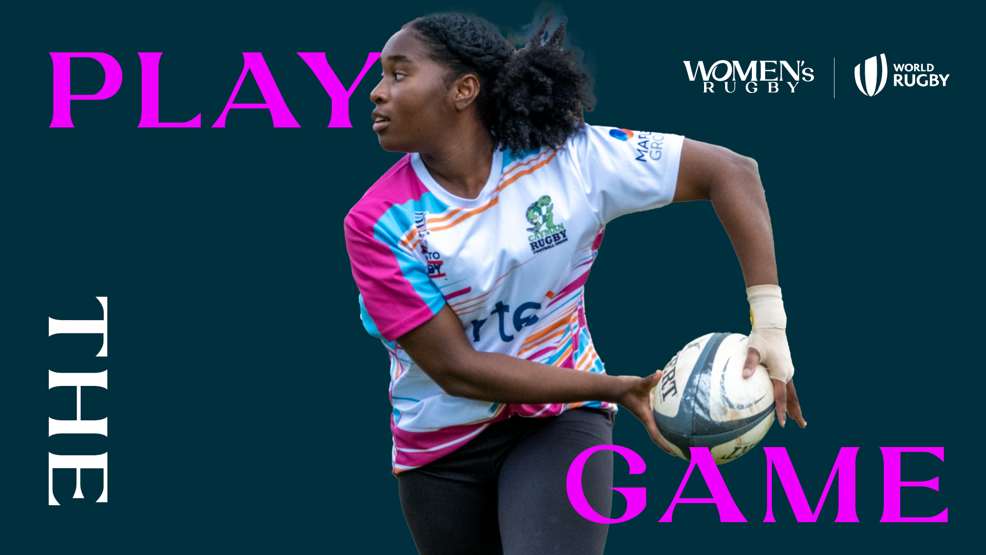
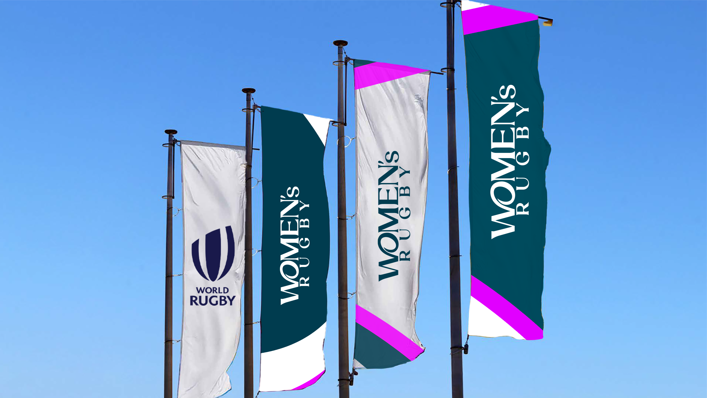
It’s rugby.
What does it mean to design a world where women’s sport isn’t the exception, but simply sport? How do we build a path grounded in continuity and confidence? And what does it mean to shape a future where this space grows wide open, and stays open?
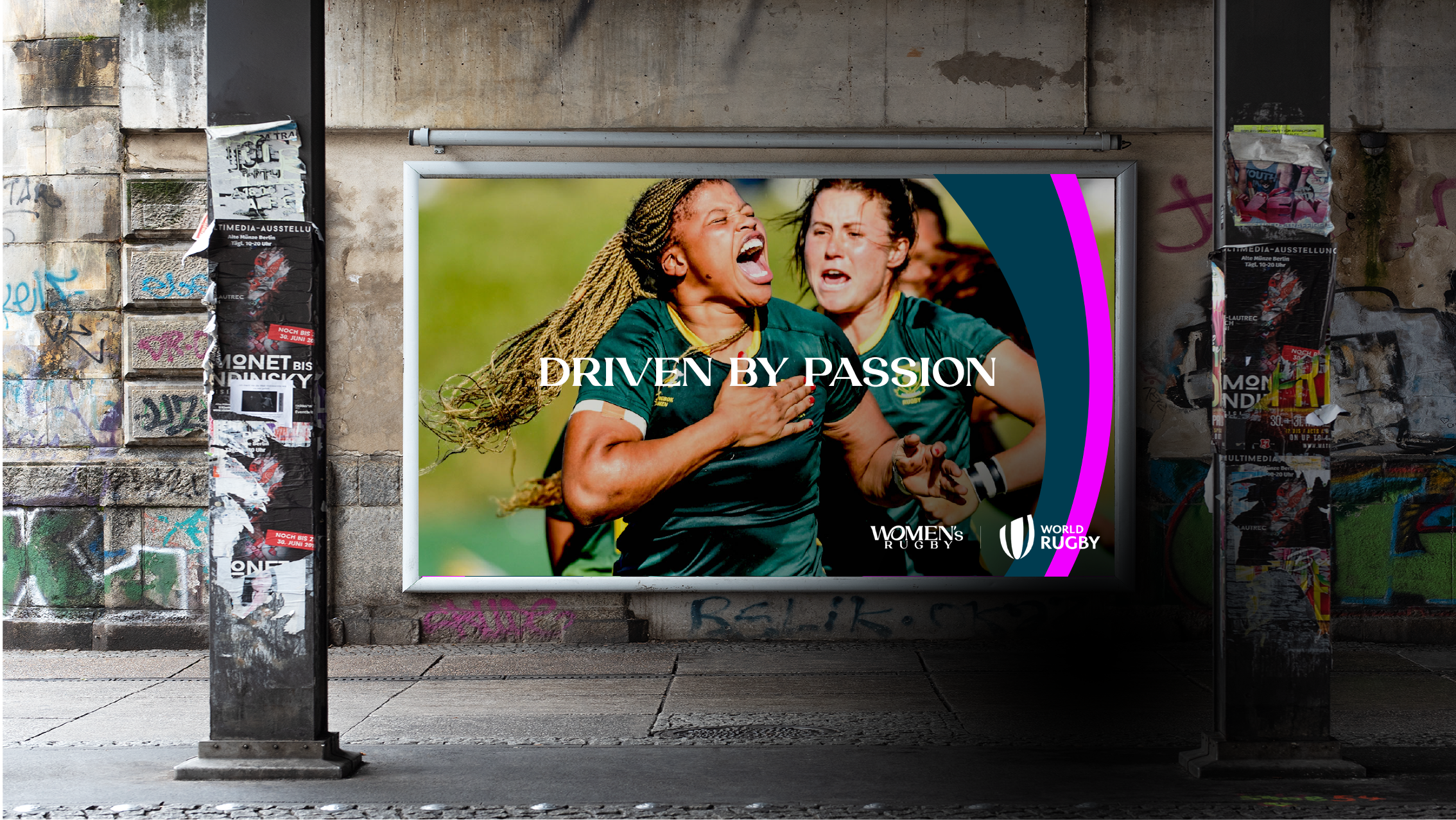
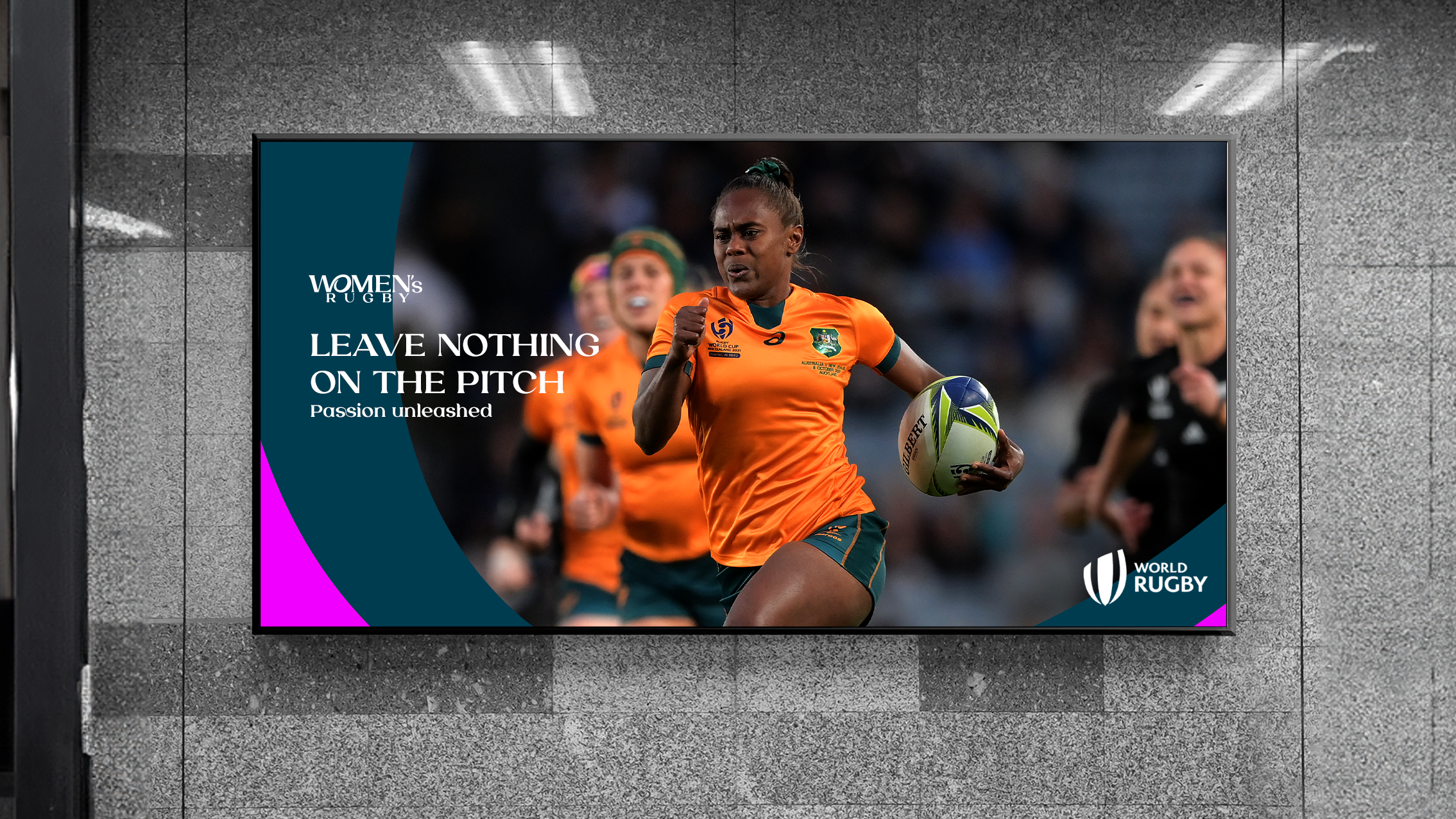
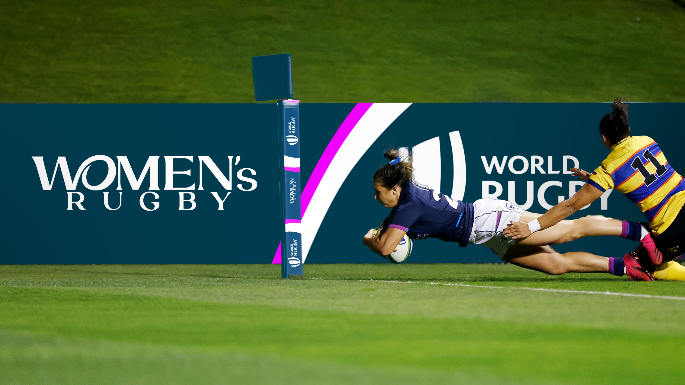
When World Rugby asked us to create a refreshed brand ahead of the biggest ever Women’s Rugby World Cup in 2025, I didn’t see it as just a rebrand. It felt like a cultural shift. We worked with World Rugby to reshape how women’s rugby shows up in the world, not as a version of something else, but as a powerful force in its own right.
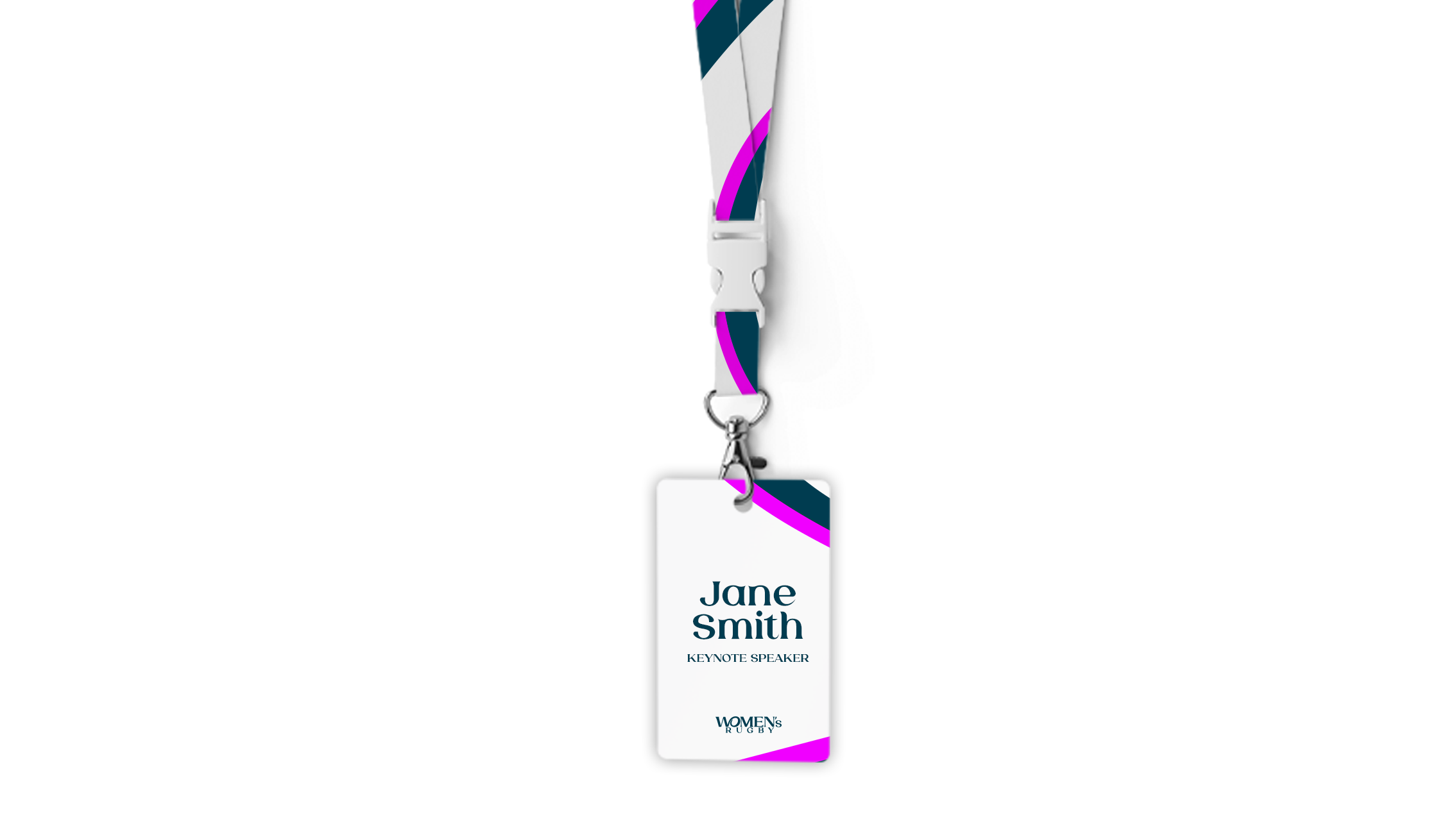
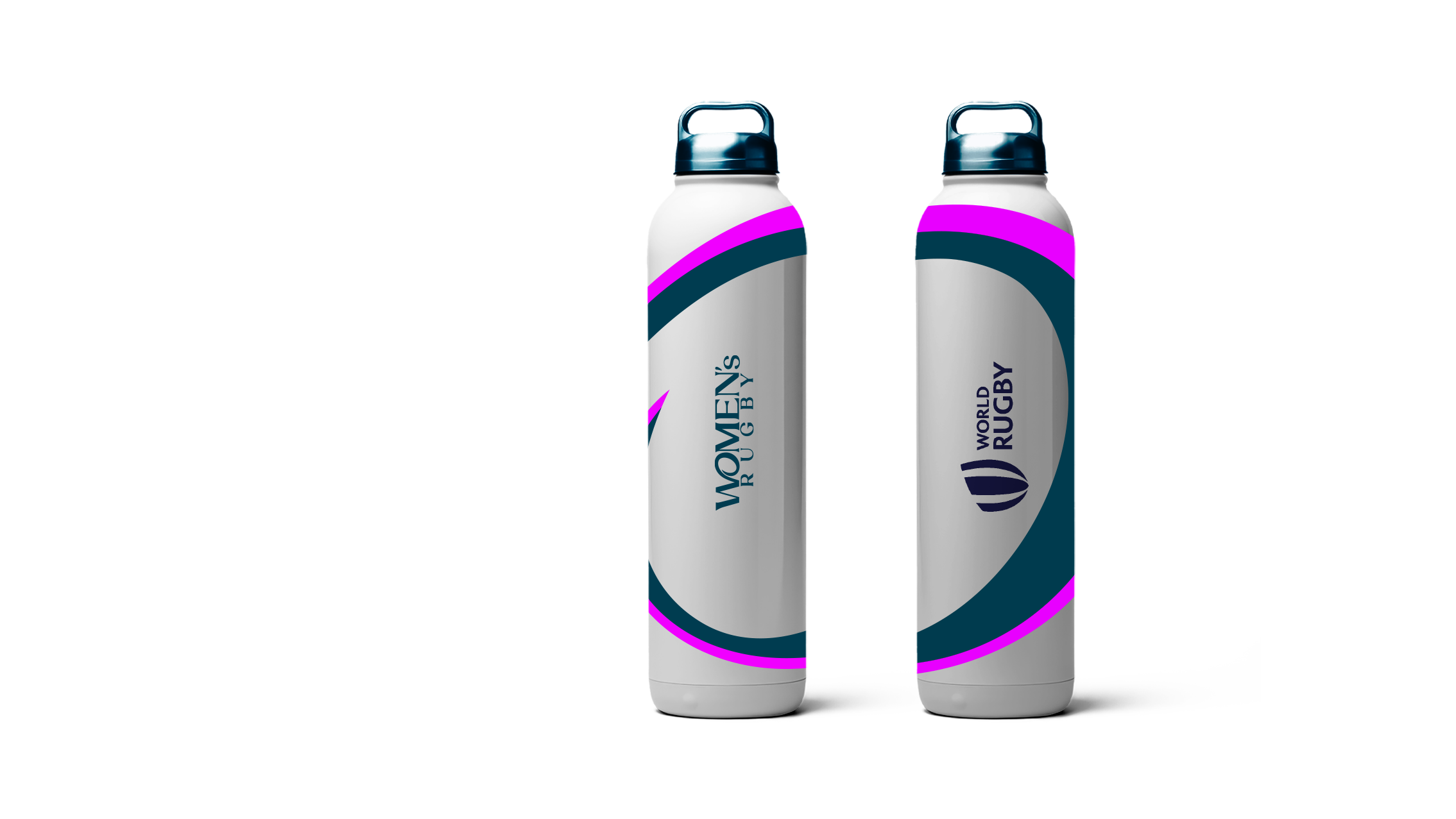
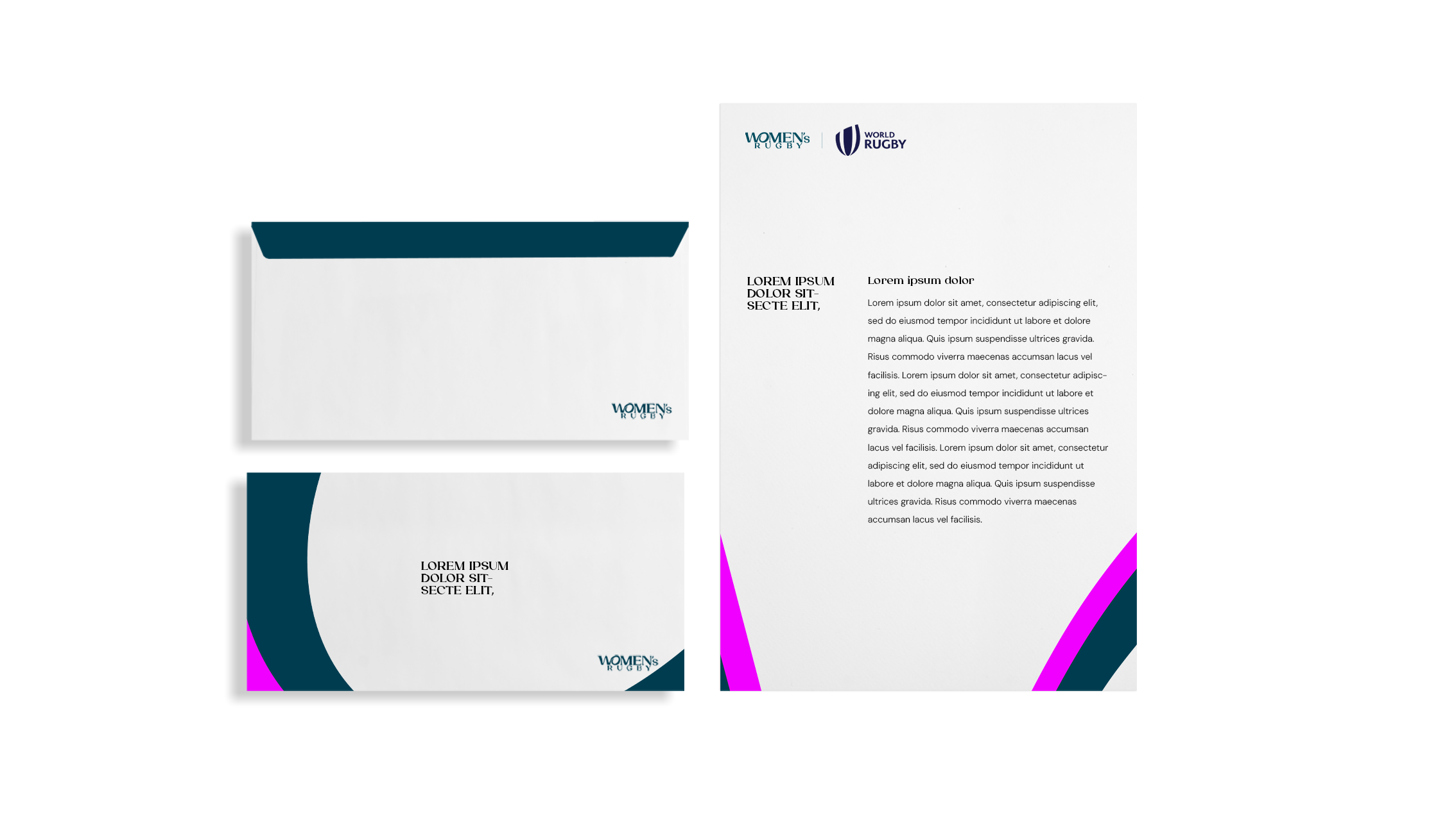
The new brand had to feel unapologetically confident, stylish, and bold, like the women who play the game. Not a copy. Not a comparison. Just the new standard.
The journey.
It wasn't a smooth journey. The brand name changed. The key sponsor changed twice. Reworked colour palettes, type, applications. Then we reworked them again. Momentum came and went. Directions shifted. So did the brief.
At one point, I said: “I need Mr. Motivator to sit next to me while I update this.” (It ended up being nominated for ‘quote of the year’ at the company!) But still, we stayed with the idea. We held the line on what mattered.
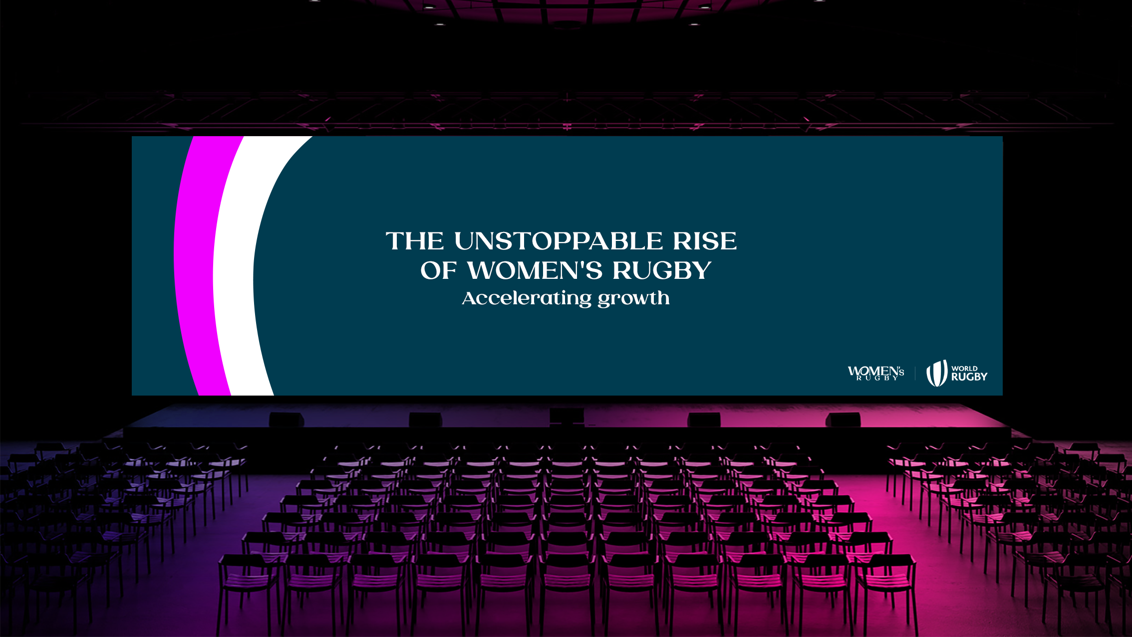
And in the end, it paid off. Here is the final output.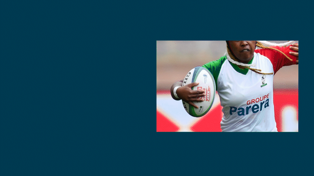
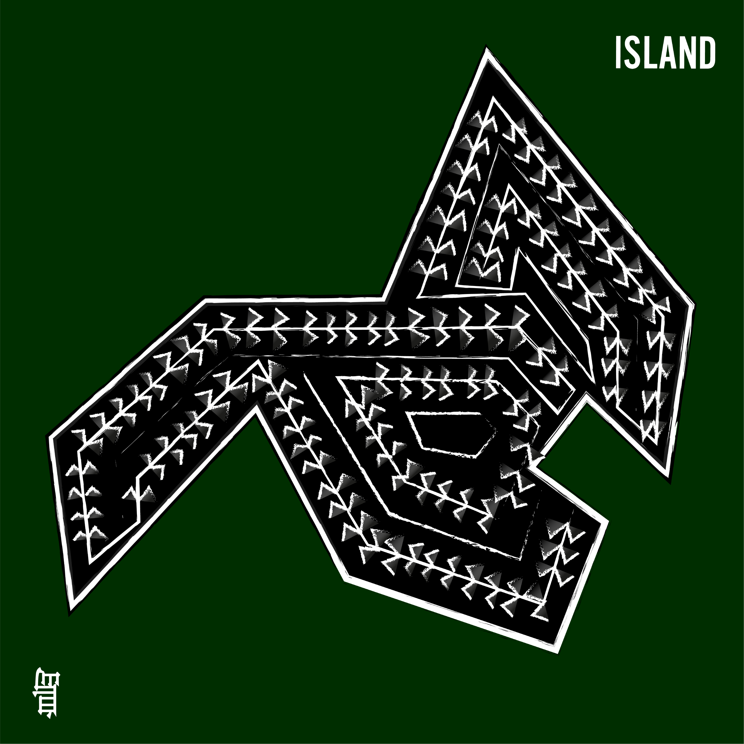
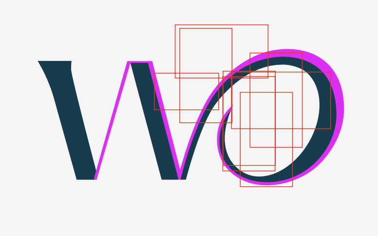
She holds the ball, and carries the game into the future.
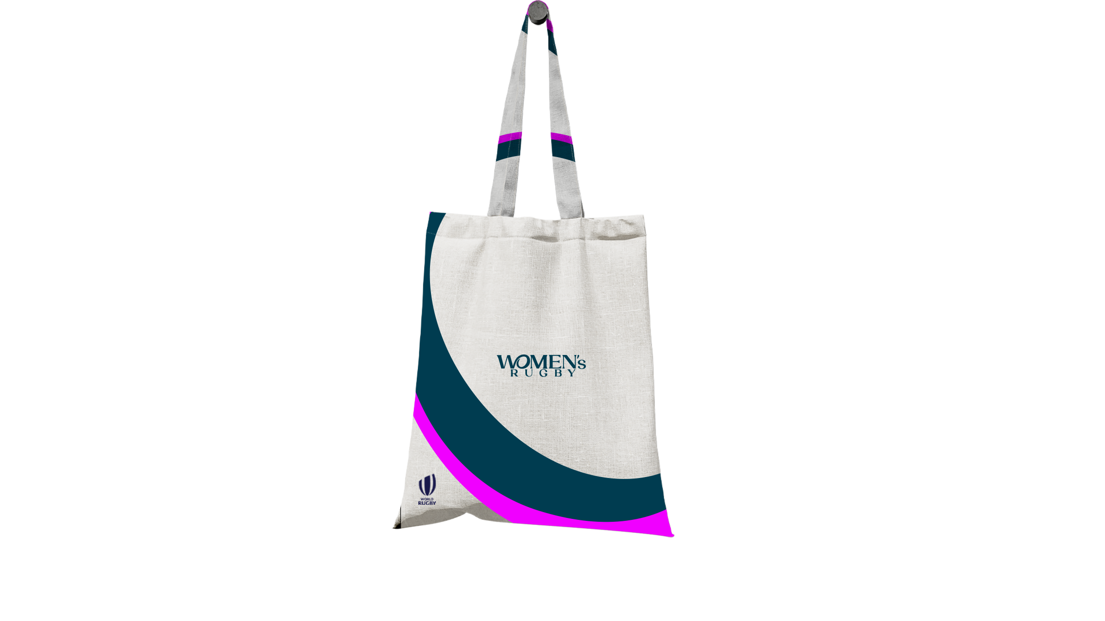
The new identity connects the ‘W’ and ‘O’ to form a symbol of a woman holding a rugby ball, powerfully showing that women don’t just belong in this game, at every level, they carry it forward with energy, and elegance.
This gesture became the core of the brand: a visual representation of leadership, motion, and pride. It reflects the belief that women aren’t stepping into a version of rugby, but defining the game on their own terms.Font, colour, graphic device.
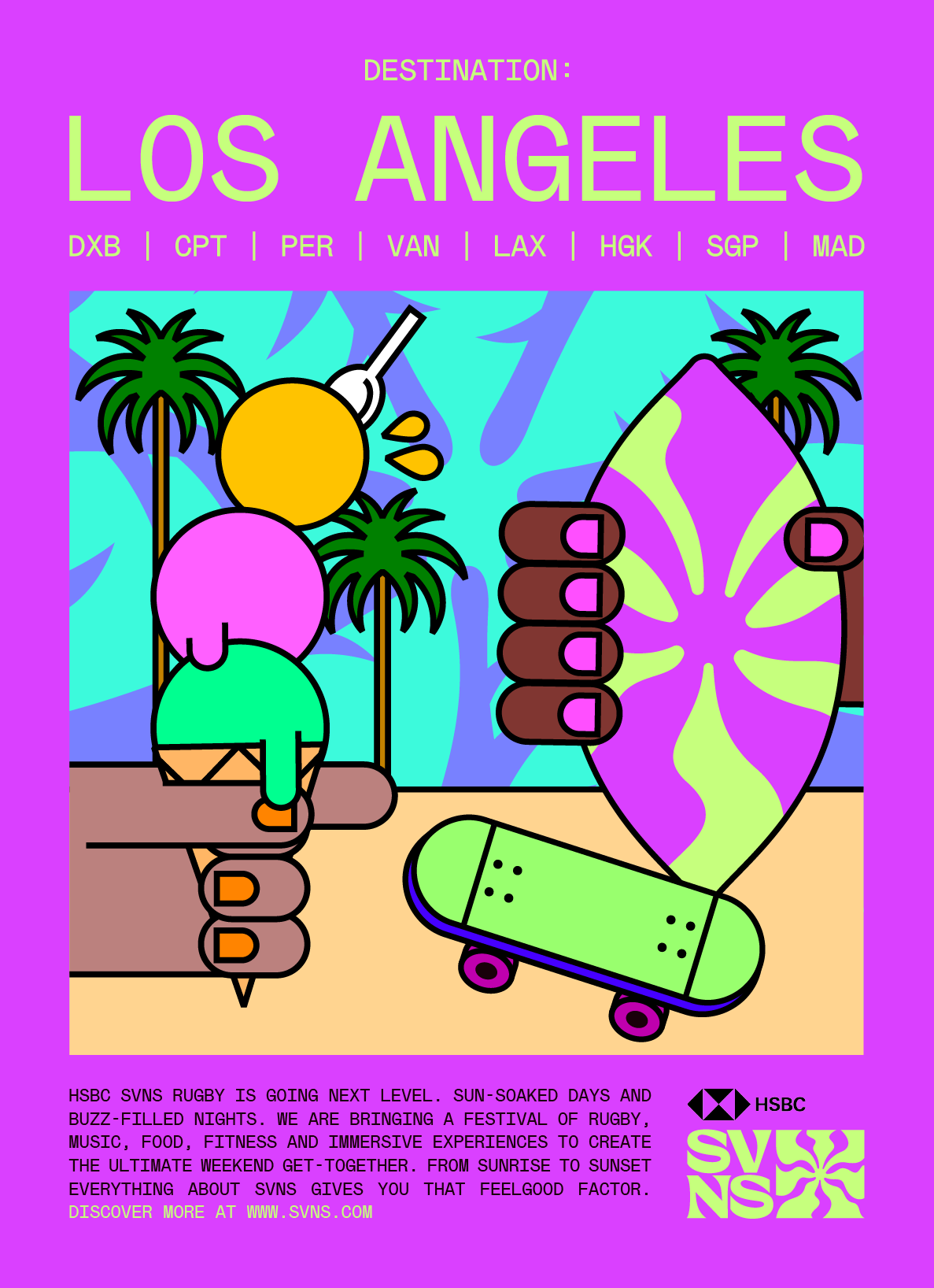
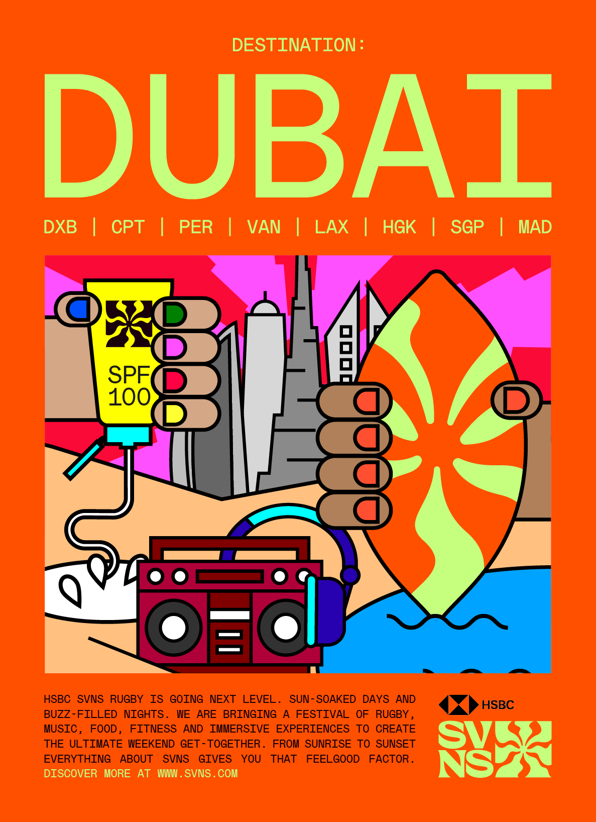
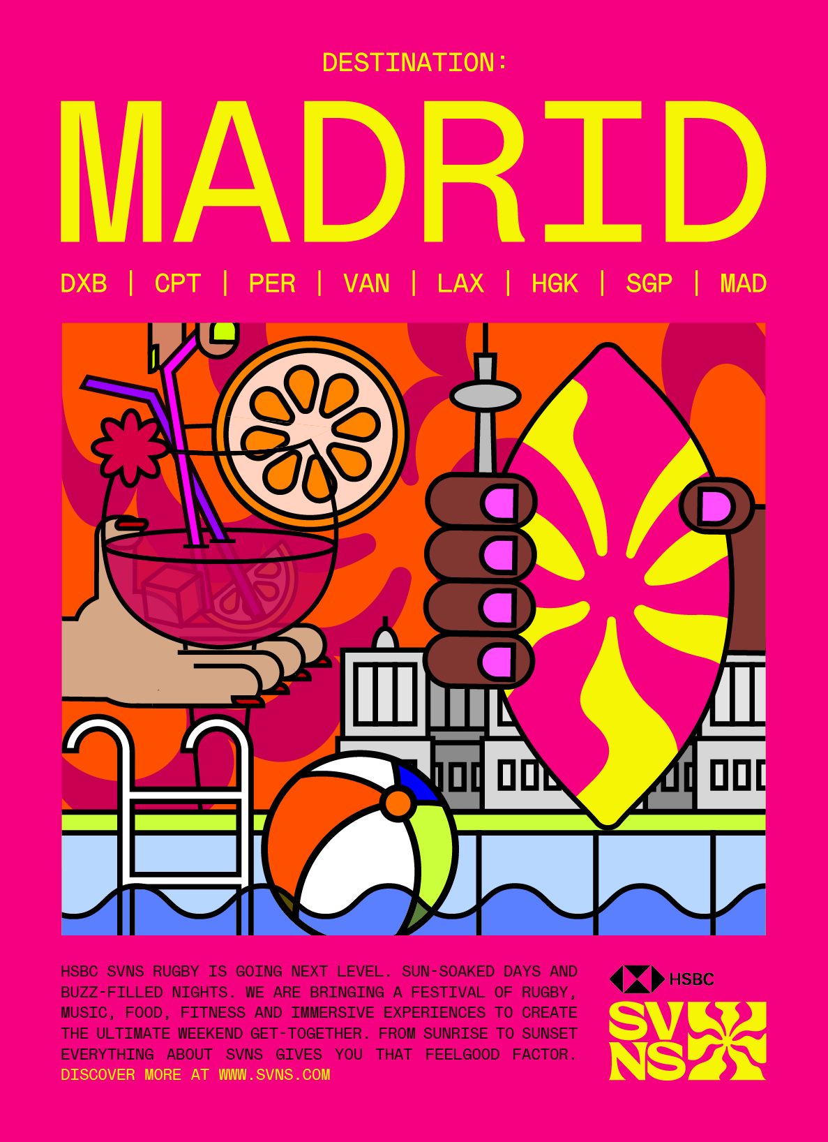
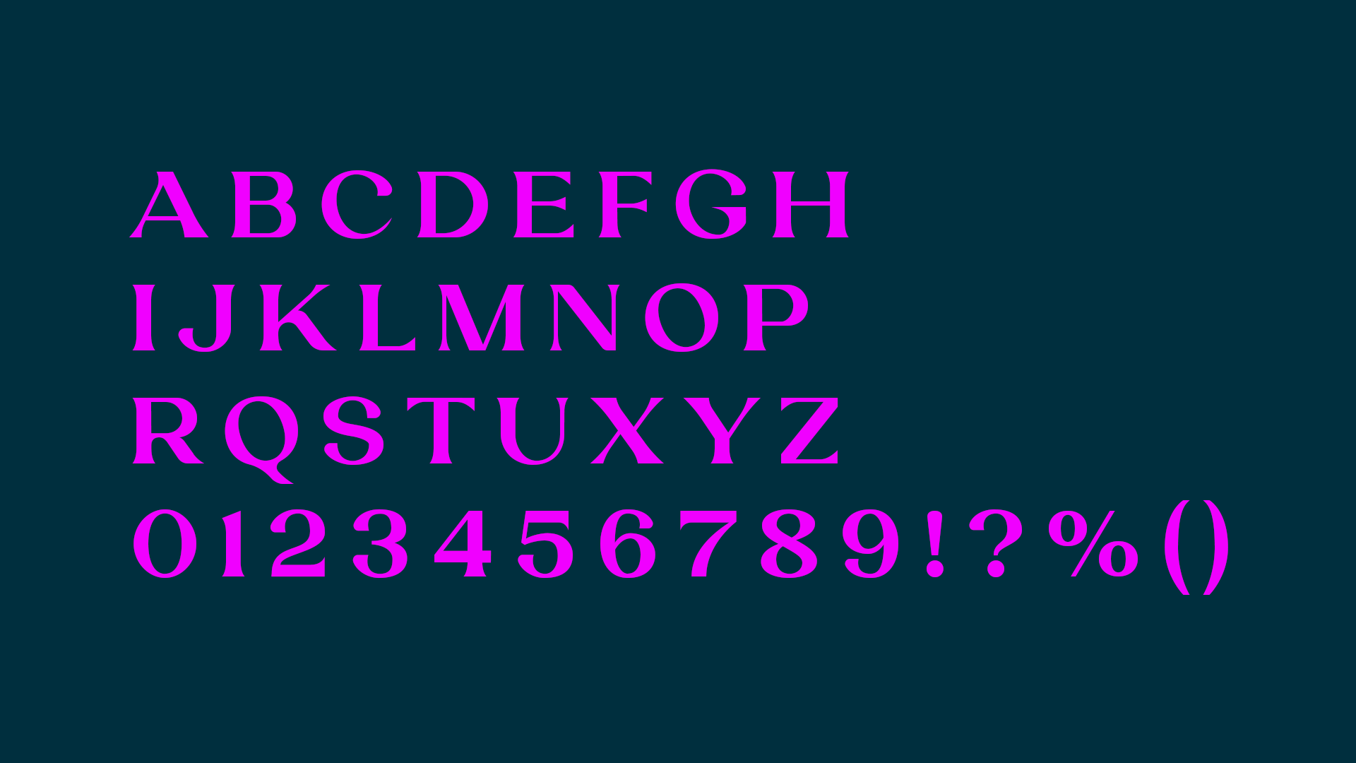
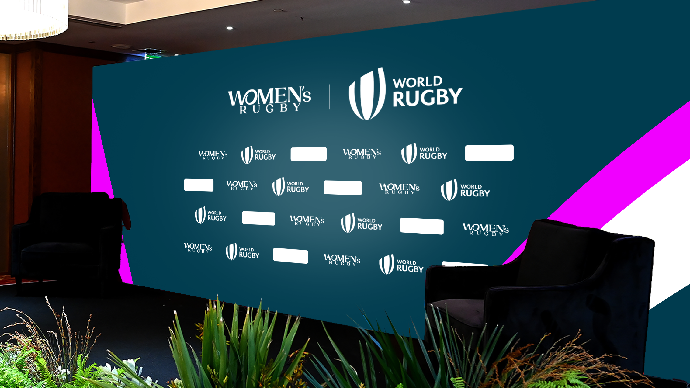
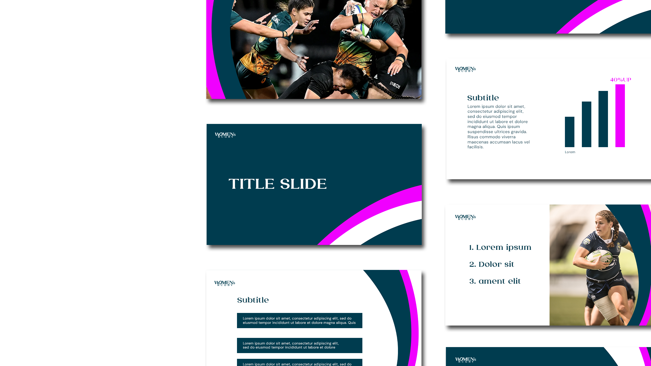
I leaned into a rich teal palette paired with energetic pink accents, a combination that feels both bold and elegant. For typography, I used Laviossa, a typeface that balances softness and strength. Its graceful curves and refined structure reflect the unapologetic elegance of the women’s game.
By extracting and enlarging parts of the logo, we created dynamic graphic patterns that capture the energy and movement of the women’s game, almost like the rhythm of a match frozen mid-motion.


The answer, in motion.
Together, these elements became more than a brand, they became a quiet answer to a loud question: What if women’s sport wasn’t the exception, but simply sport?
The identity carries that answer with grace and power. It moves with the rhythm of change, grounded in confidence and built to last, so that this space not only opens, but stays wide open.A few more from the journey so far, small steps, bold questions.